
AOI Coffee Packaging|葵咖啡包裝識別規劃
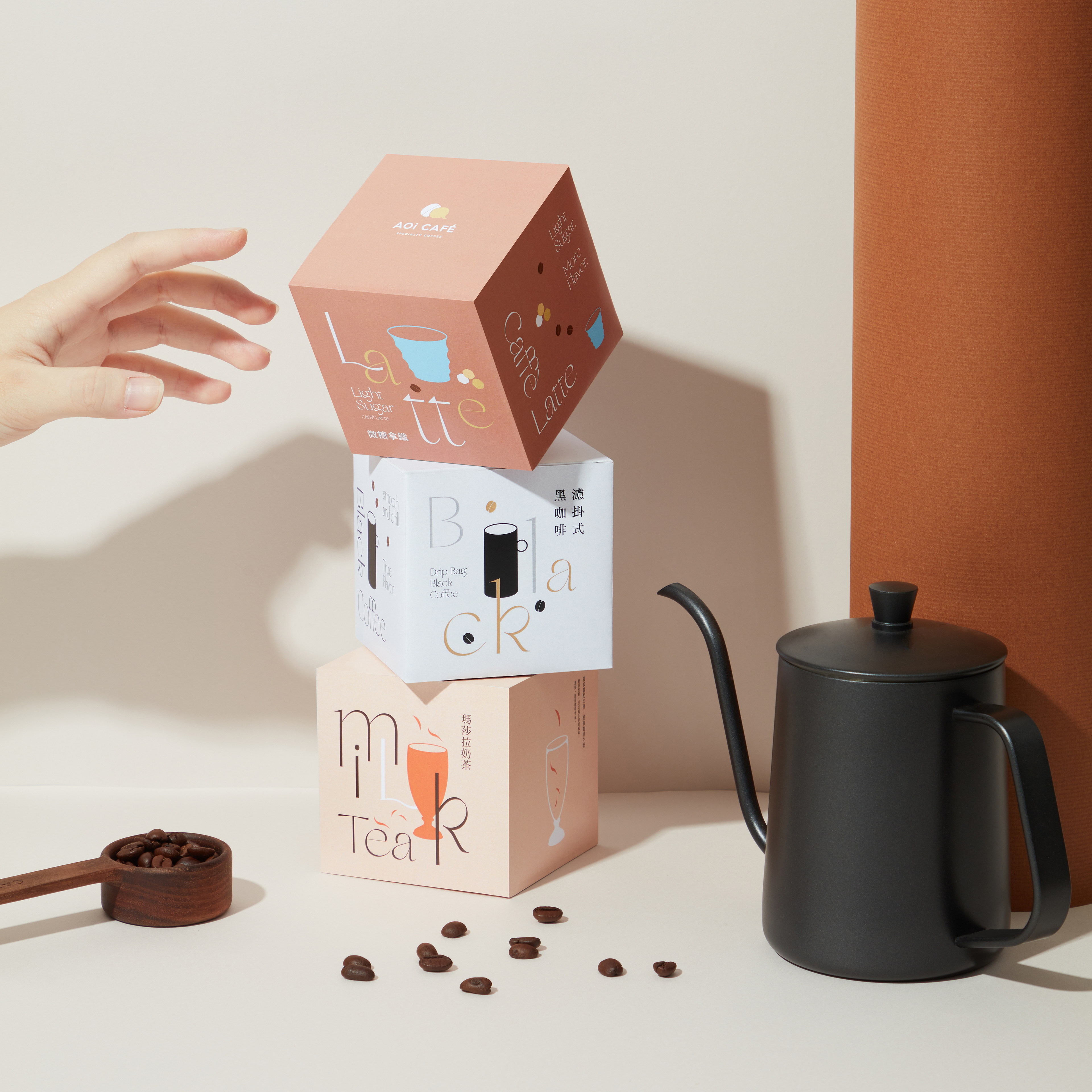
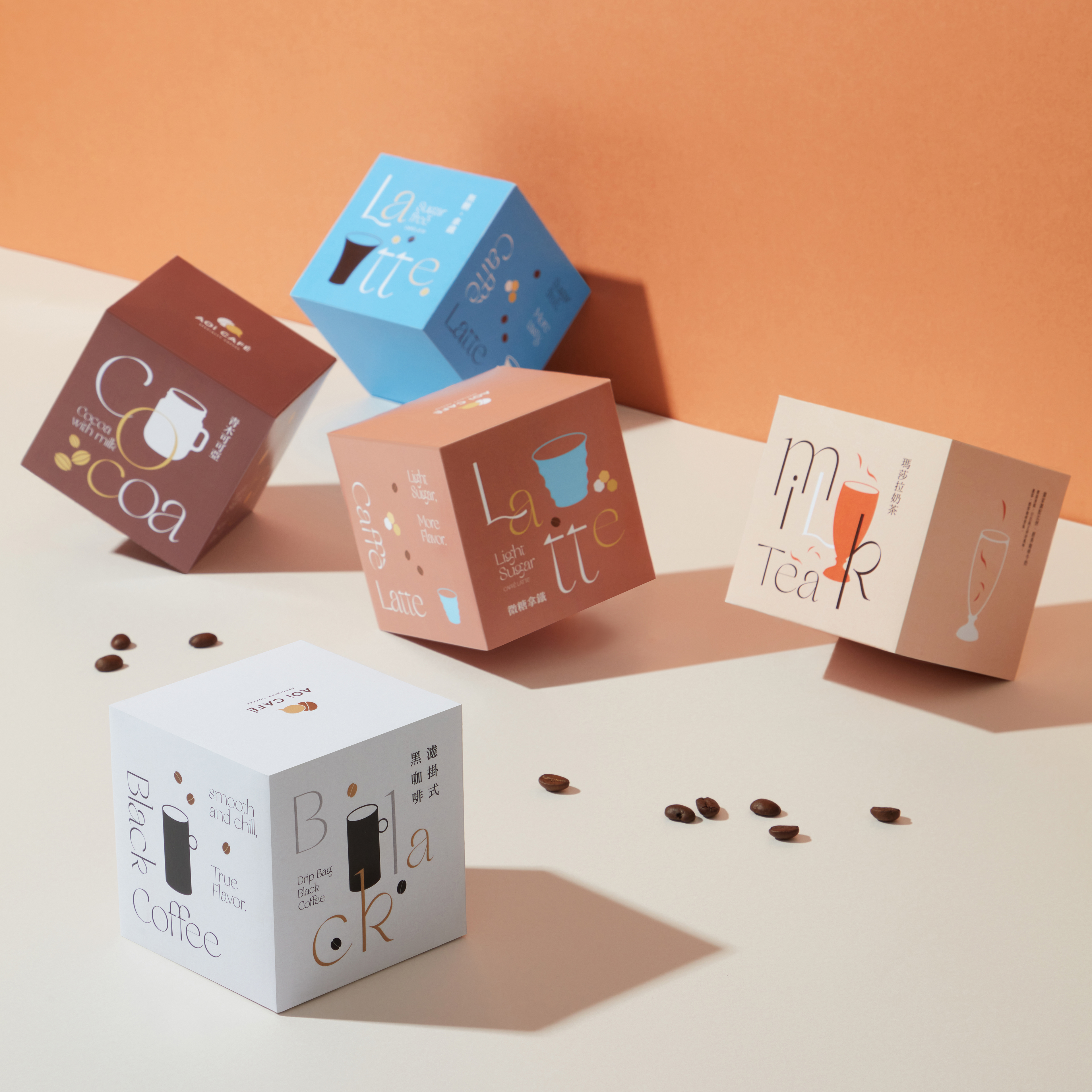
簡單享用|輕鬆品嚐 沒有繁瑣的器具與複雜的步驟,只需撕開包裝沖泡出生活的步調
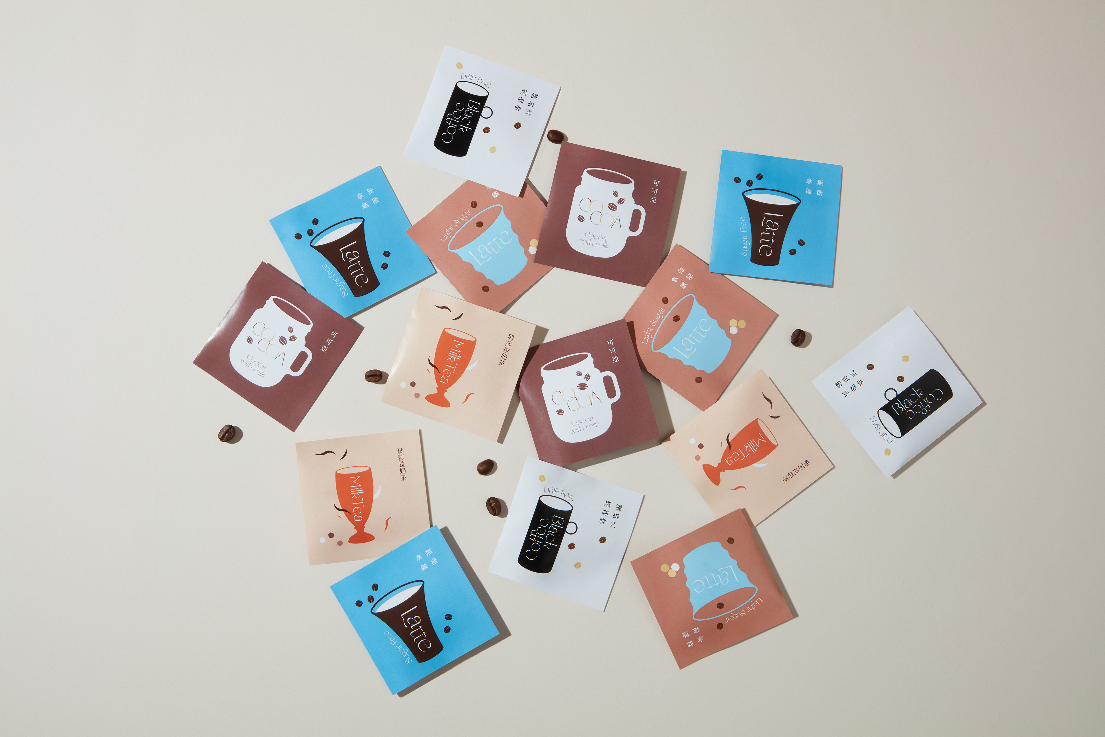
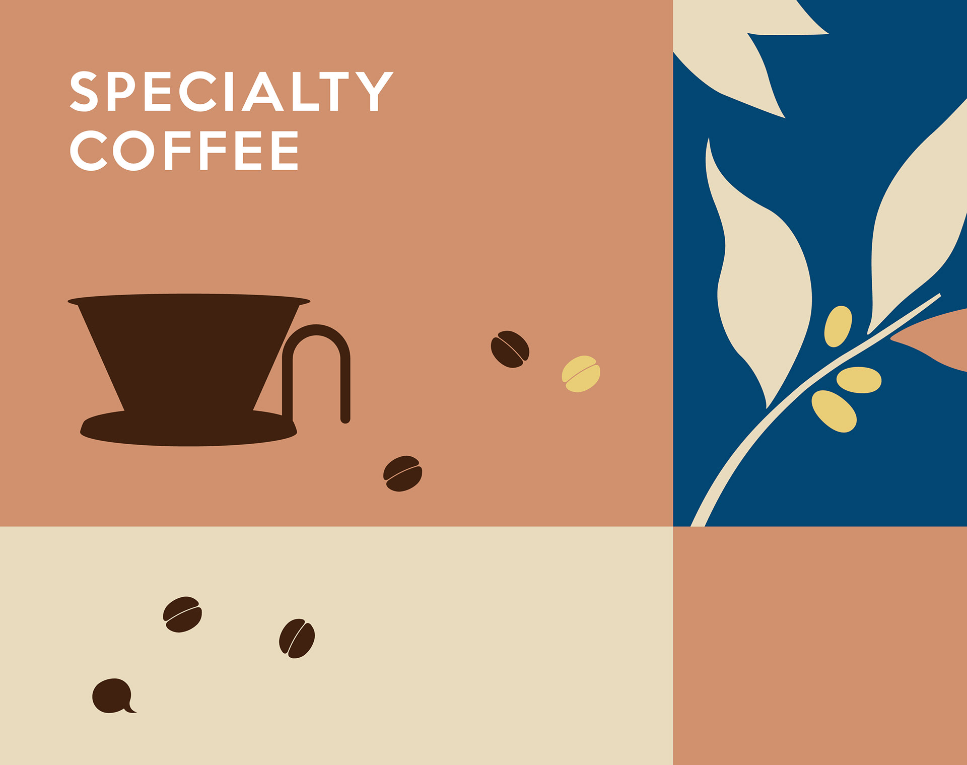
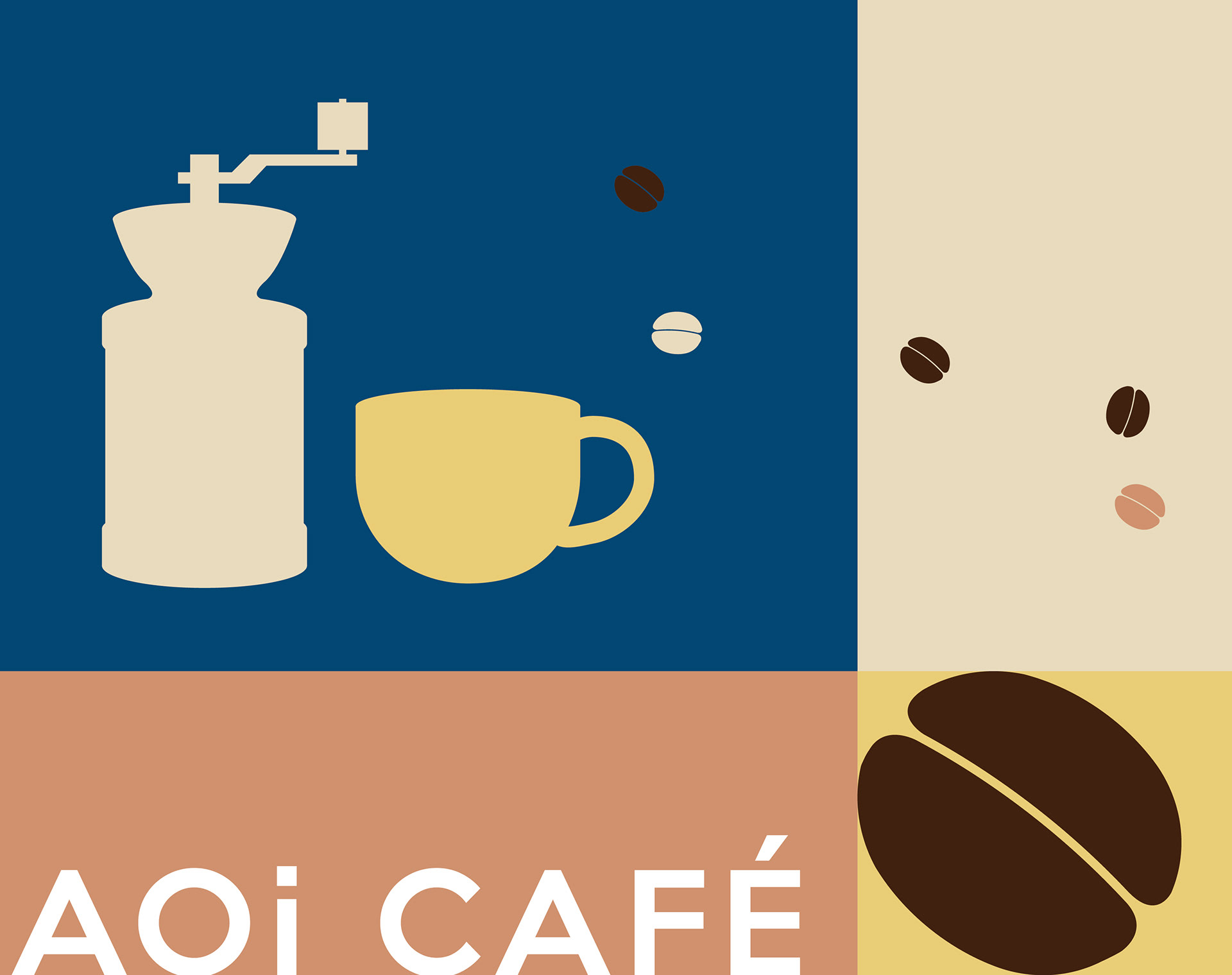
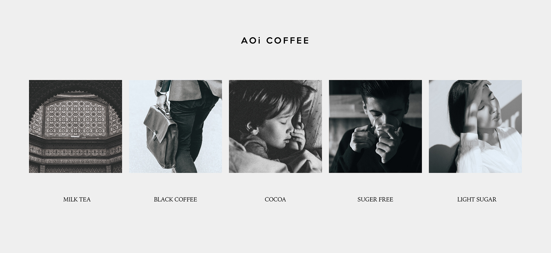
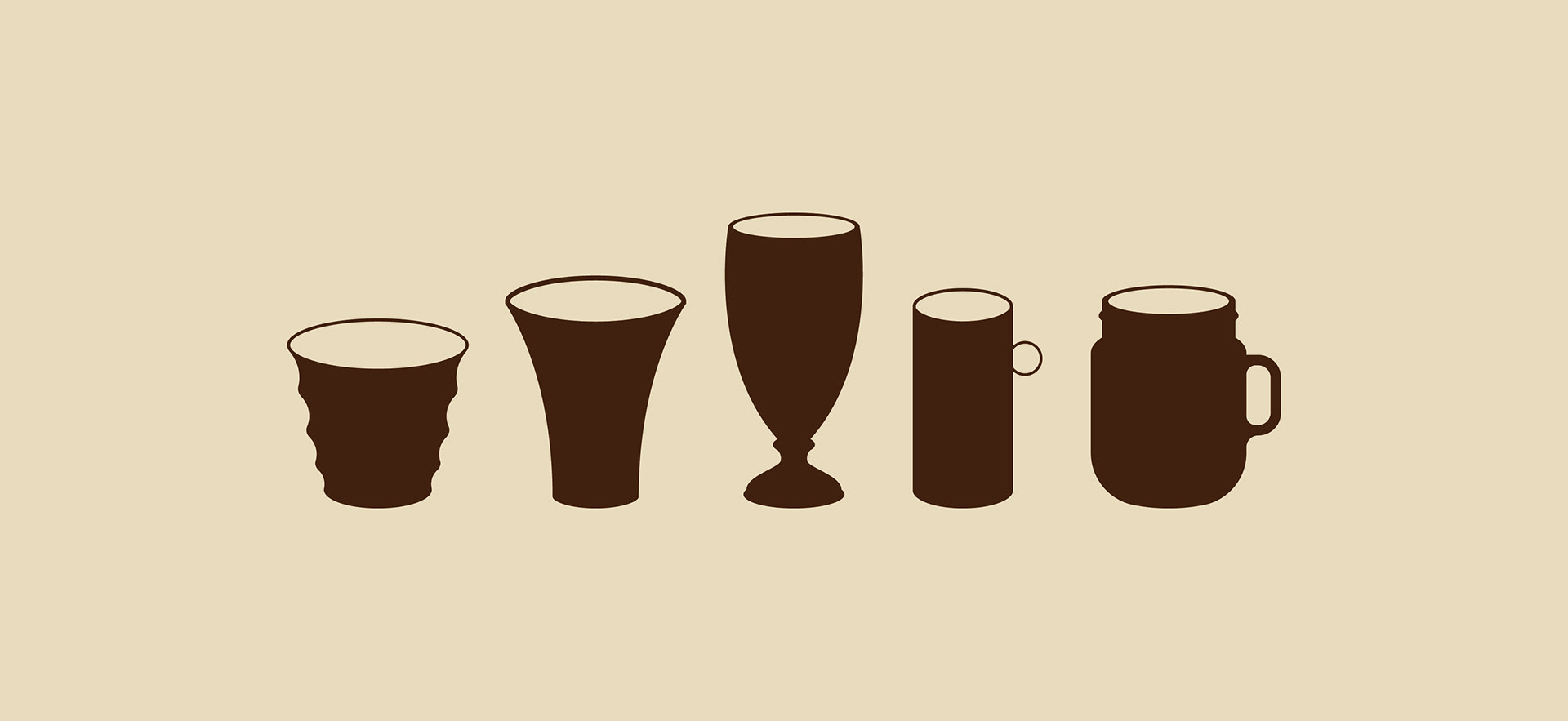
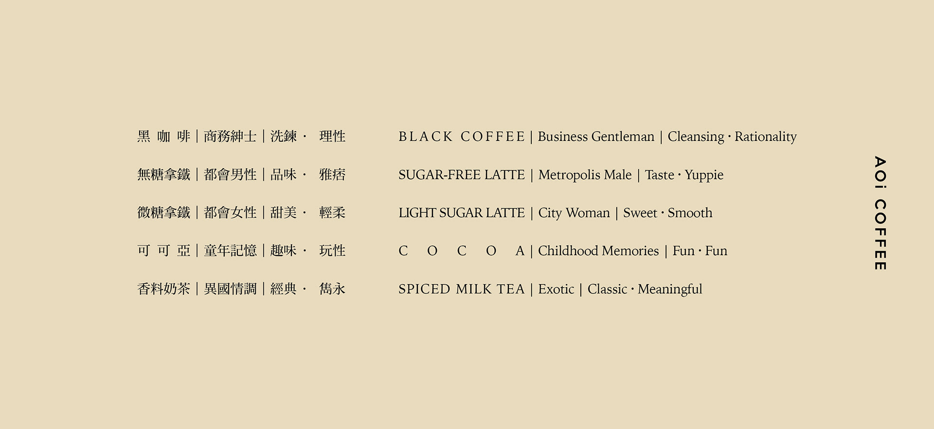
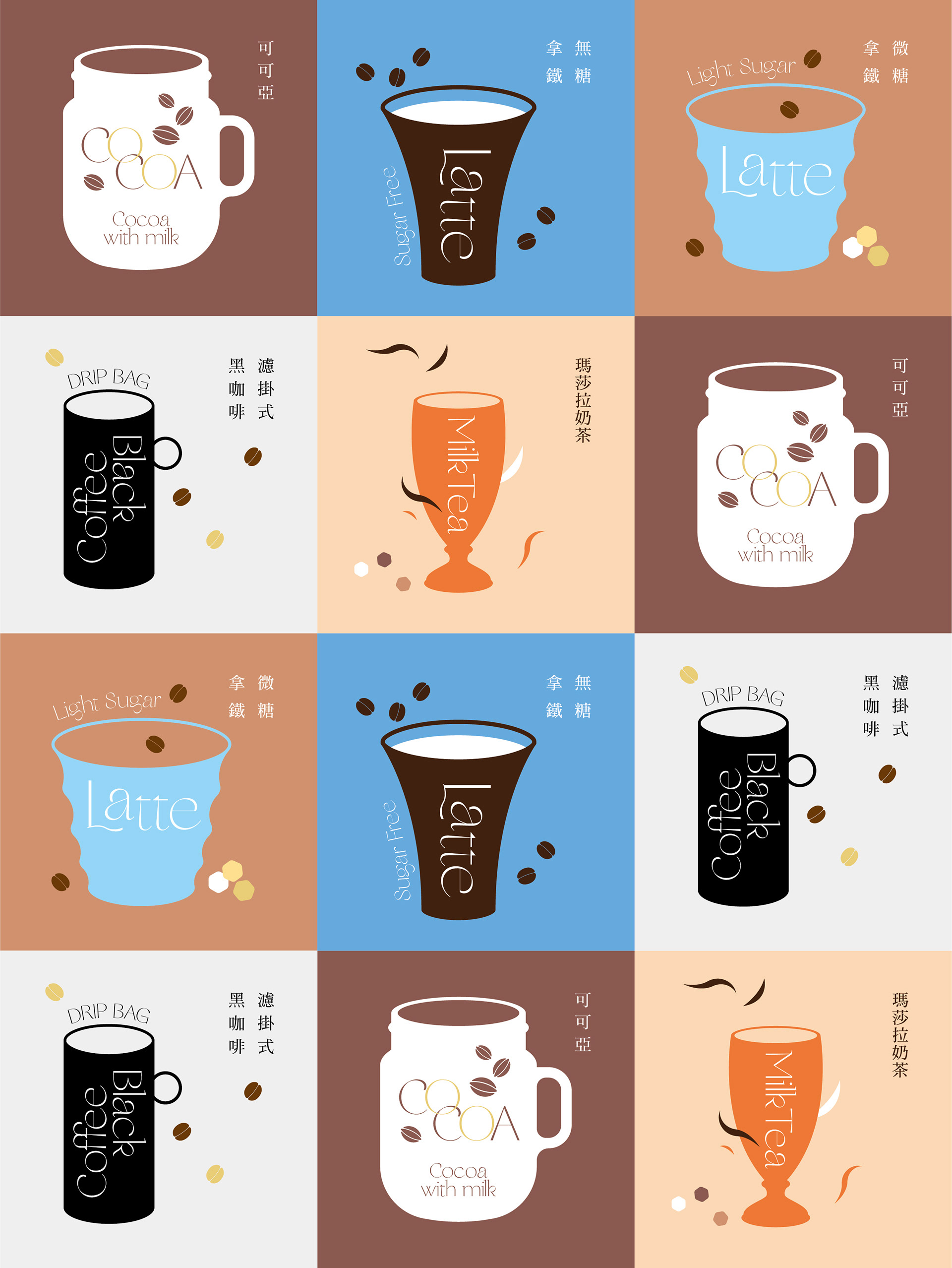
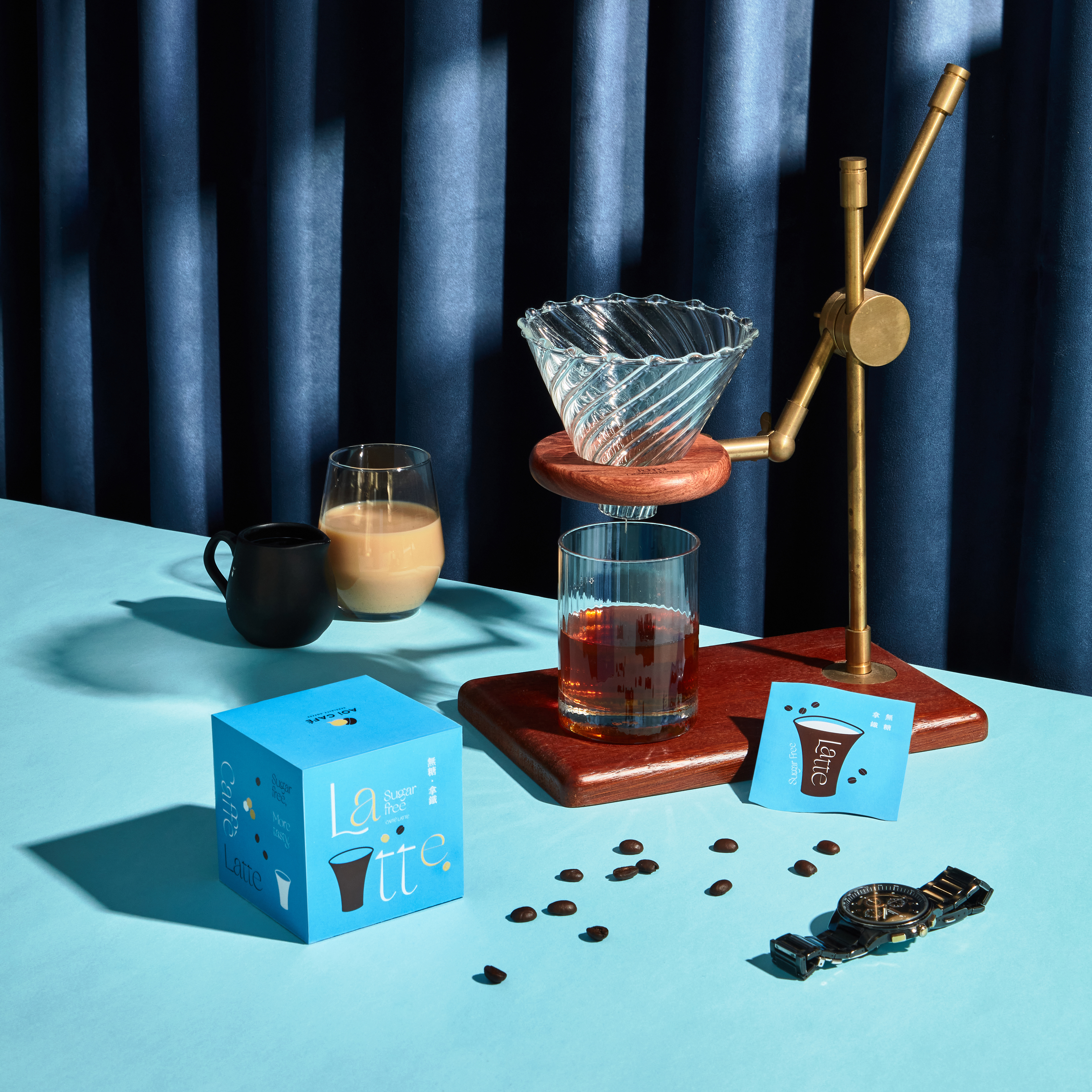
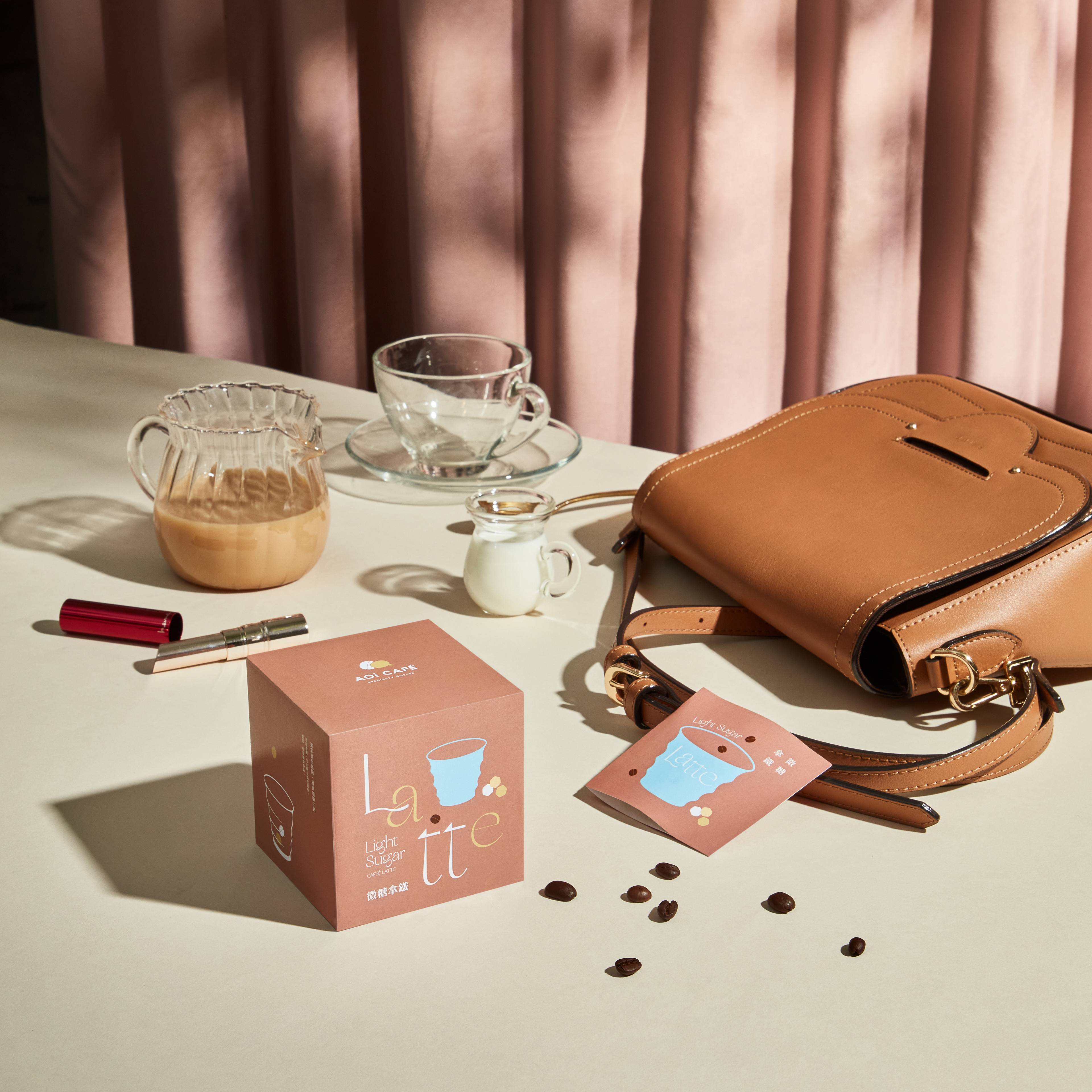
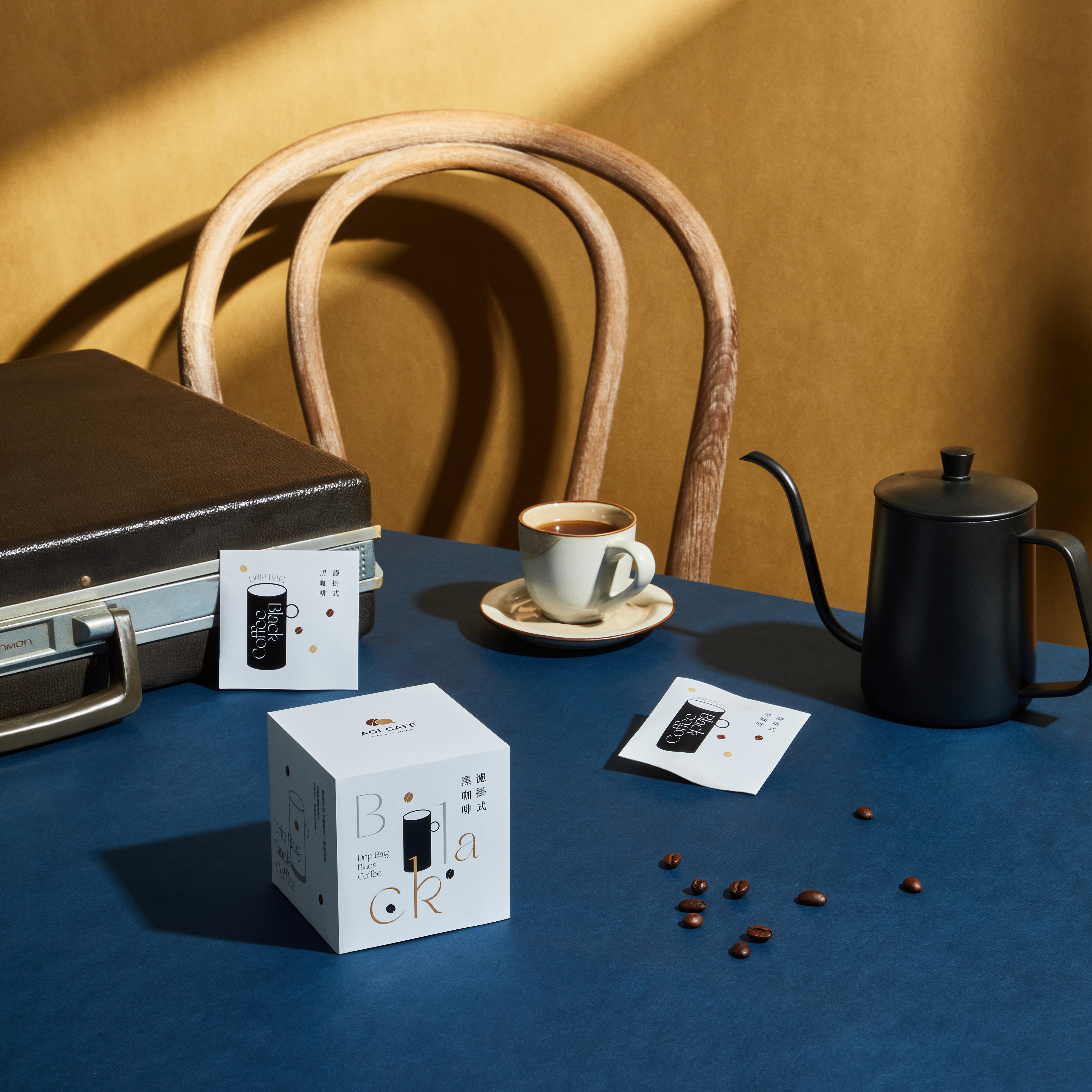
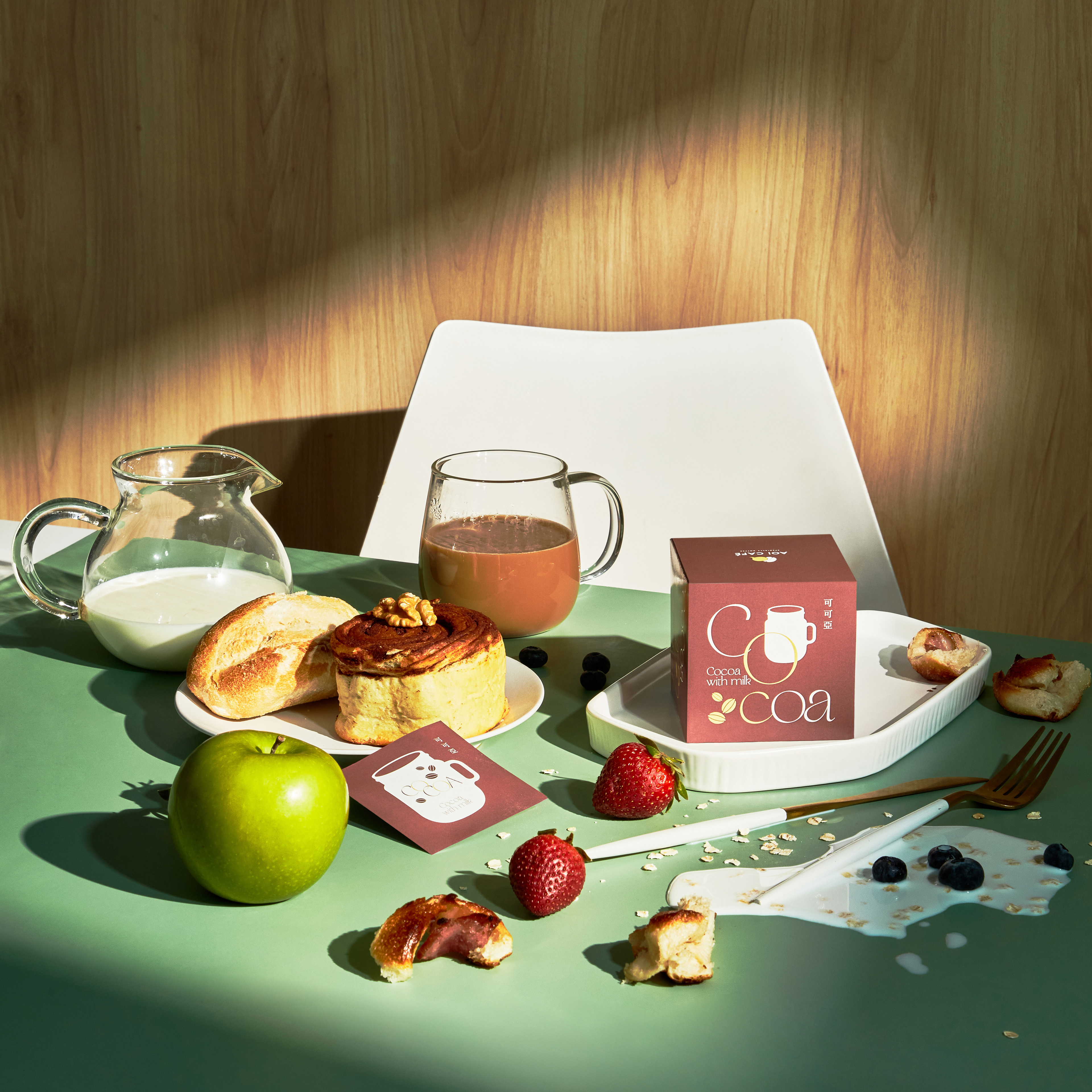
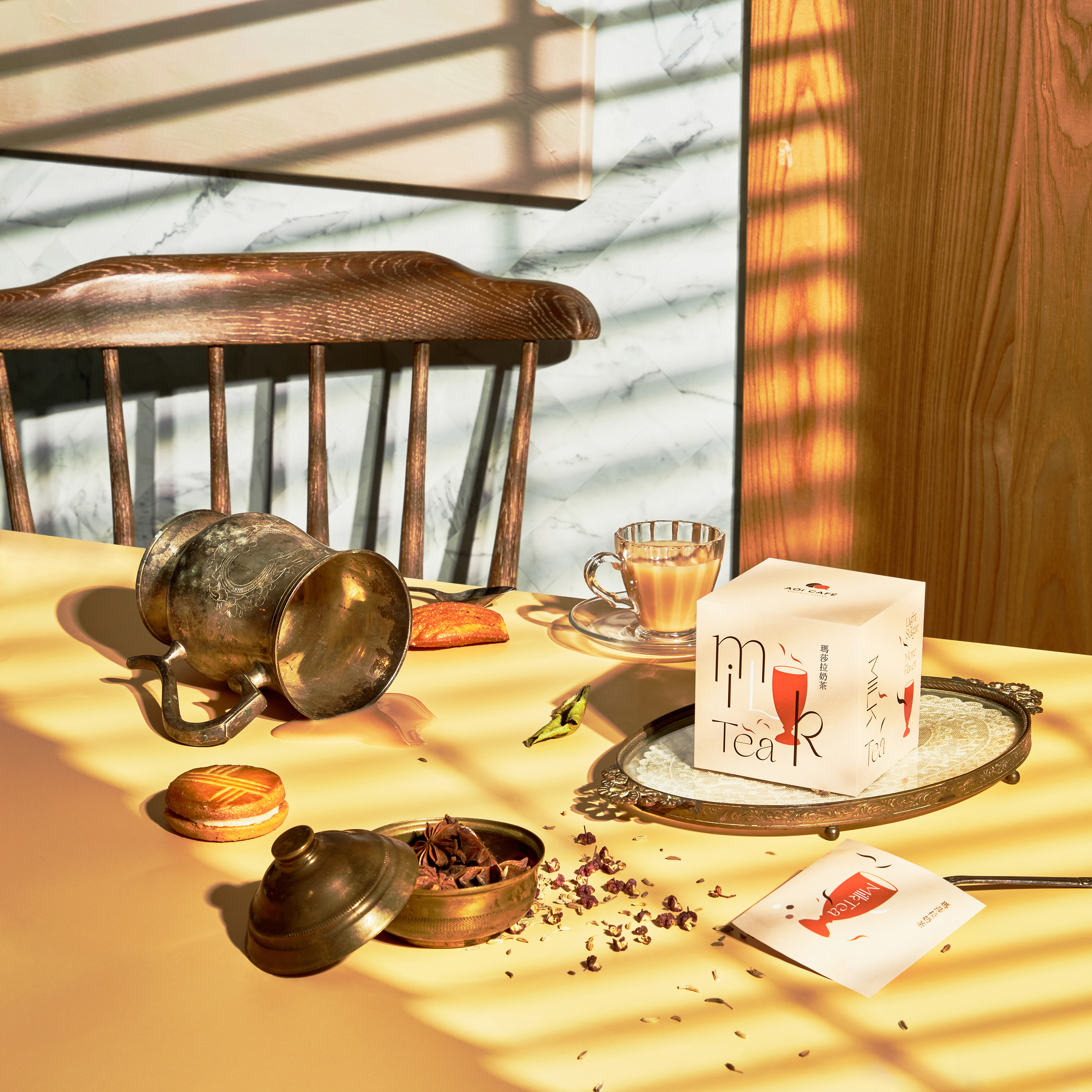
葵咖啡前身為來自台南東山的傳統咖啡品牌,提供咖啡生豆與相關延伸產品;在新的品牌定位中,我們提出以“純粹、簡單、多樣化”為主軸,重新調整產品定位與生產線並提供五種產品類別。在包裝設計中,將品牌調性中的“多樣化”特點轉化為“個性”並作為包裝主題,以不同杯子形狀代表五種不同的個性人格,象徵每一位使用者都能夠在葵咖啡中找到專屬於自己的產品人格。
Simple to enjoy | easy to taste.
No cumbersome appliances and complex steps, just tear the packaging out of the pace of life.
AOI Coffee, formerly a traditional coffee brand from Dongshan, Tainan, provides green coffee beans and related extension products. In the new brand positioning, we propose to take "pure, simple, diversified" as the main axis, readjust the product positioning and production line and provide five product categories. In the packaging design, the "diversified" characteristics of the brand tonality are transformed into "individuality" as the packaging theme. Different cup shapes represent five different personalities, symbolizing that each user can find their own product personality in sunflower coffee.
客戶 Client|AOI CAFE 葵咖啡
類型 Type|包裝設計 Packaging
設計 Designer|Louis Chiu
藝術指導 Art Director|Louis Chiu
攝影企劃 Photography plan|Louis Chiu
攝影 Photography|WU2 STUDIO