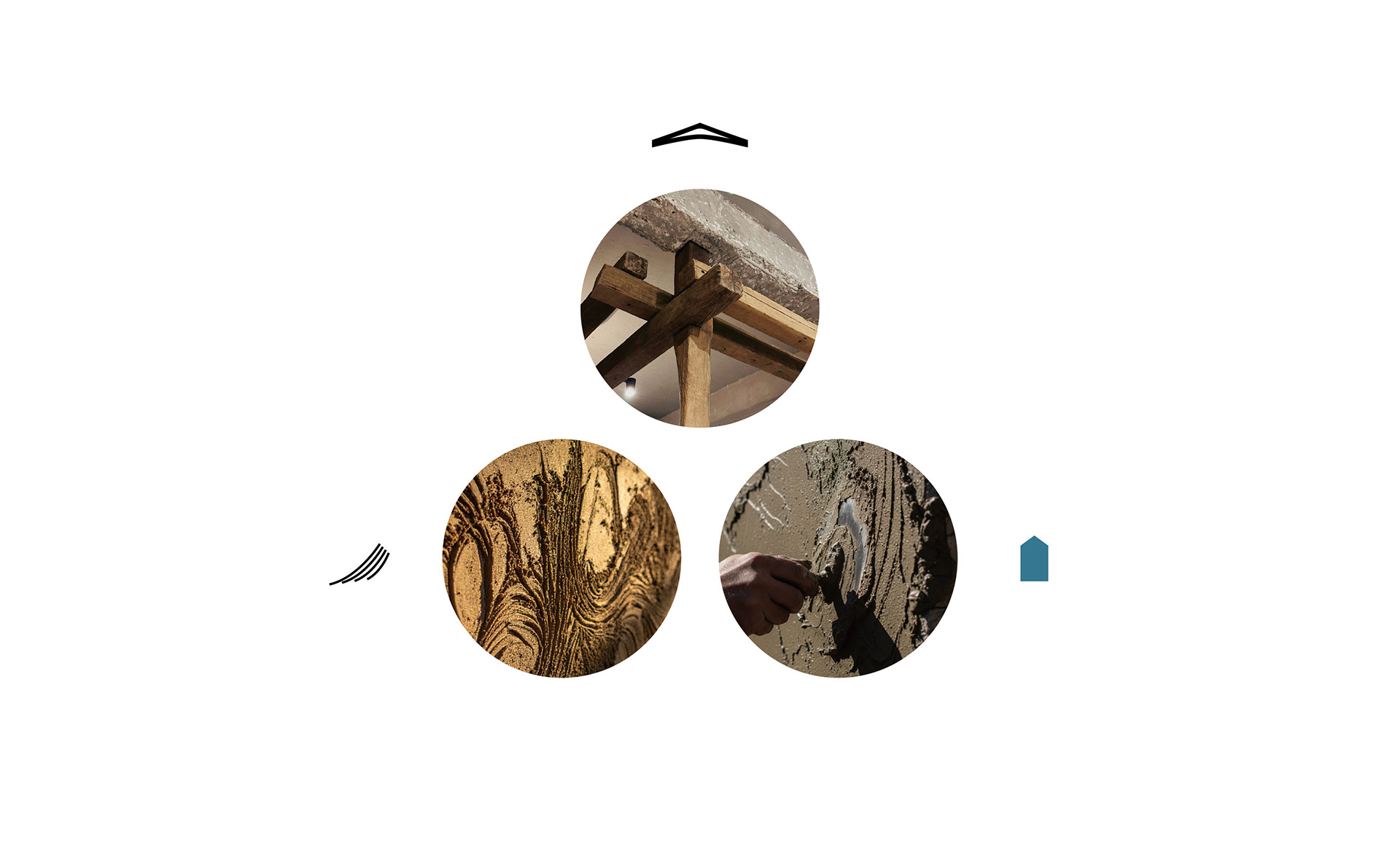
在設計的世界裡,一個標誌不僅是視覺的符號,更是品牌靈魂的縮影。它如同一座隱形的橋樑,連接過去的工藝遺產與未來的創新想像。當我們談到功宇工程行—這家專注於日式左官與古蹟修復的品牌,如一首泥土與石塊譜寫的詩歌,悄然訴說著穩固的根基與溫暖的家園。
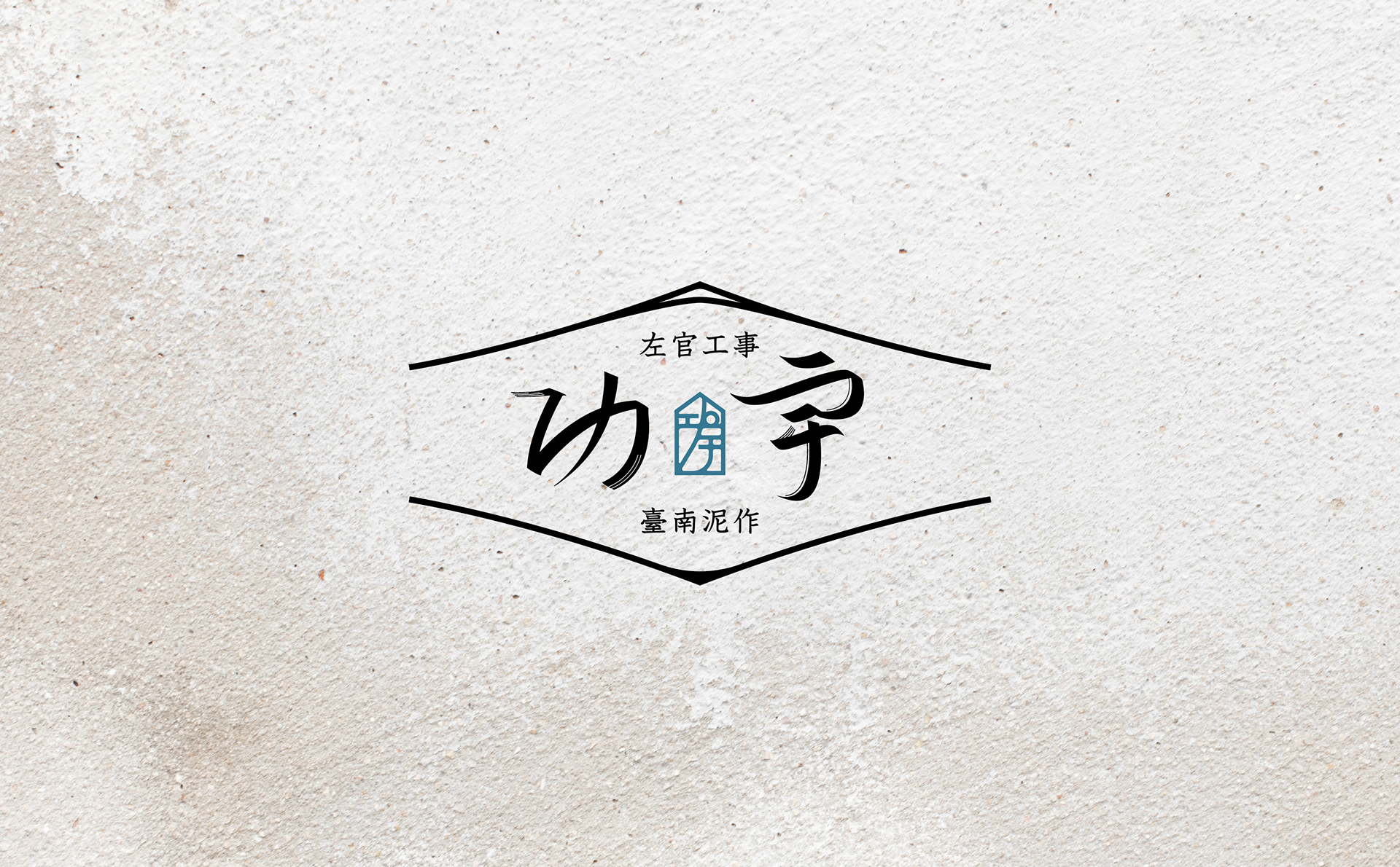
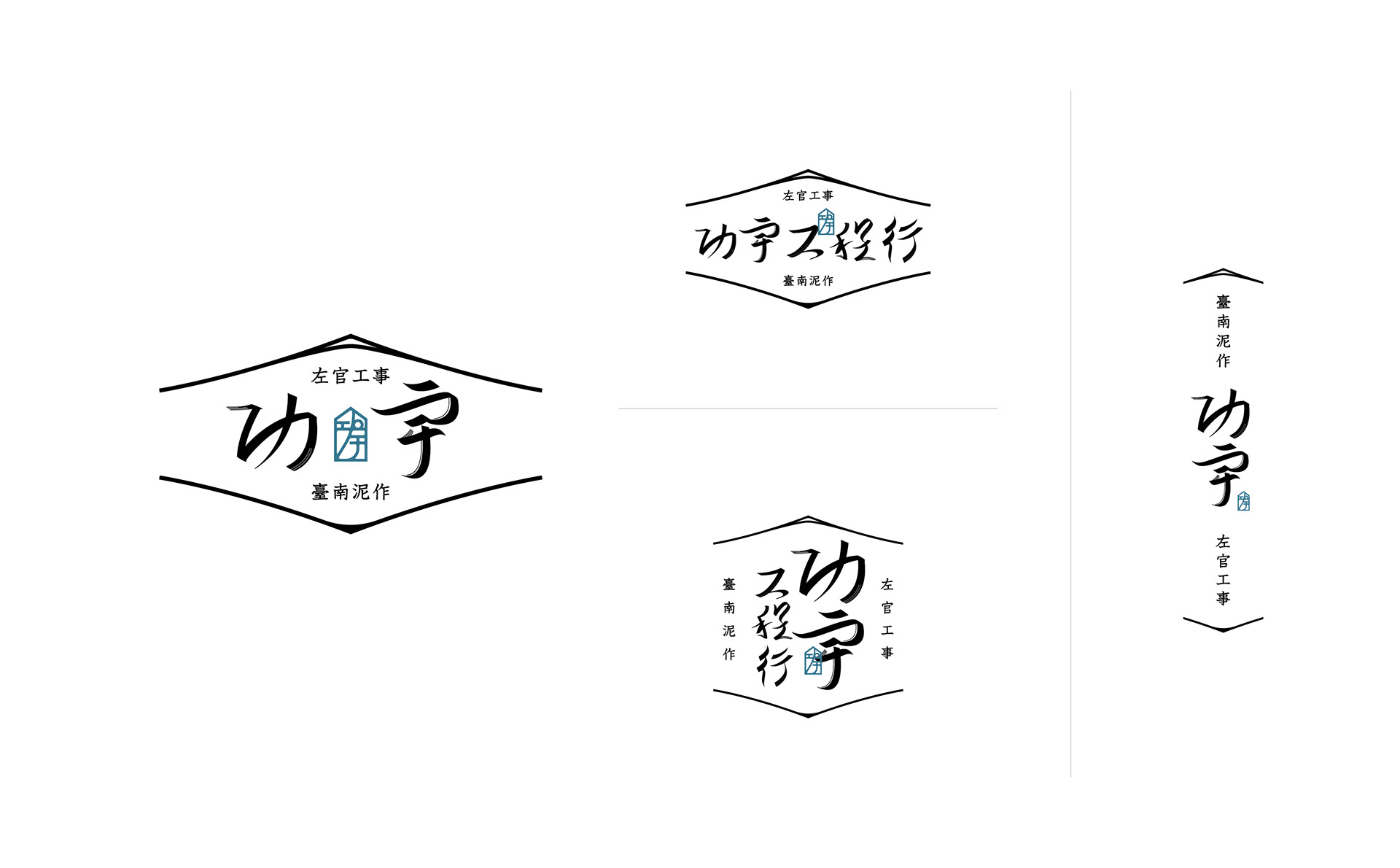
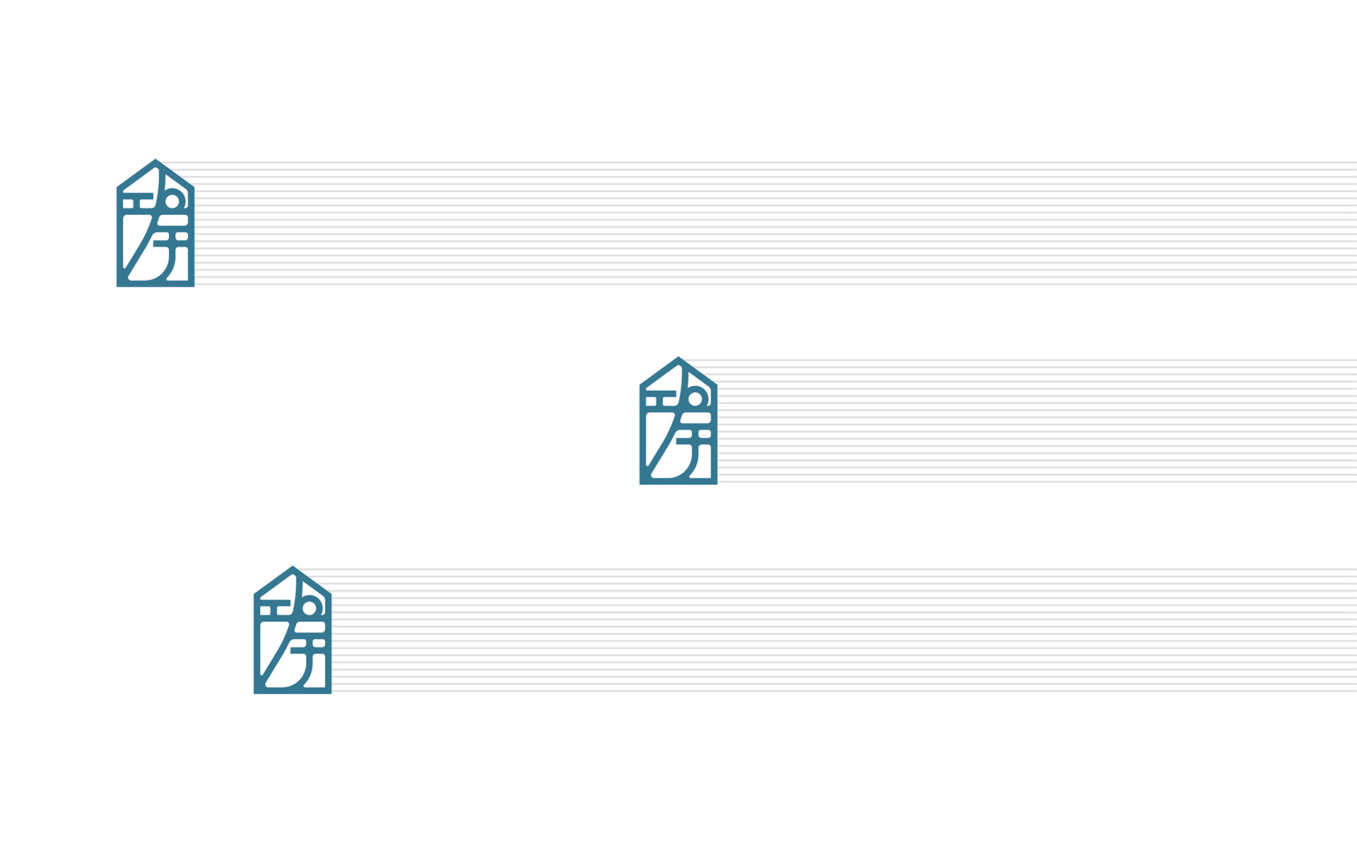
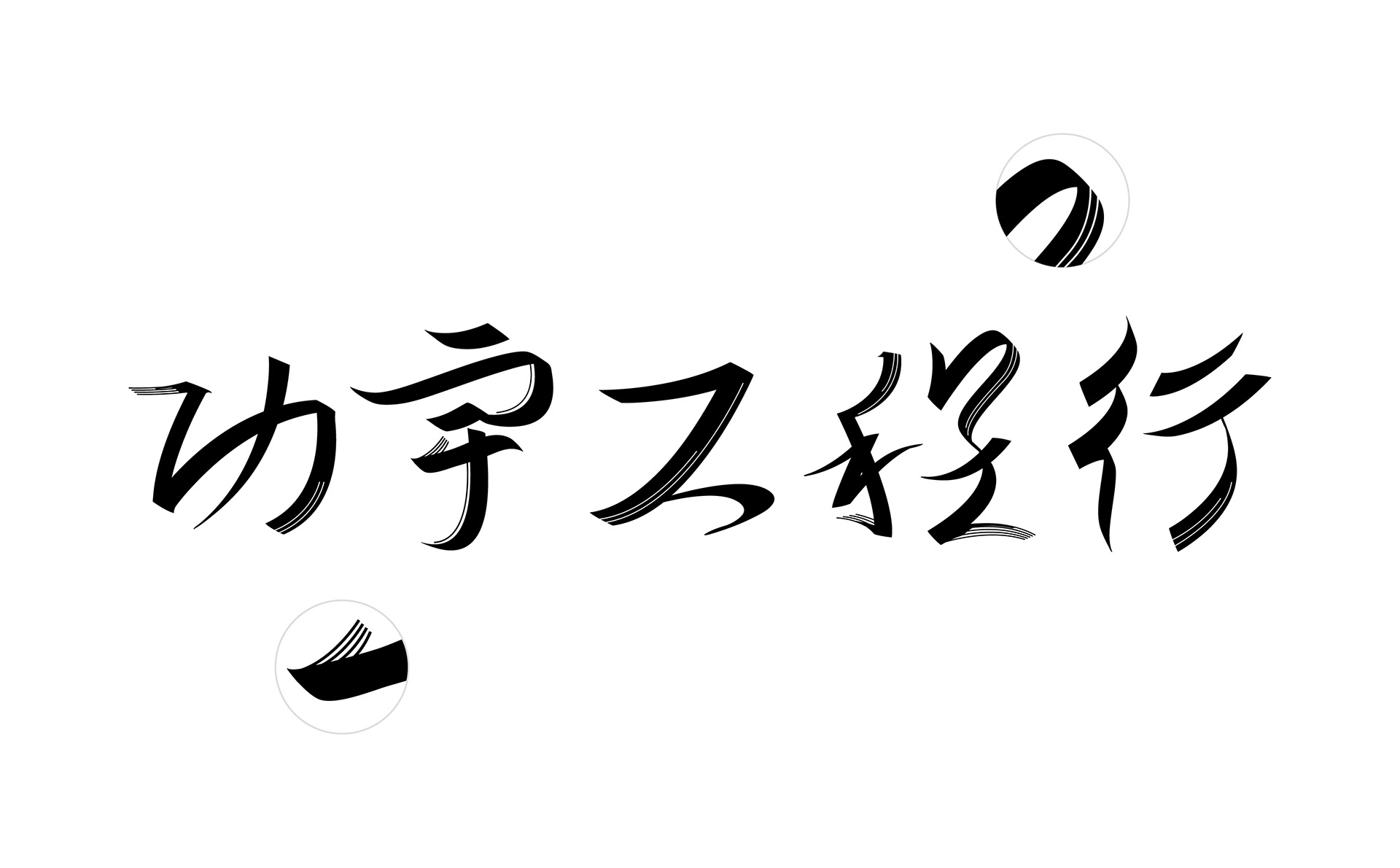
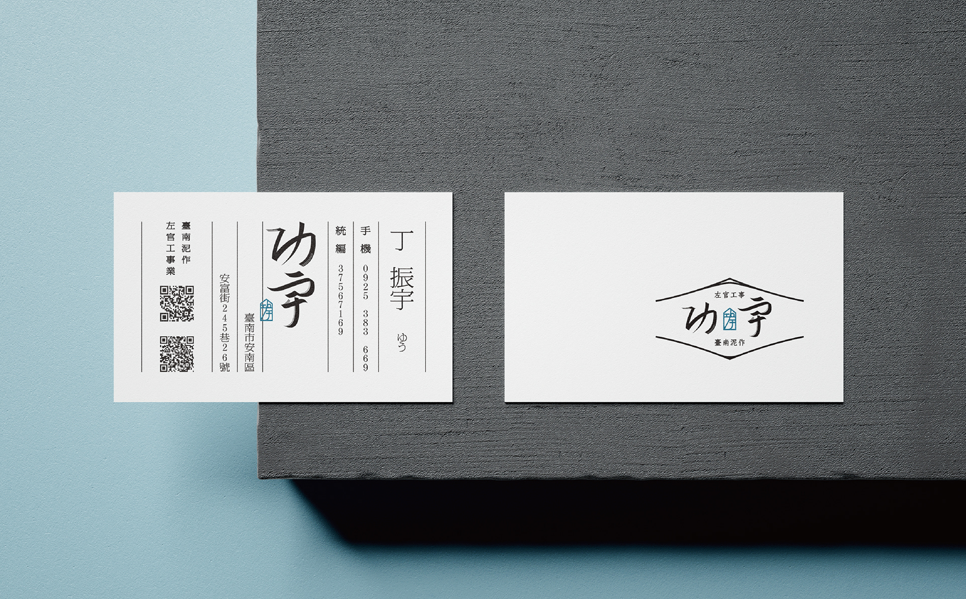
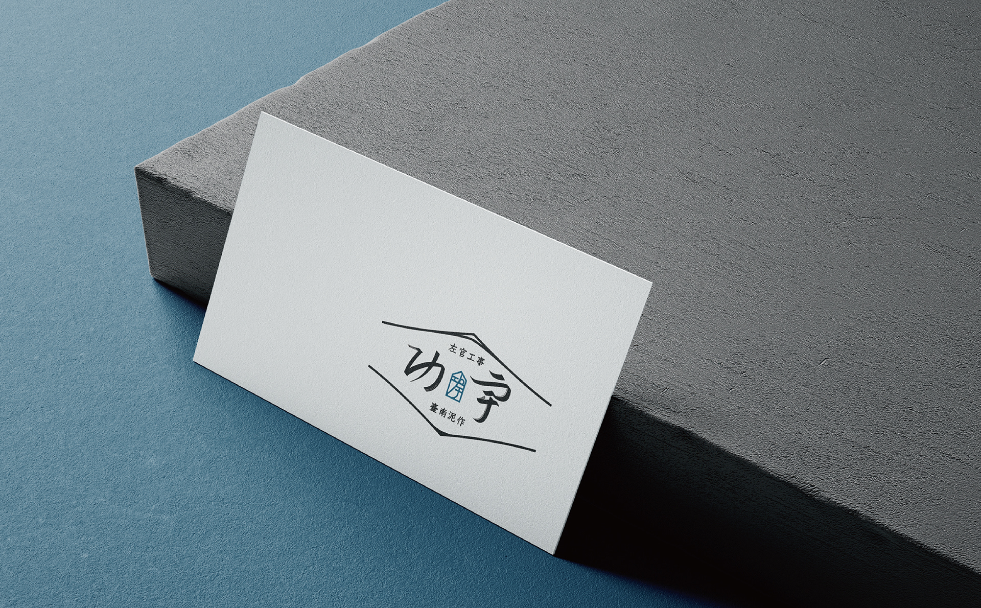
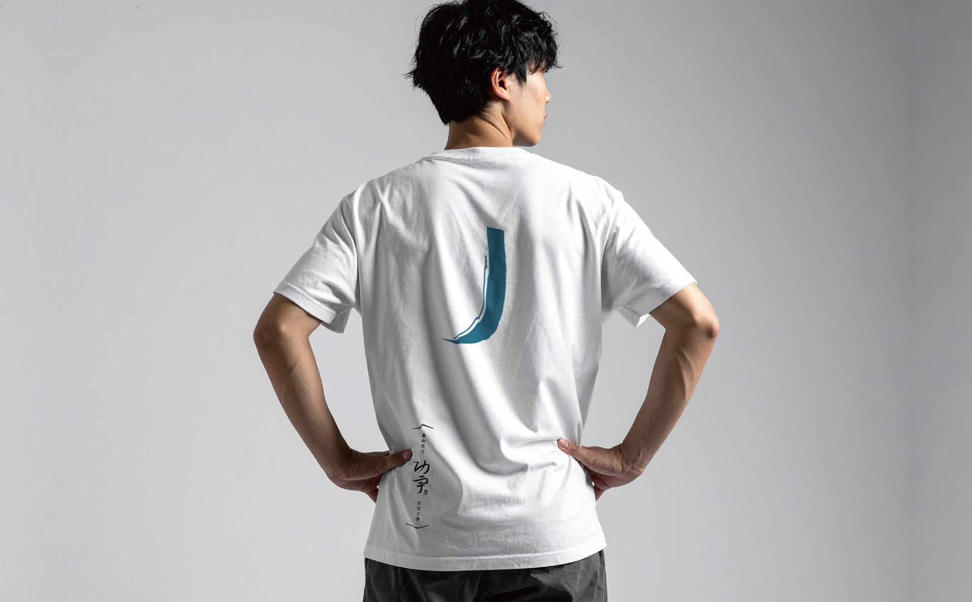
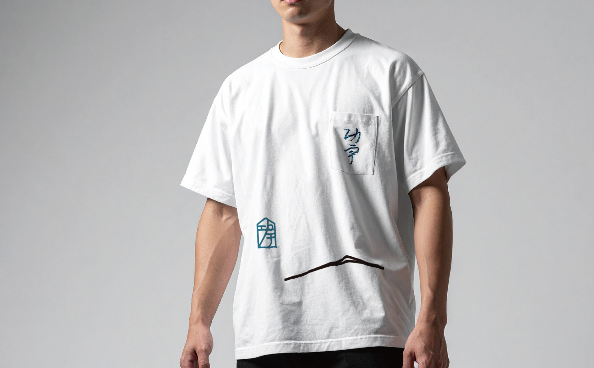
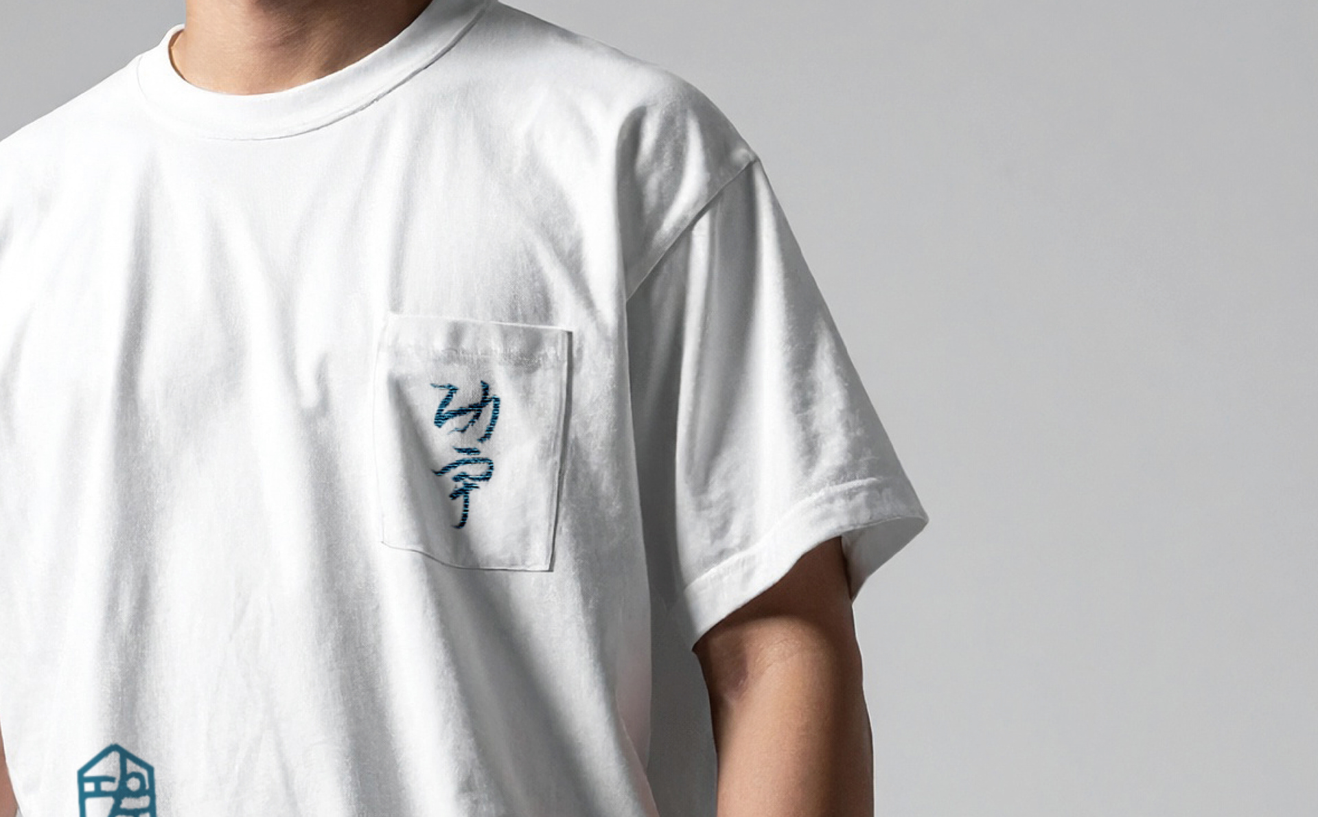
標誌以「功宇」二字為主體,融入泥作工程中的獨特紋樣與俐落筆畫。「功」字的豎鉤如拱頂,挺拔有力,展現專業成就;「宇」字筆畫開闊延展如拱形,寓意空間與包容。 字體簡潔流暢,如隨手創作灑脫不羈。點綴一方小圖章,造型取自泥作中的鏝刀,如職人作品的落款,象徵匠心與獨一無二的印記。
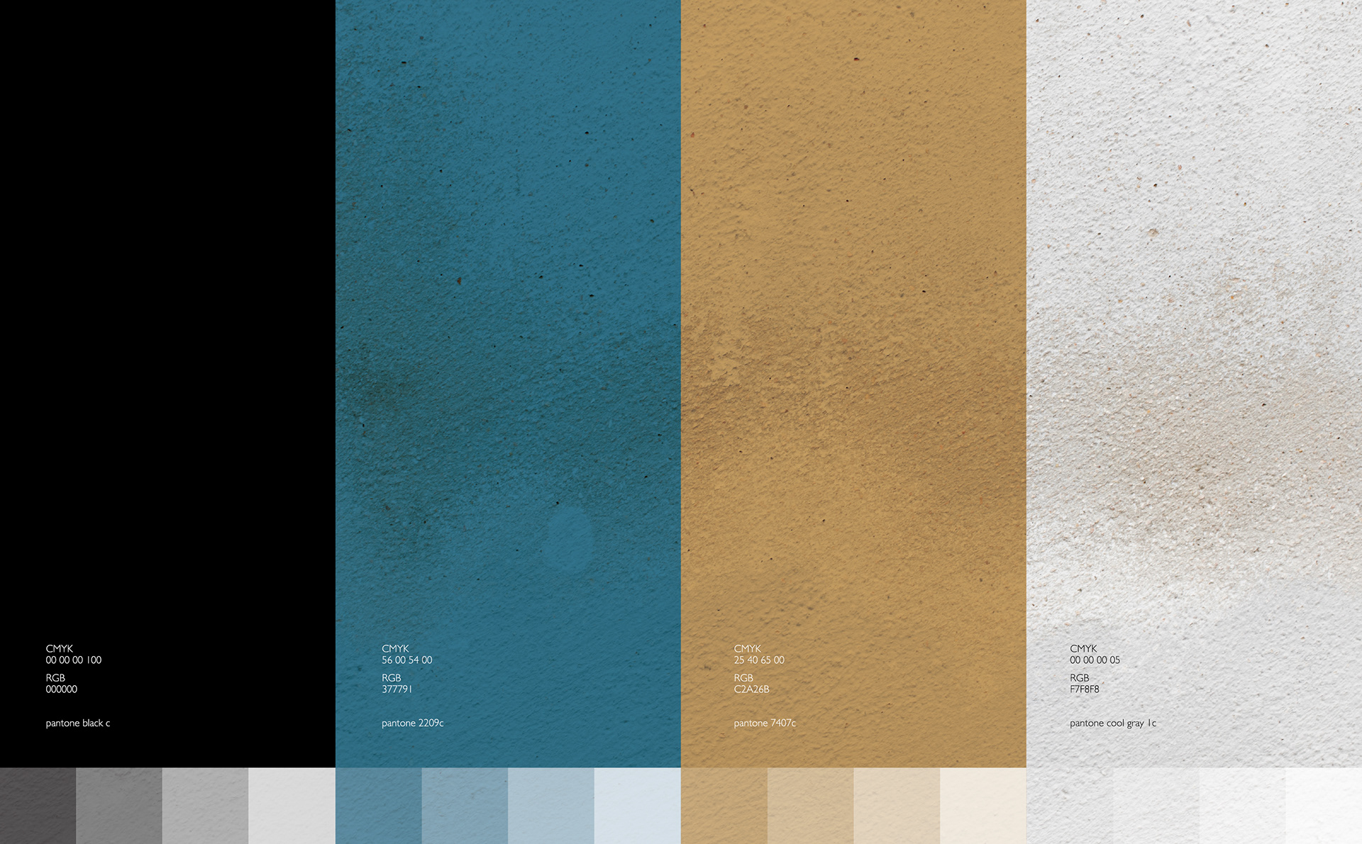
色調選用黑色與天青色,前者沉穩厚重,後者清新靈動,彷彿泥土與天空的對話,傳遞品牌的質樸與生命力。這款標誌不僅是視覺符號,更是功宇對工藝與家園承諾的縮影,以拱形與鏝刀,守護每一個溫暖的角落。
The Poetry of Craftsmanship
In the realm of design, a logo is more than a visual symbol—it is the embodiment of a brand’s soul. It serves as an invisible bridge, connecting the heritage of traditional craftsmanship with the imagination of future innovation. When we speak of Kung Yu Engineering—a brand dedicated to Japanese trowel plastering and heritage restoration—it is like a poem woven from earth and stone, quietly narrating the essence of steadfast foundations and the warmth of home.
The logo centers on the Chinese characters for “Kung Yu,” infused with the unique textures of plastering and crisp, elegant strokes. The vertical hook of “Kung” rises like an arch’s apex, resolute and strong, symbolizing professional achievement. The expansive strokes of “Yu” stretch like an arch, evoking space and inclusivity. The typeface is sleek yet fluid, exuding a carefree, natural grace. A small seal, shaped like the trowel used in plastering, adorns the design—a nod to the artisan’s signature, embodying craftsmanship and individuality.
The color palette marries black and celadon blue: the former grounded and profound, the latter fresh and vibrant, as if earth and sky were in dialogue, conveying the brand’s simplicity and vitality. This logo is not merely a visual mark but a reflection of Kung Yu’s commitment to craft and home, safeguarding every warm corner with the arch and the trowel.
デザインの世界において、ロゴは単なる視覚的シンボルではなく、ブランドの魂の象徴です。それは、過去の職人技の遺産と未来の革新的な想像をつなぐ、目に見えない橋のような存在です。日式左官と古蹟修復に特化した功宇工程行は、土と石で紡がれた詩のように、堅固な基盤と温かな家庭を静かに物語ります。
ロゴは「功宇」の二文字を主軸に、泥作工程特有のテクスチャーと流麗な筆致を取り入れています。「功」の縦画はアーチの頂点のように力強くそびえ、プロフェッショナルな成果を象徴。「宇」の広がる筆画はアーチの形状を思わせ、空間と包容力を表現します。フォントは簡潔で流れるような美しさを持ち、自由で奔放な創作の精神を漂わせます。右下には、泥作に用いる鏝(こて)を模した小さな印章が配され、職人の落款のように、匠の心と唯一無二の個性を象徴します。
色調は黒と天青色を採用。黒は重厚で落ち着いた印象を与え、天青色は清新で生き生きとした雰囲気を添えます。まるで土と空の対話のように、ブランドの素朴さと生命力を伝えています。このロゴは視覚的シンボルを超え、功宇の職人技と家庭への約束を凝縮したもの。アーチと鏝を通じて、あらゆる温かな場所を守ります。

專案類型 Type | Identity 識別
專案年份 Year | 2025
客戶 Client|功宇工程行
製作單位 Production | AAOO Studio