
Branding|李爸辣醬
Father Lee's
Father Lee's
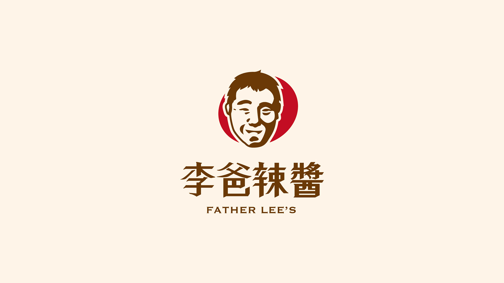
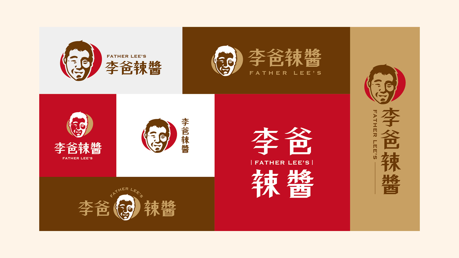
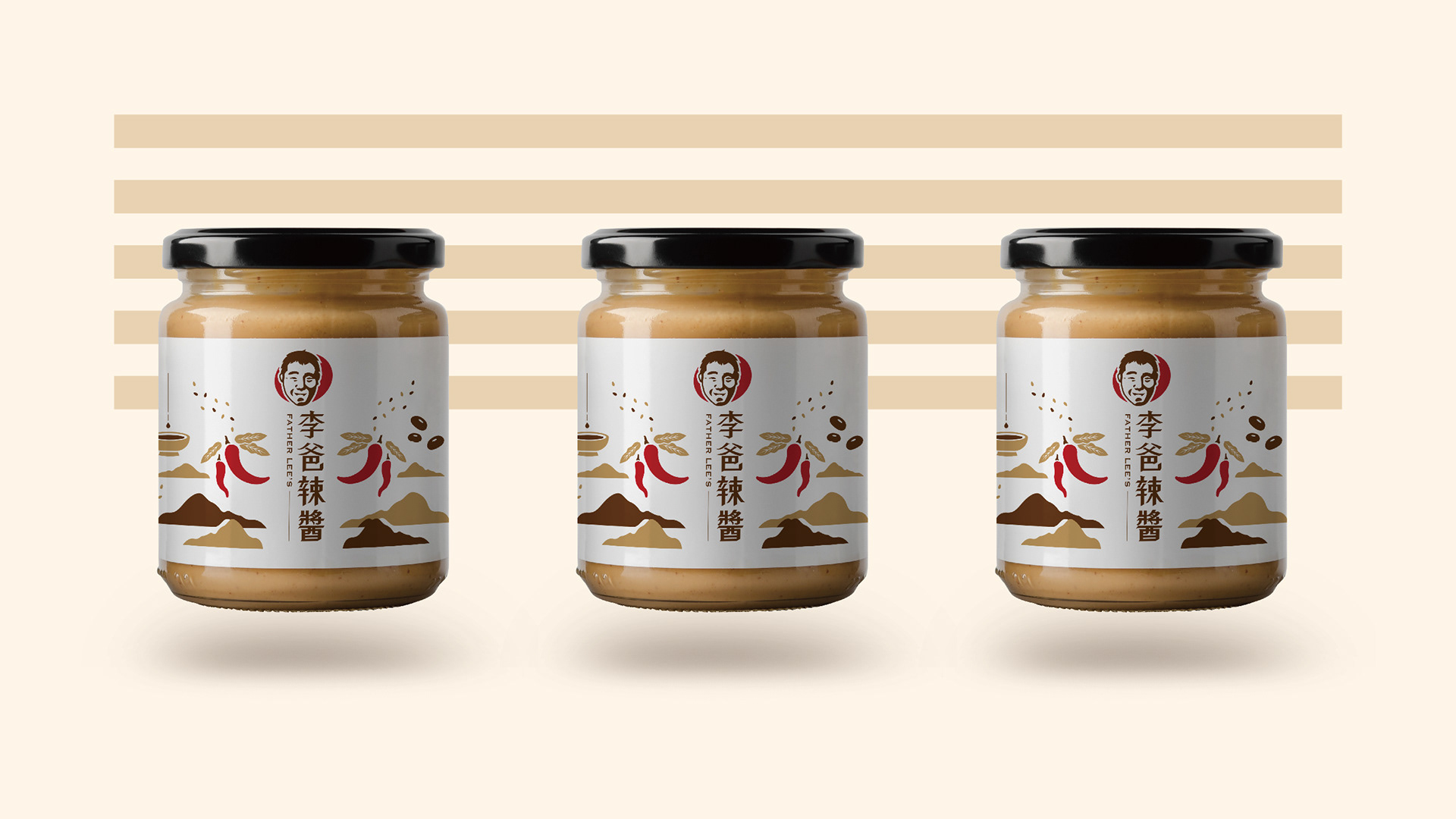
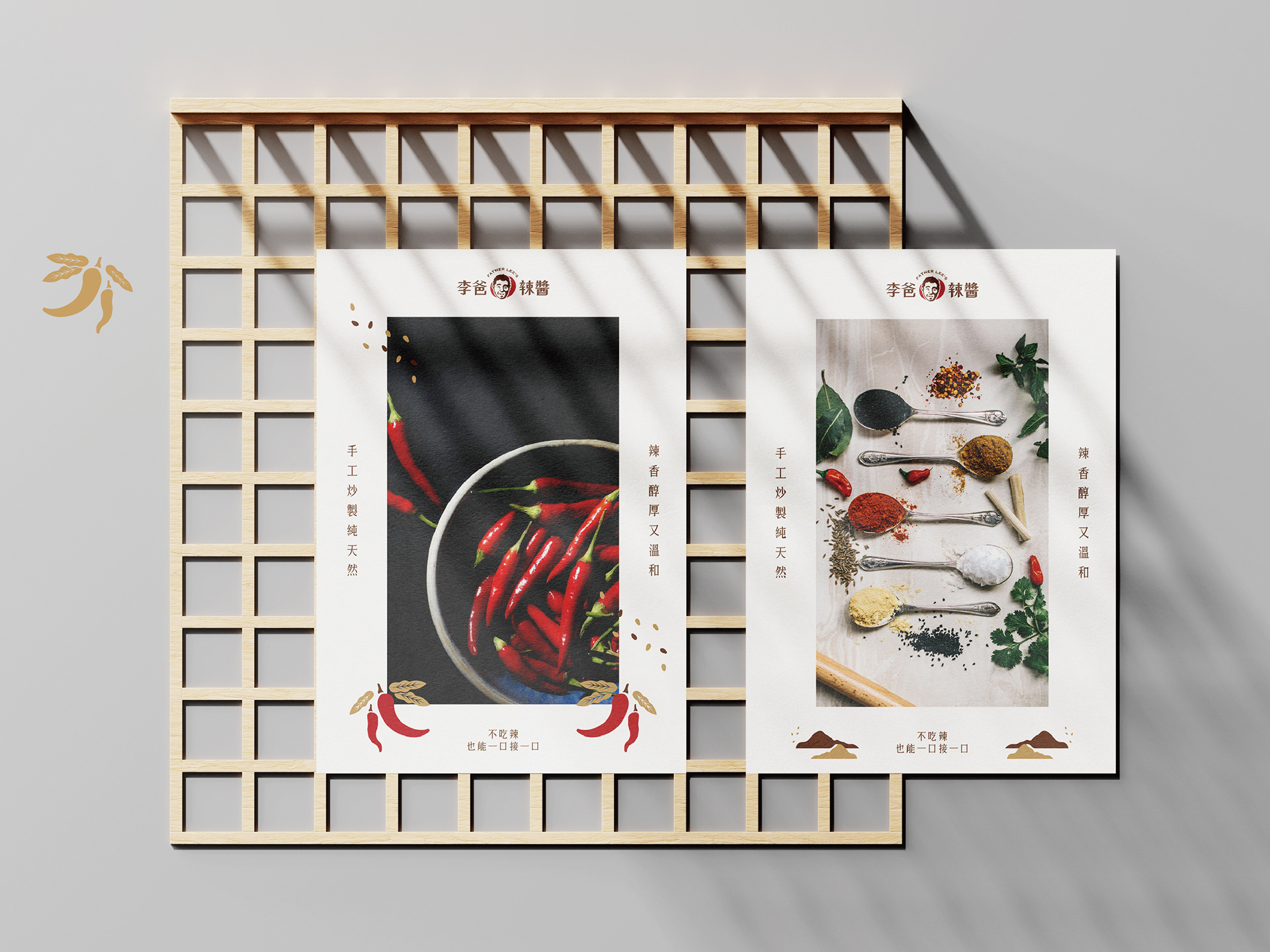
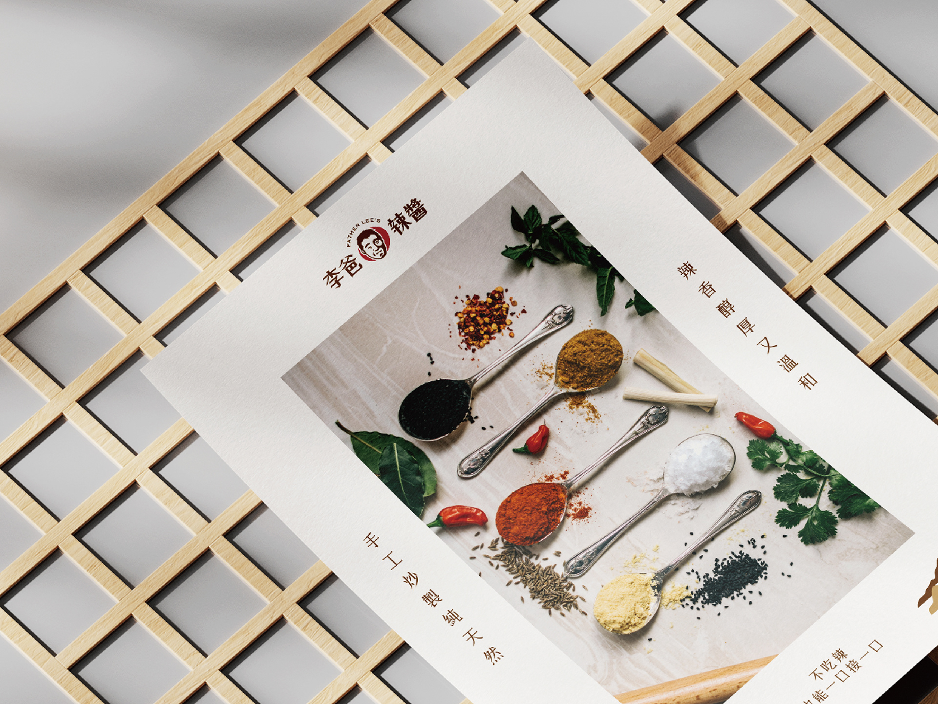
講求純手工、不造作的李爸辣醬,以人物肖像做為品牌識別,強調企業精神中誠實、自然以及專注的經營理念。在色彩運用中使用了正紅、淺金、深褐色等,代表產品中精緻以及堅持傳統手工的職人精神。
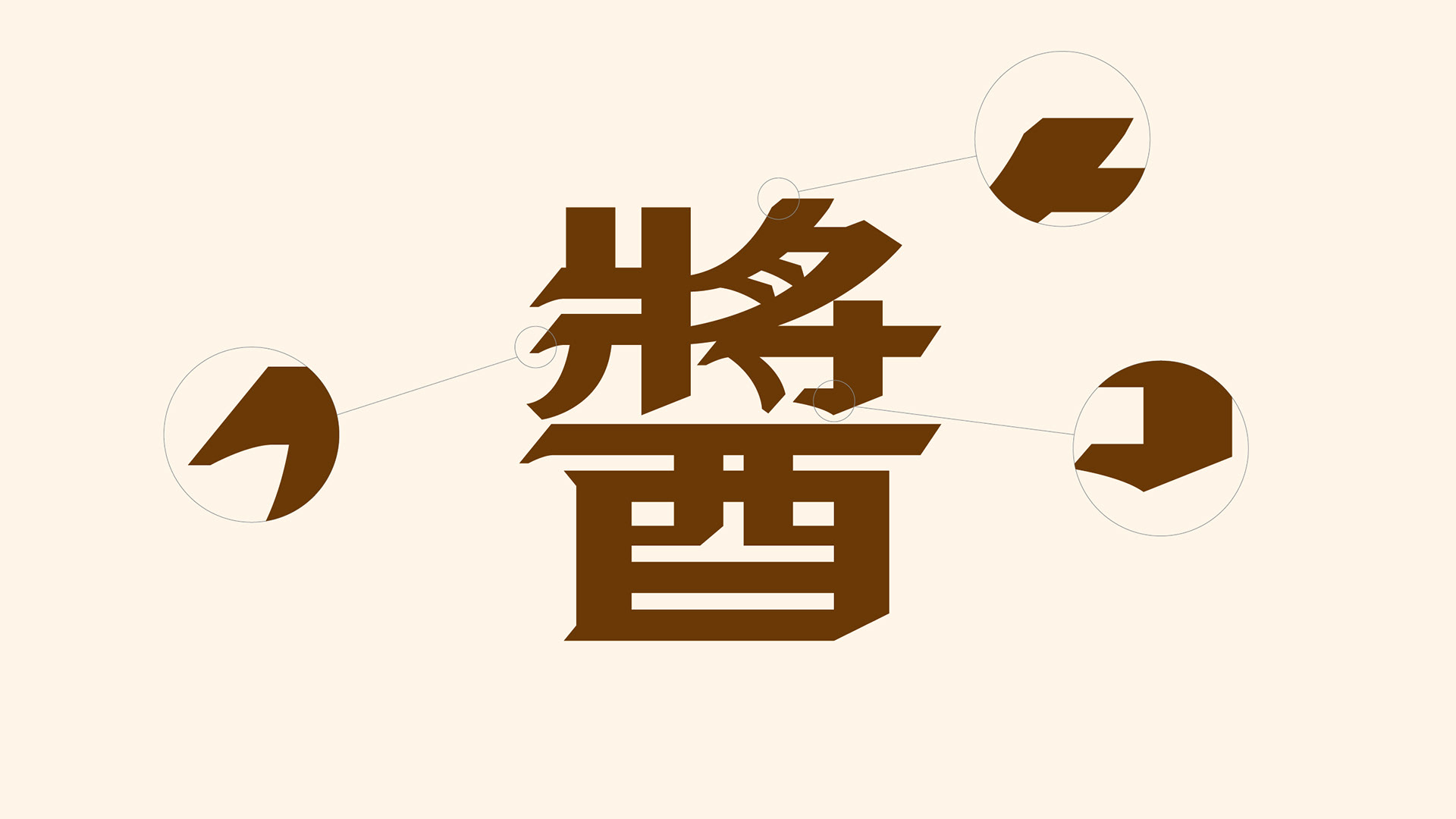
標準字設計在筆畫起首都採用了仿古的轉筆設計,除歷史之外也代表著產品中包含辣味的意象,呈現較為剛硬的表現形式。
標準字設計在筆畫起首都採用了仿古的轉筆設計,除歷史之外也代表著產品中包含辣味的意象,呈現較為剛硬的表現形式。
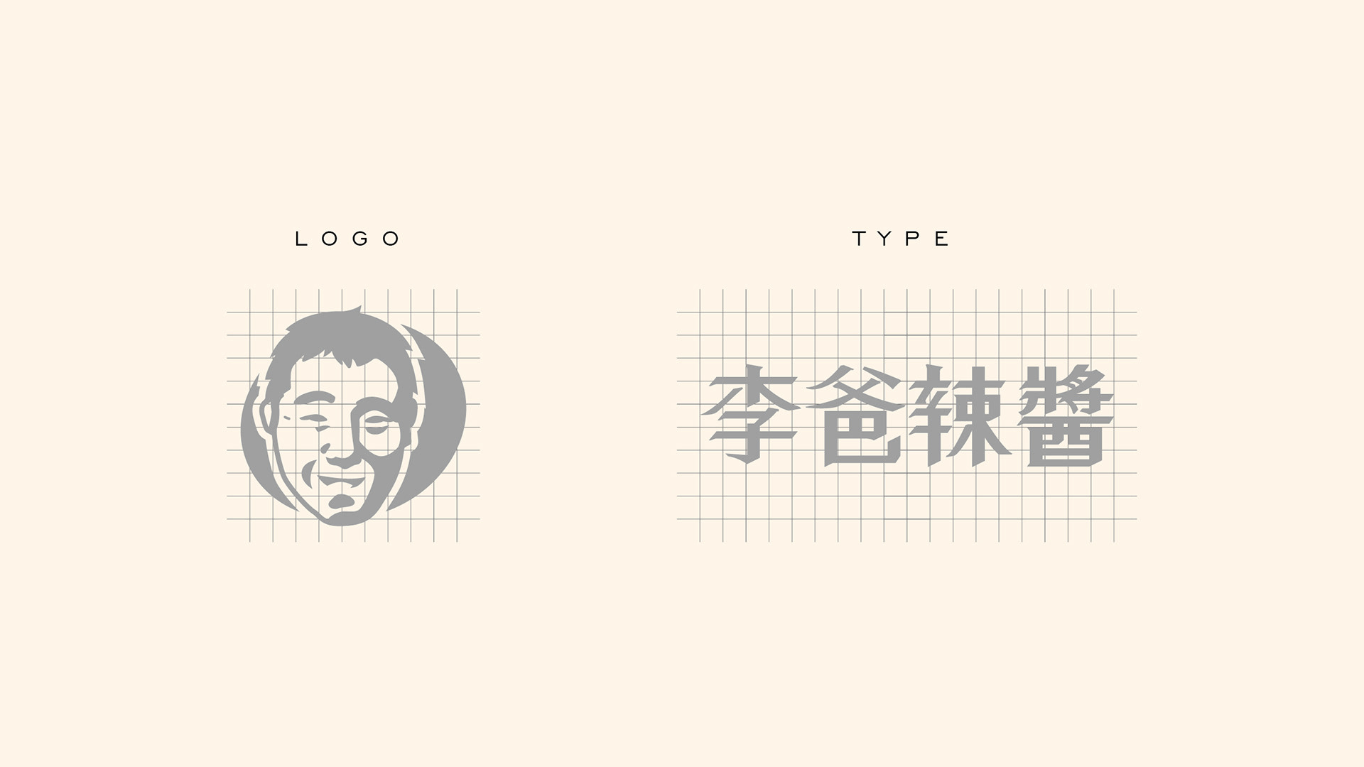
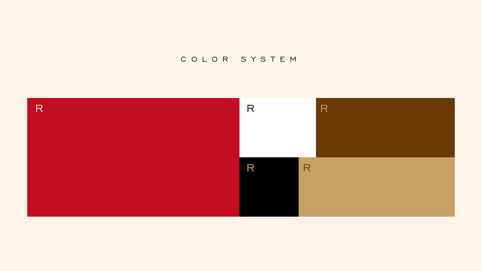
Father Lee's hot sauce is handmade and not artificial. It takes portraits as brand recognition and emphasizes the honest, natural and focused business philosophy in the enterprise spirit. In the use of color, the use of red, light gold, dark brown, etc., on behalf of the product in the delicate and adhere to the traditional manual workers spirit.
The standard character design in the stroke capital USES the archaistic turn pen design, in addition to the history also represents the product contains the spicy image, presents the relatively rigid form of expression.
Client|李爸辣醬
Designer|Louis Chiu
Type|Branding
Designer|Louis Chiu
Type|Branding