
恆芯診所品牌規劃,源自對當代醫療環境的反思與選擇。
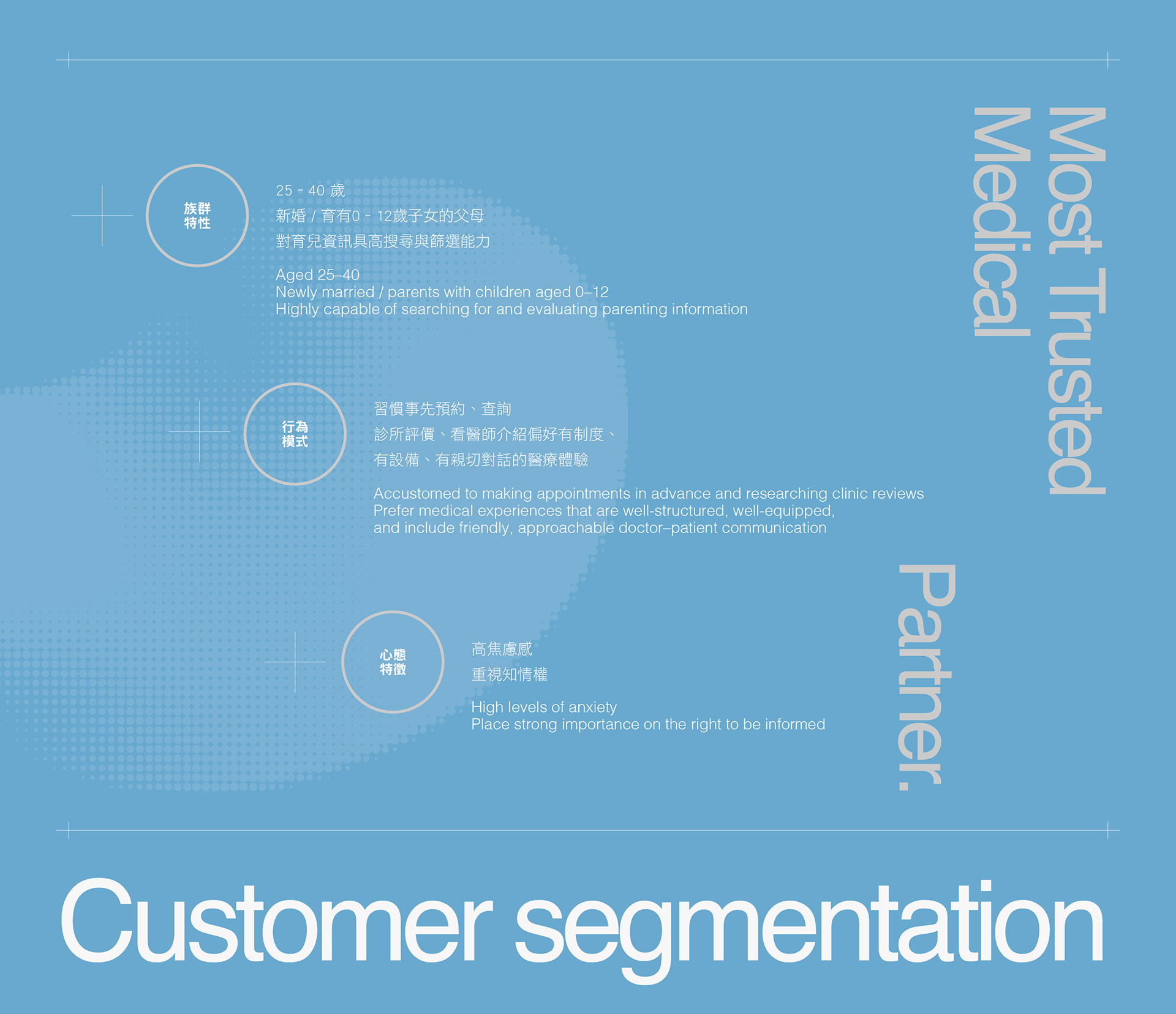
在多數診所以自費療程作為主要溝通與營運導向的市場氛圍中,恆芯明確定位為一間回歸醫療本質的兒童心臟專科診所,以社區小家庭為核心服務對象,聚焦於健保治療的專業深度,並重視家長在醫療過程中「被充分說明、被理解」的需求。
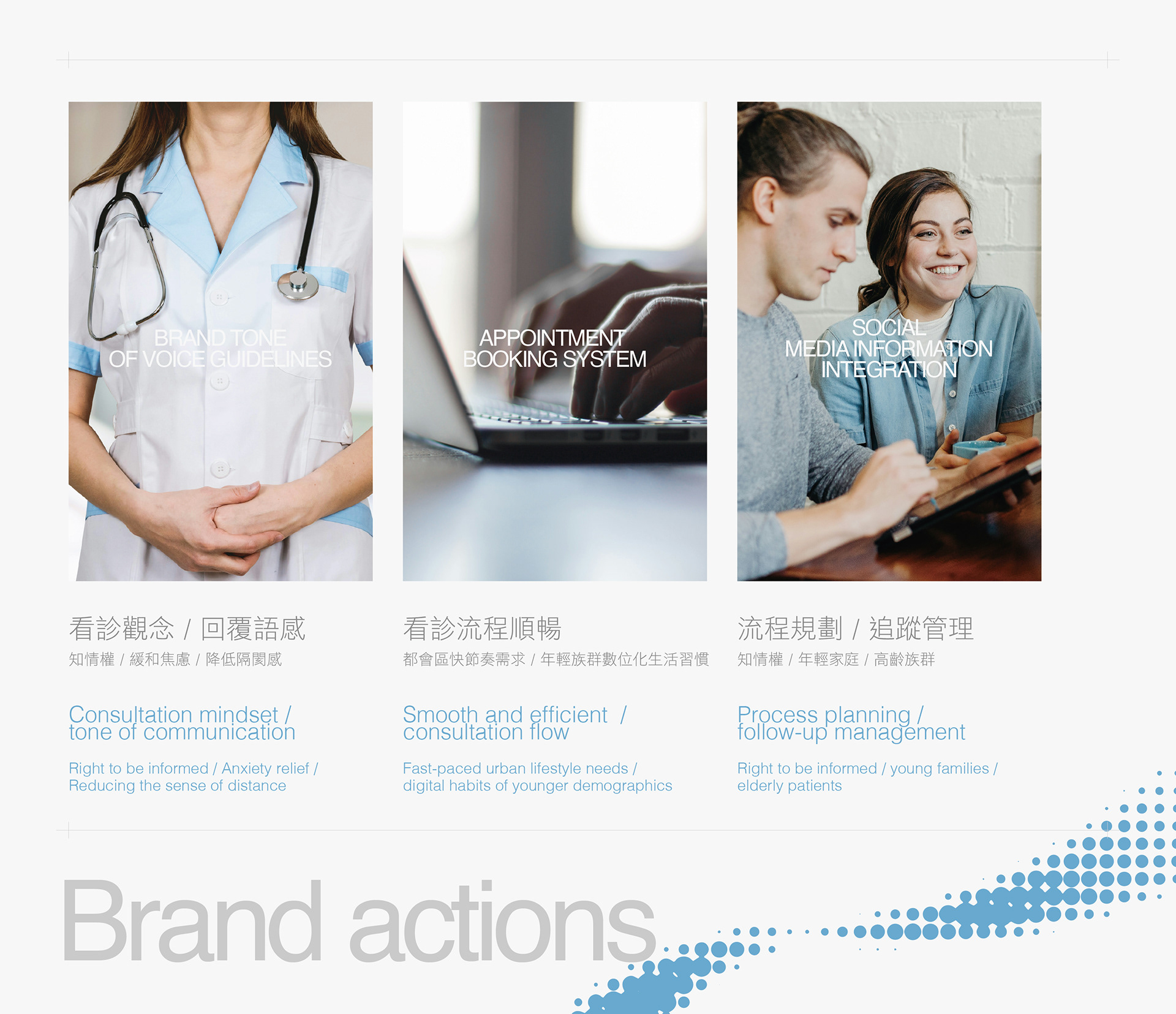
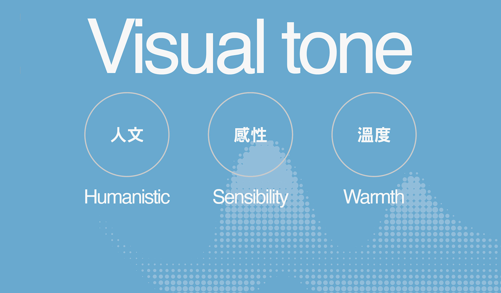
品牌核心被定義為「傾聽與理解」 - 這不僅是醫病溝通的態度,更是恆芯在所有品牌接觸點中的一致原則:
從診間對話、資訊傳遞,到空間與指標的設計語言,皆以降低焦慮、建立信任為最終目標。品牌因此不以誇張的醫療承諾或商業話術作為識別手段,而是透過清晰、穩定且可被理解的設計系統,回應家長對知情權與安全感的期待。
從診間對話、資訊傳遞,到空間與指標的設計語言,皆以降低焦慮、建立信任為最終目標。品牌因此不以誇張的醫療承諾或商業話術作為識別手段,而是透過清晰、穩定且可被理解的設計系統,回應家長對知情權與安全感的期待。
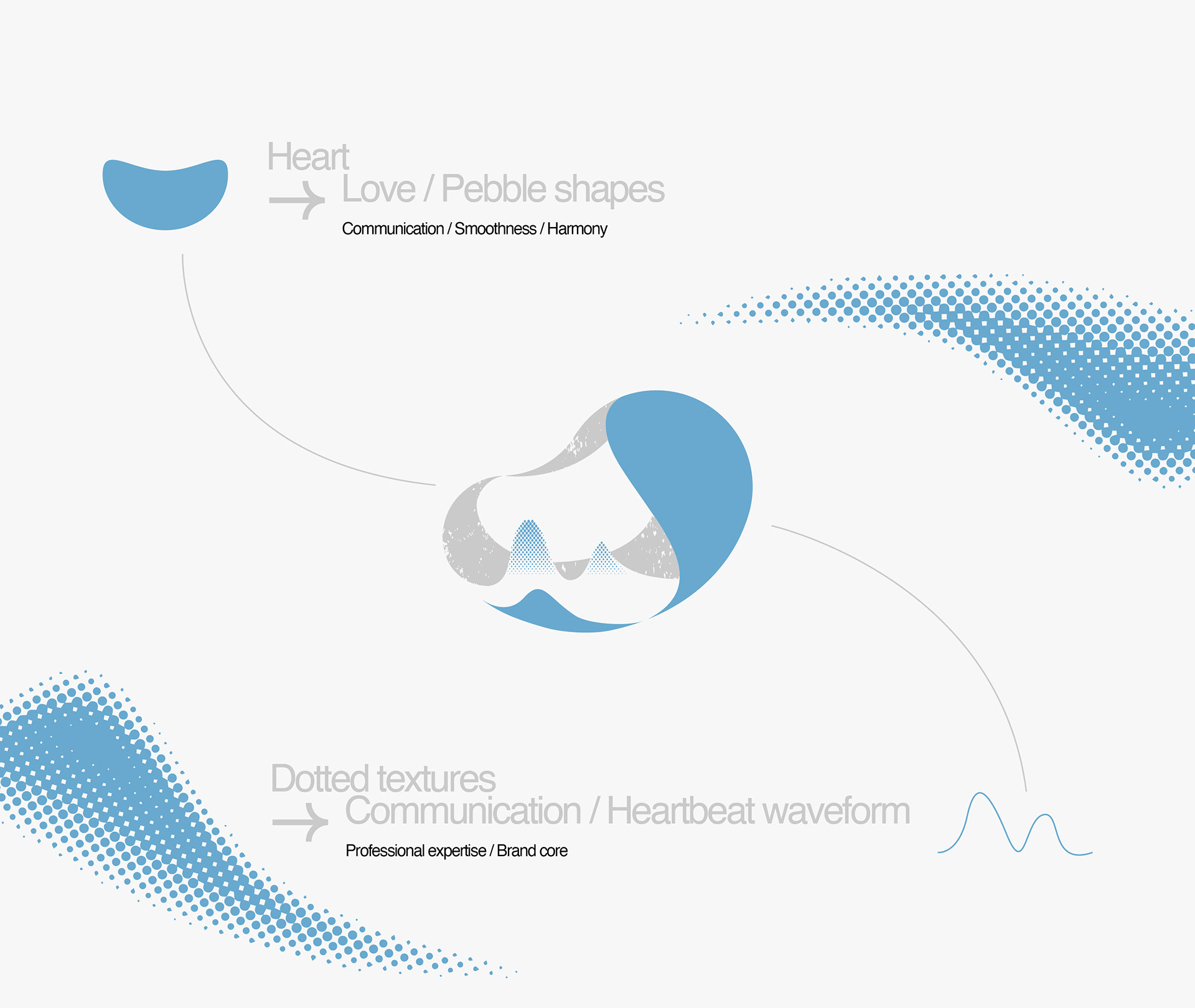
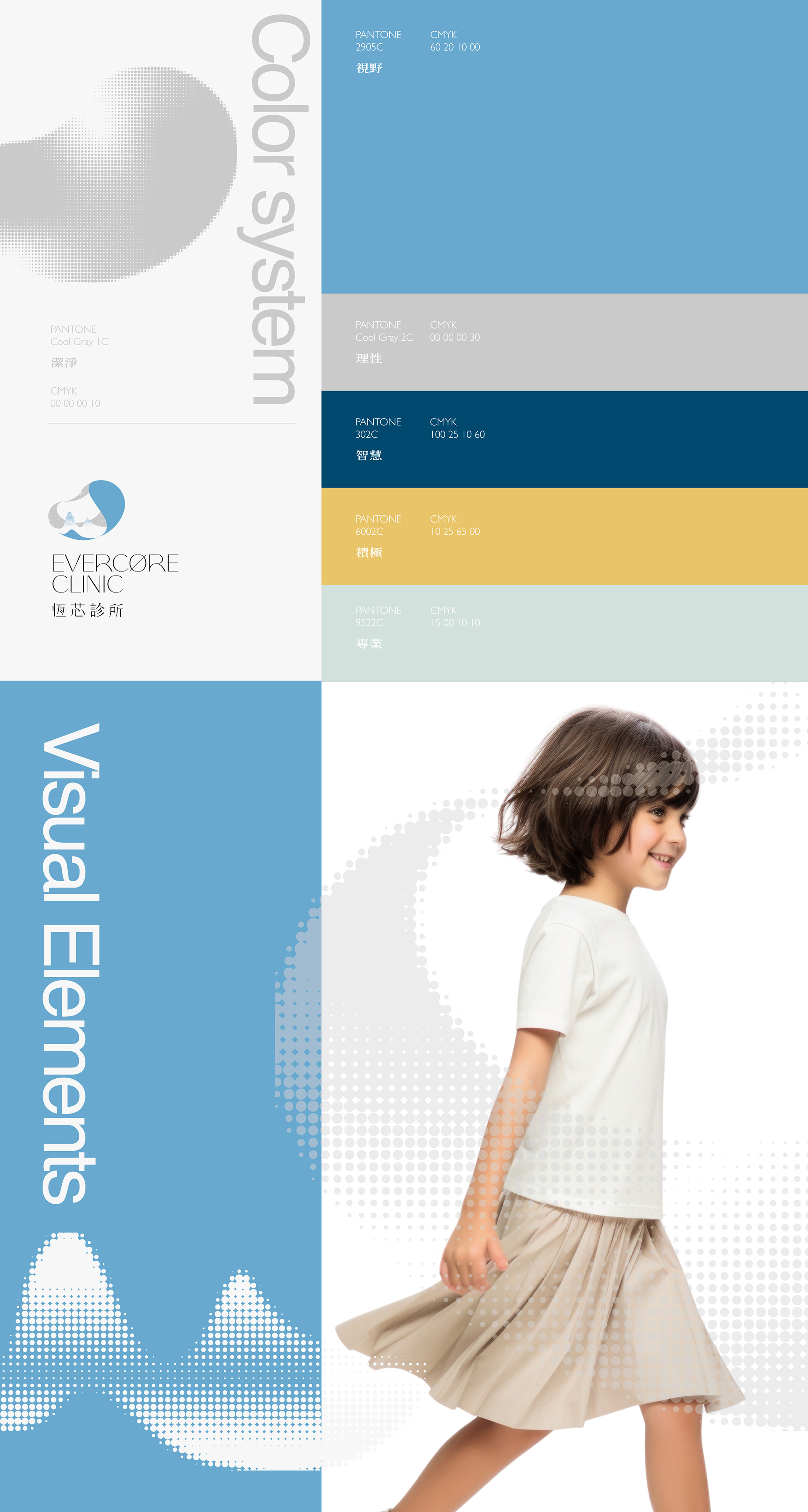
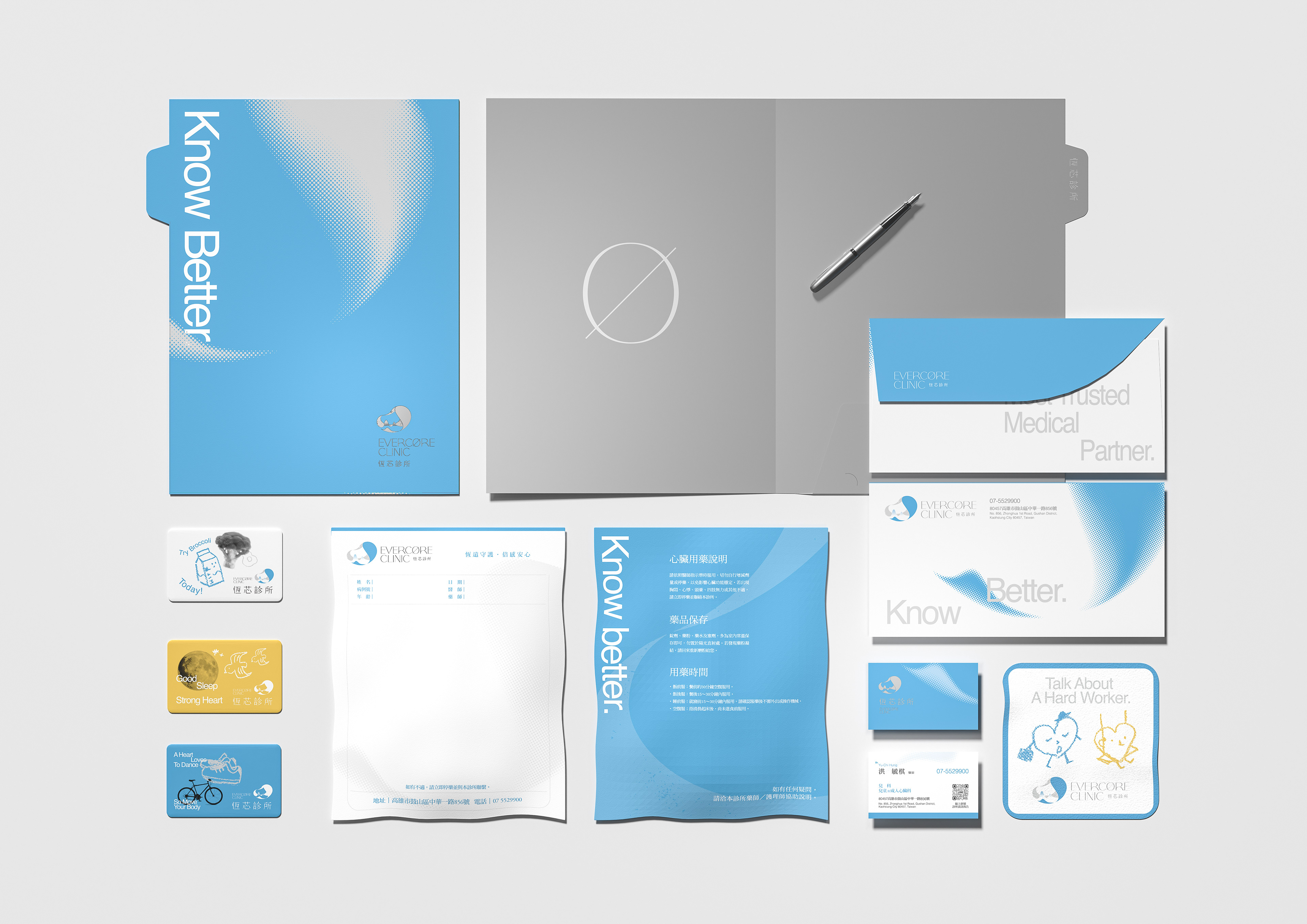
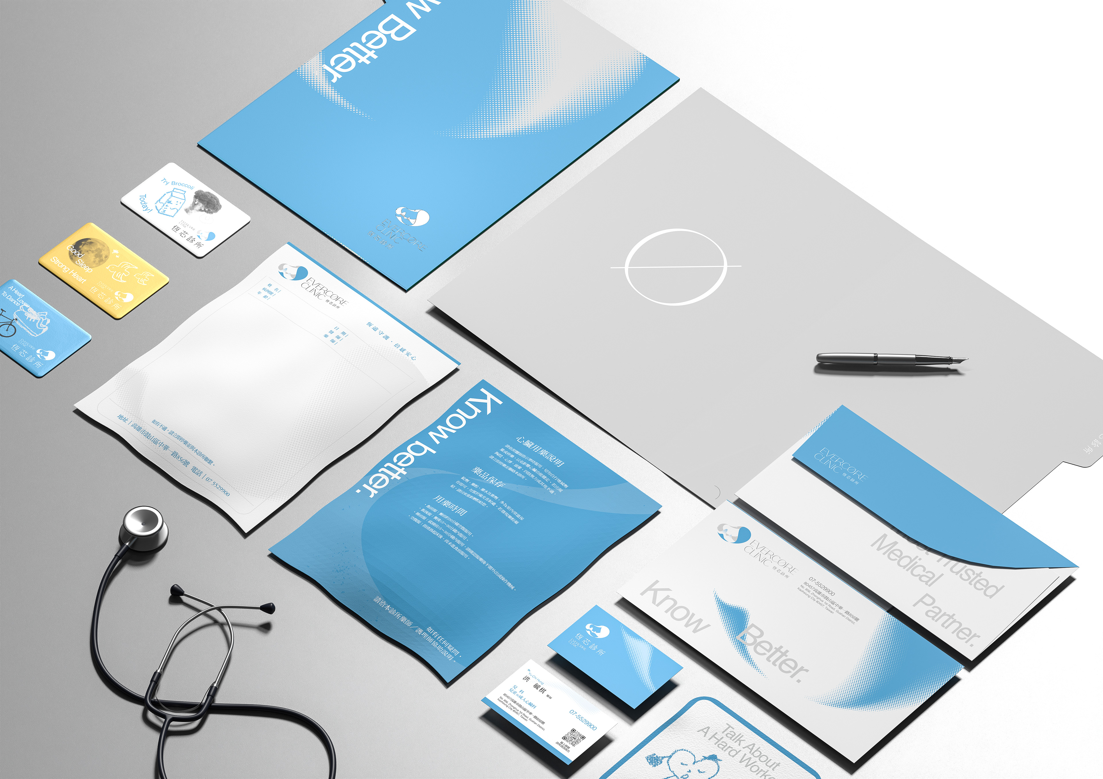
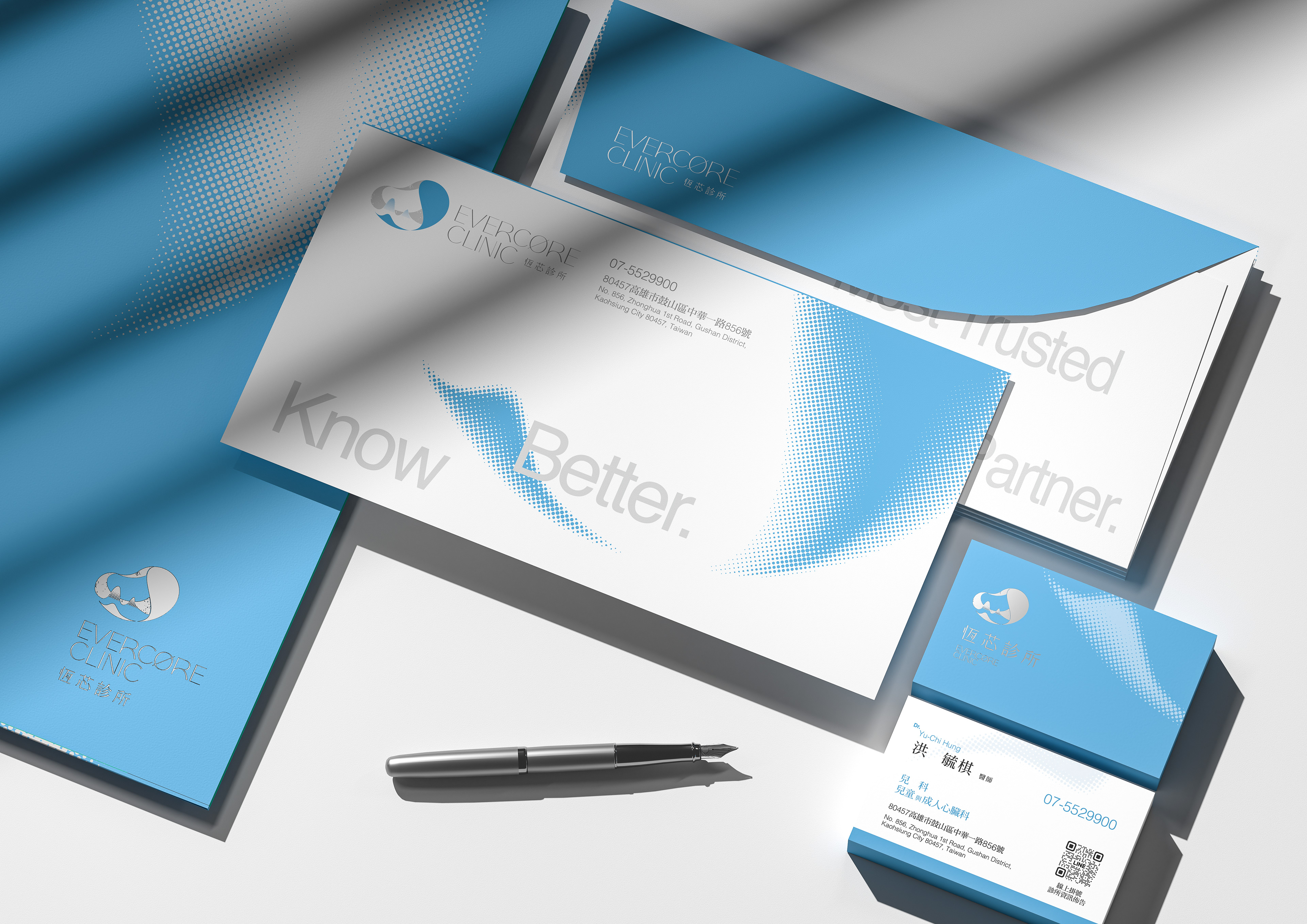
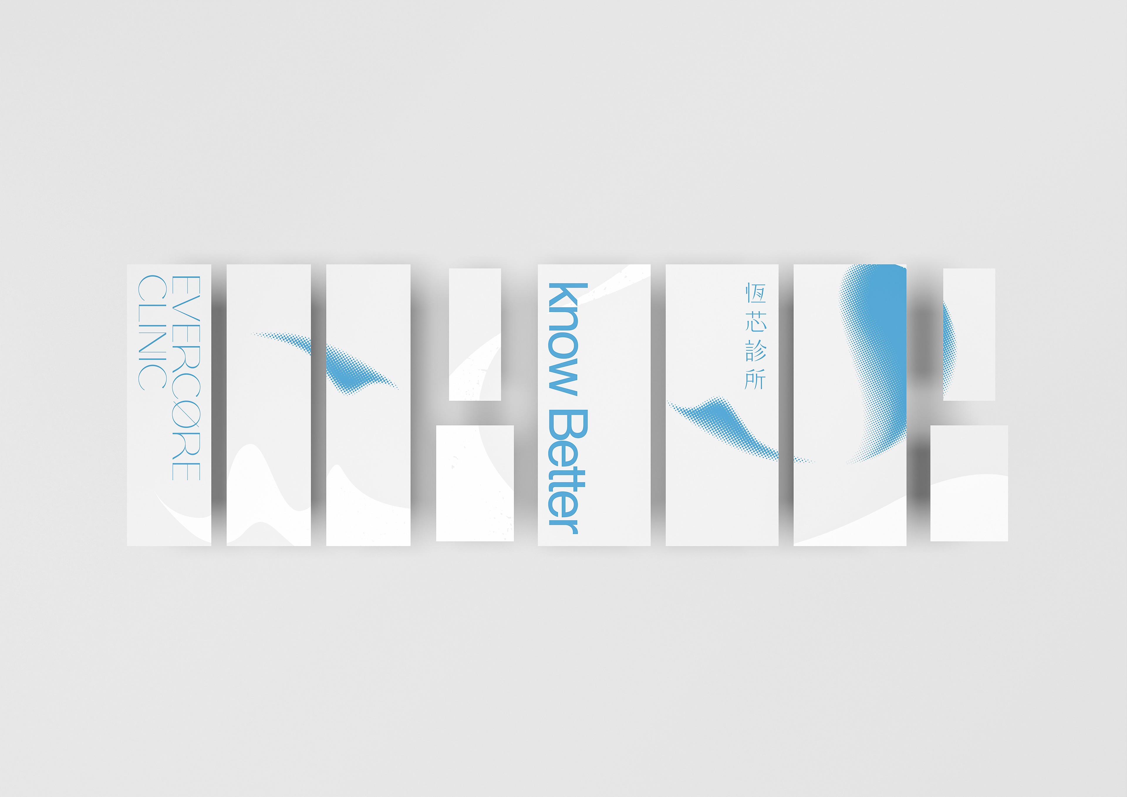
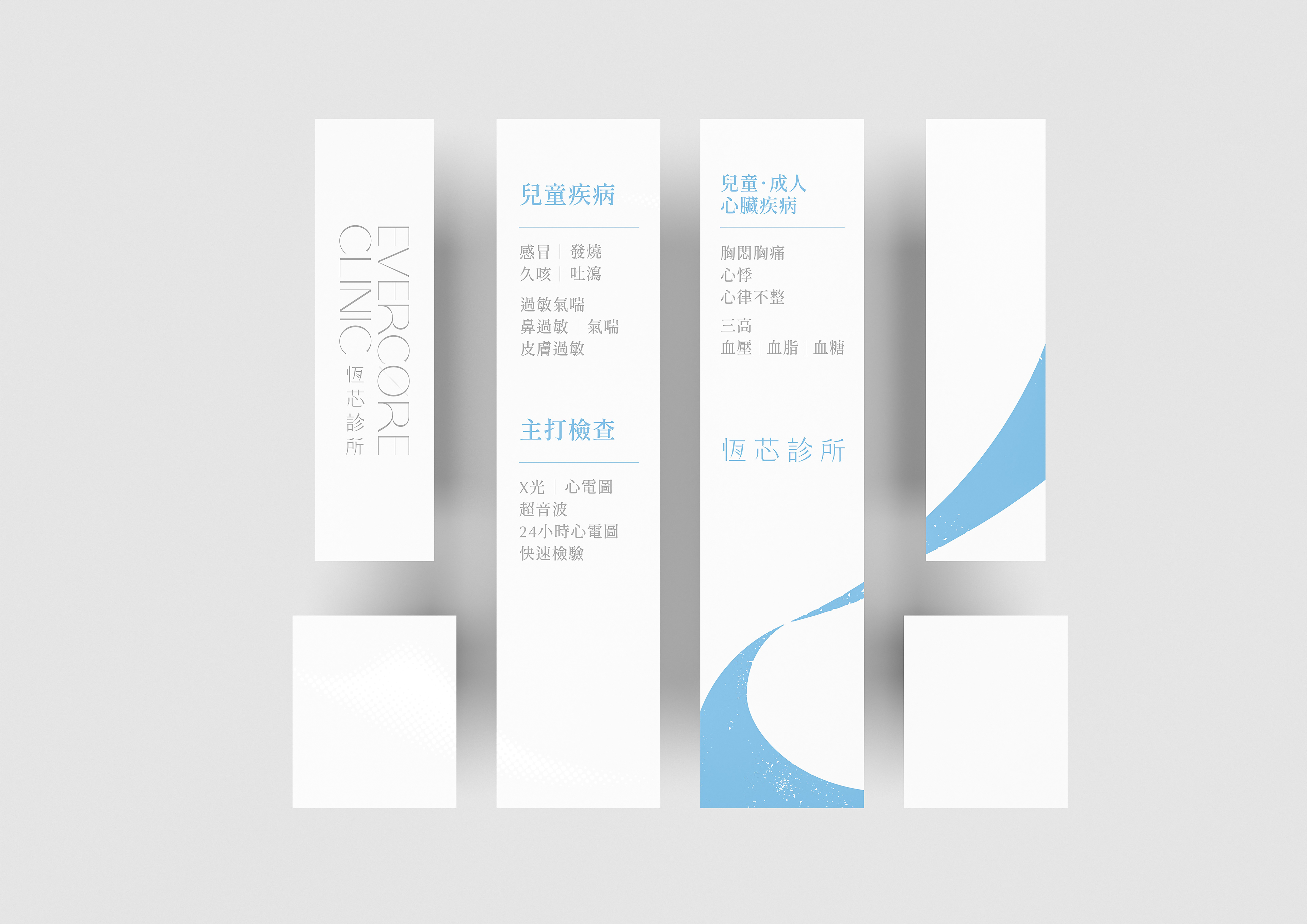
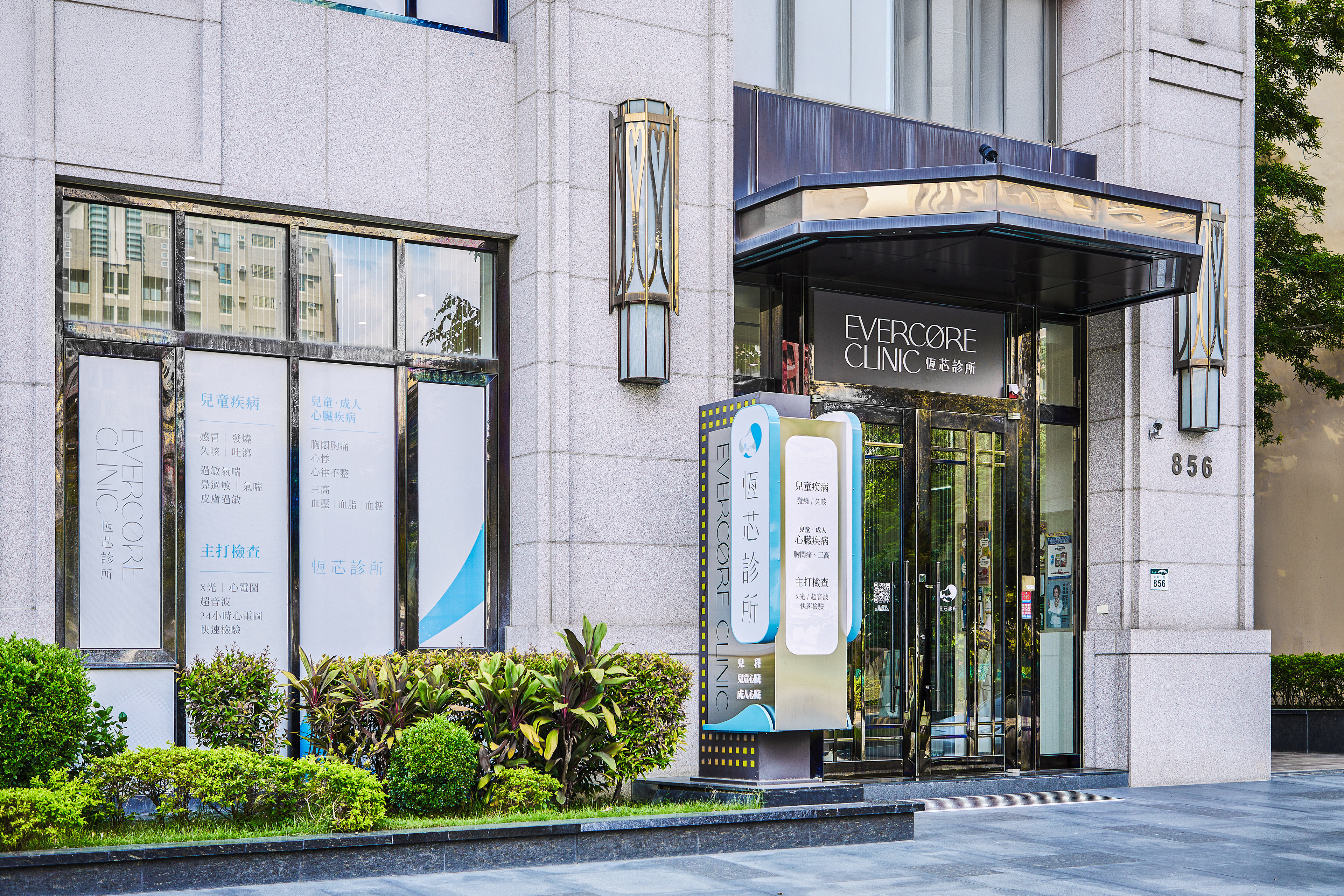
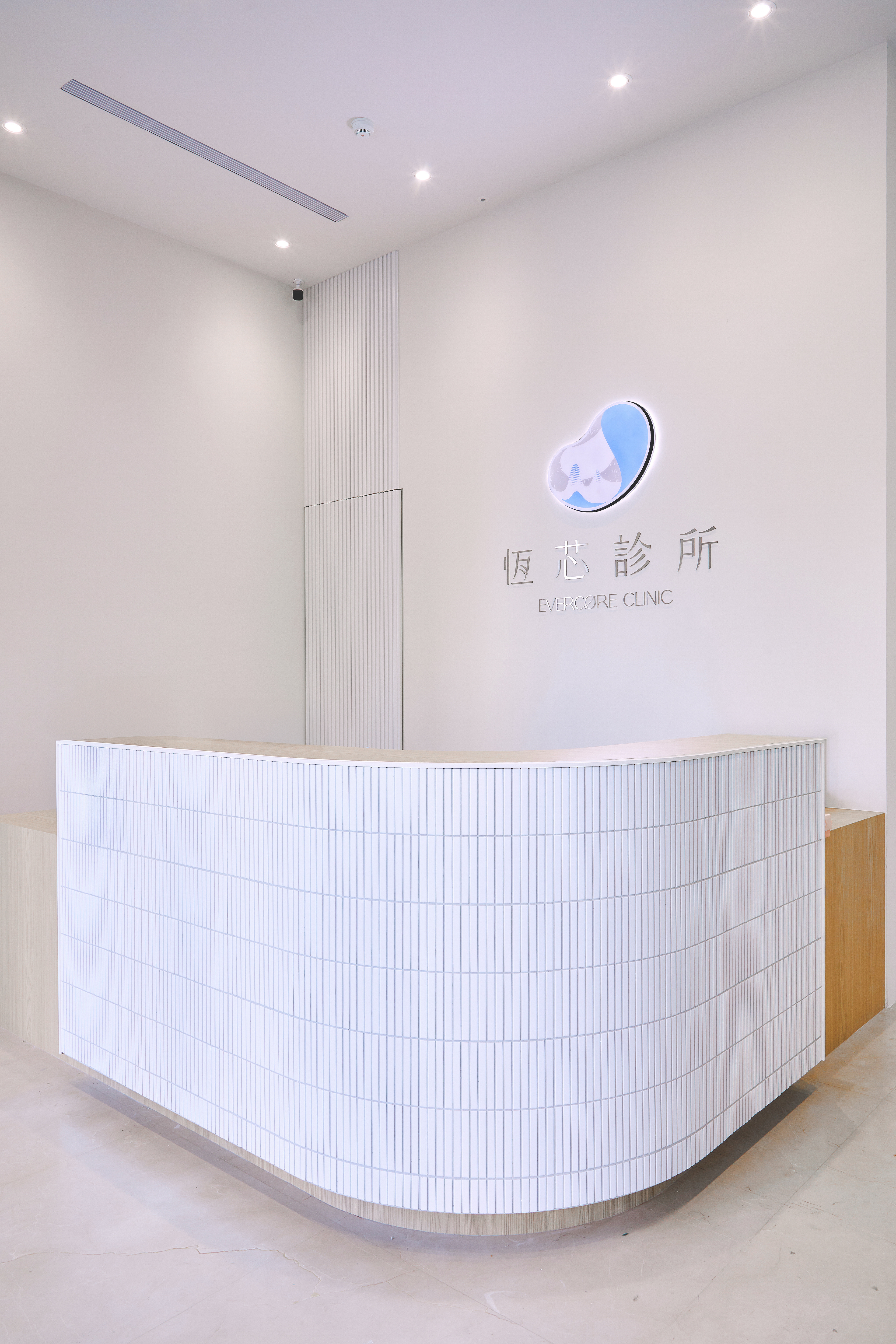
在視覺識別上,標誌以「心臟」作為品牌精神的具象化符號,並轉譯為圓滑、近似鵝卵石的愛心輪廓,象徵被呵護的生命核心與長期陪伴的醫療關係。點狀紋路的運用,抽象化心臟科的波形節律,隱含醫療專業的持續觀察與精準判讀。主色調選用藍色,作為靜脈與理性醫療的象徵,建立穩定、可信賴且不具侵略性的品牌印象。
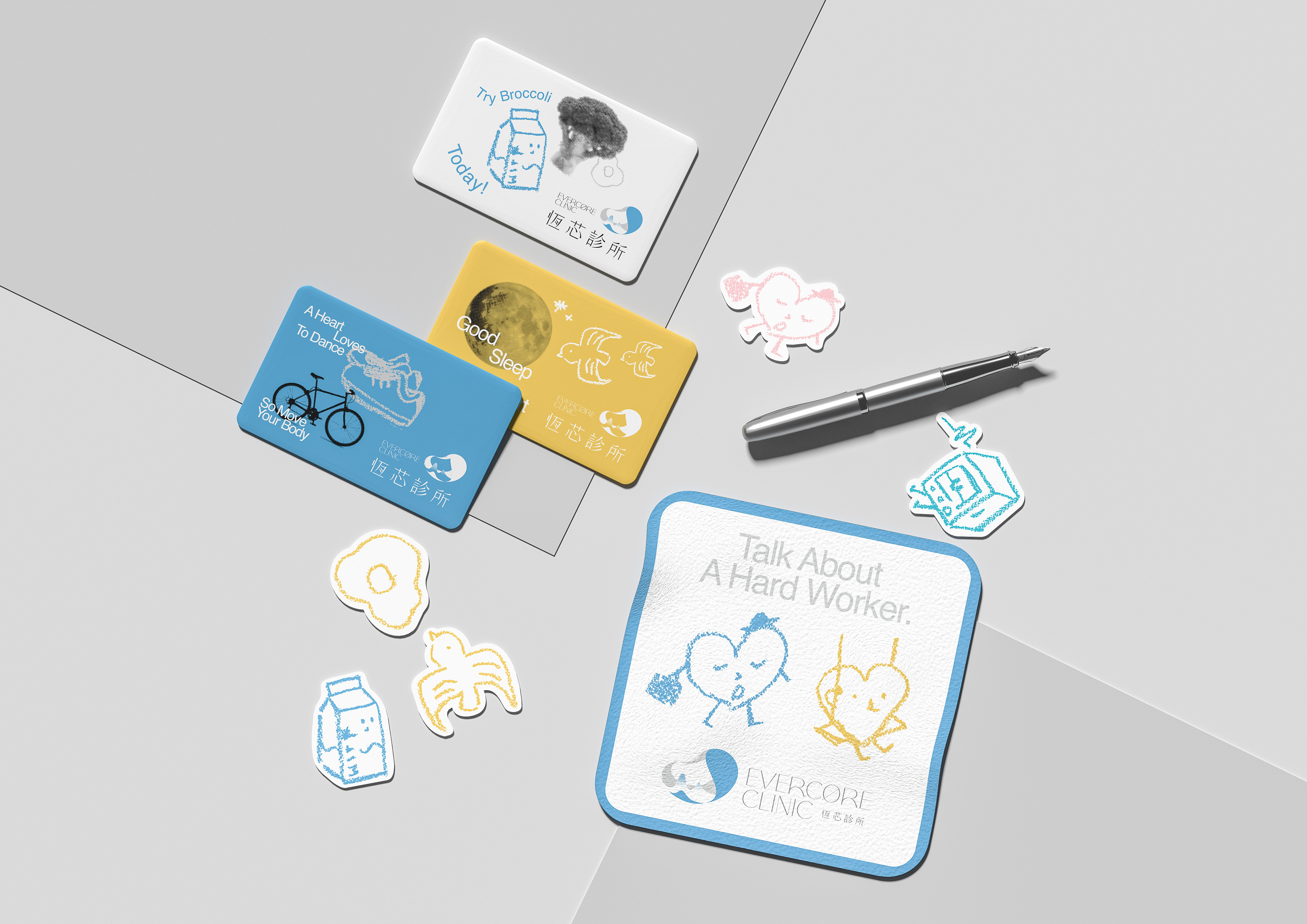
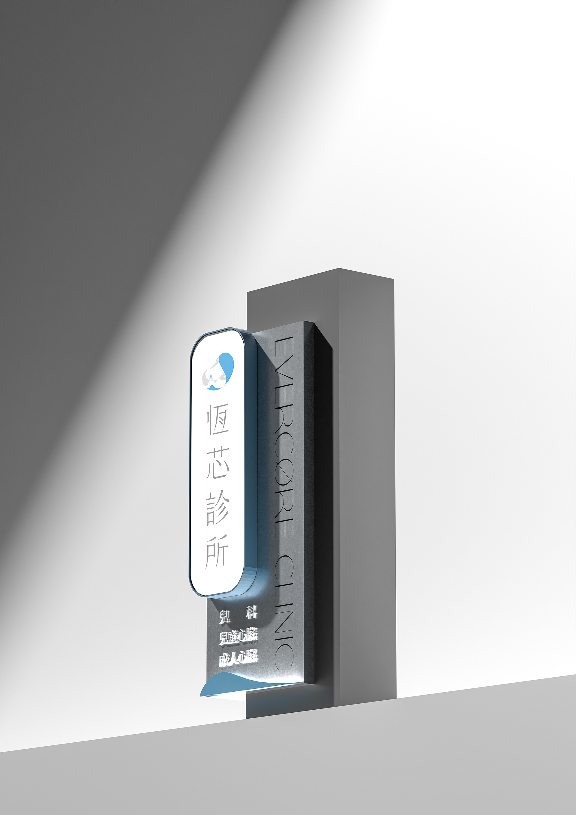
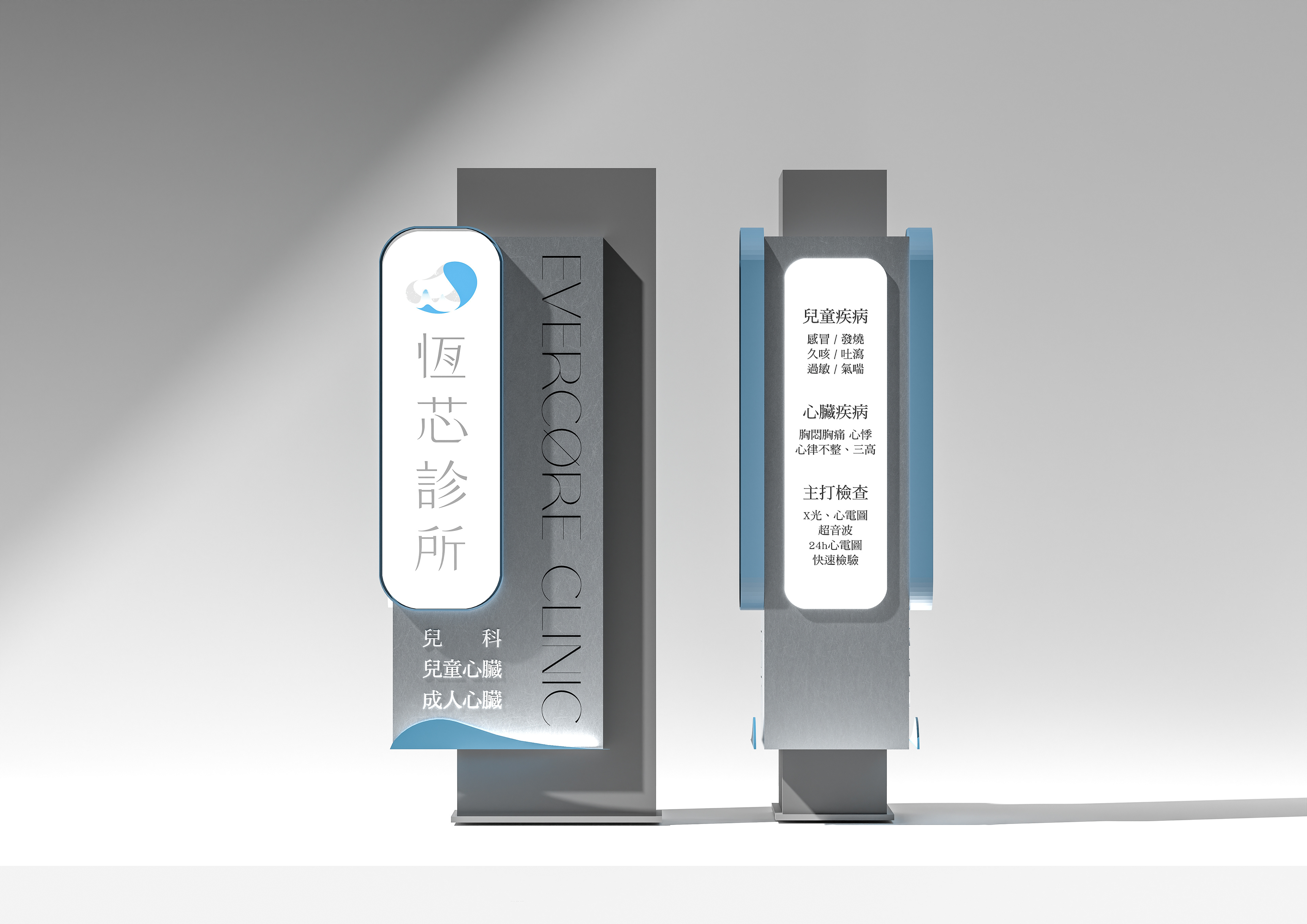
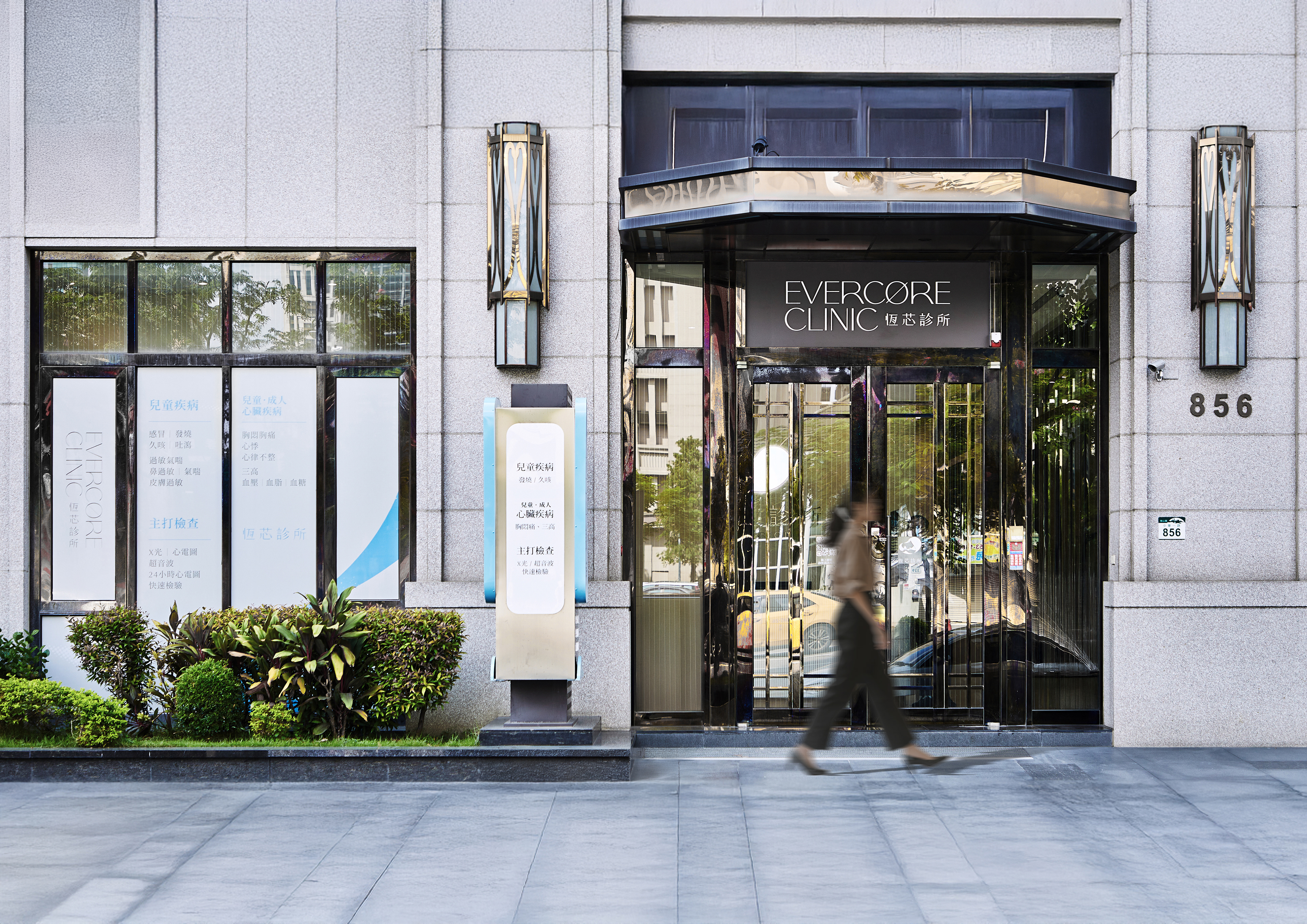
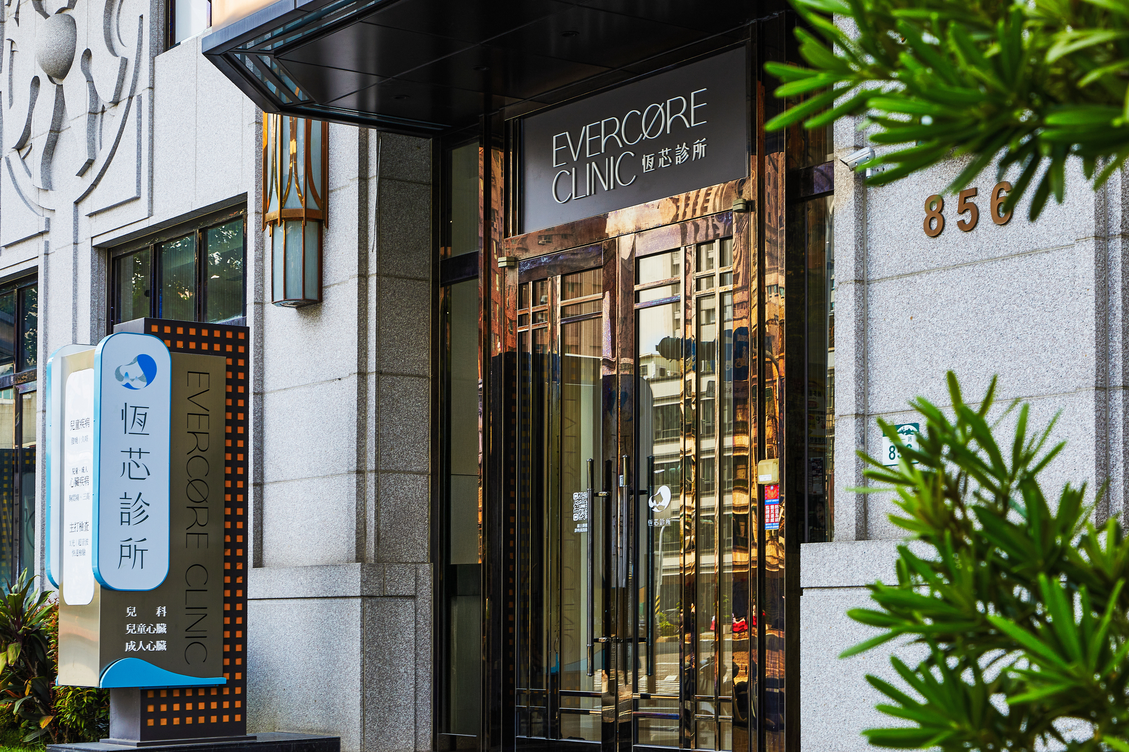
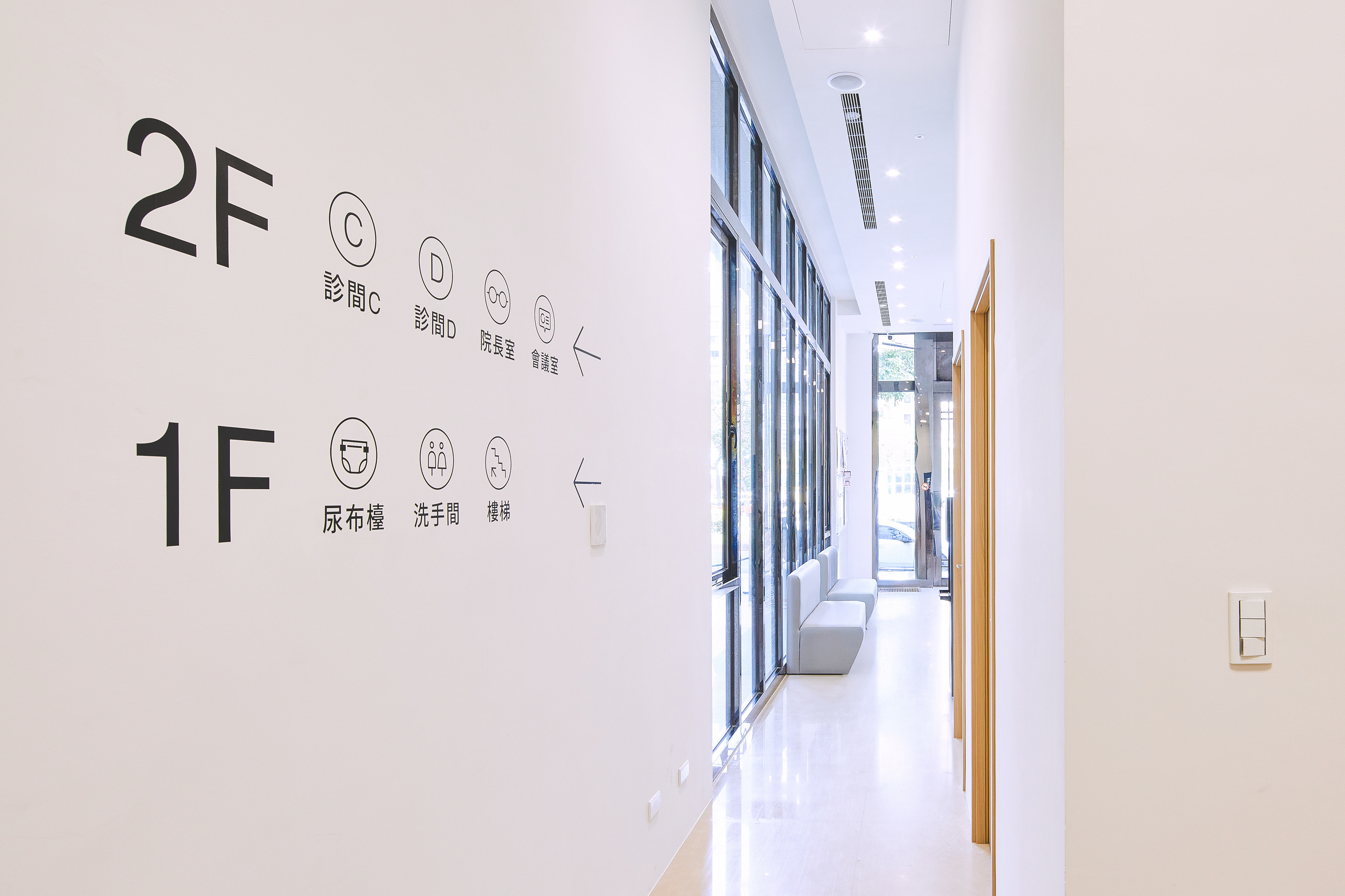
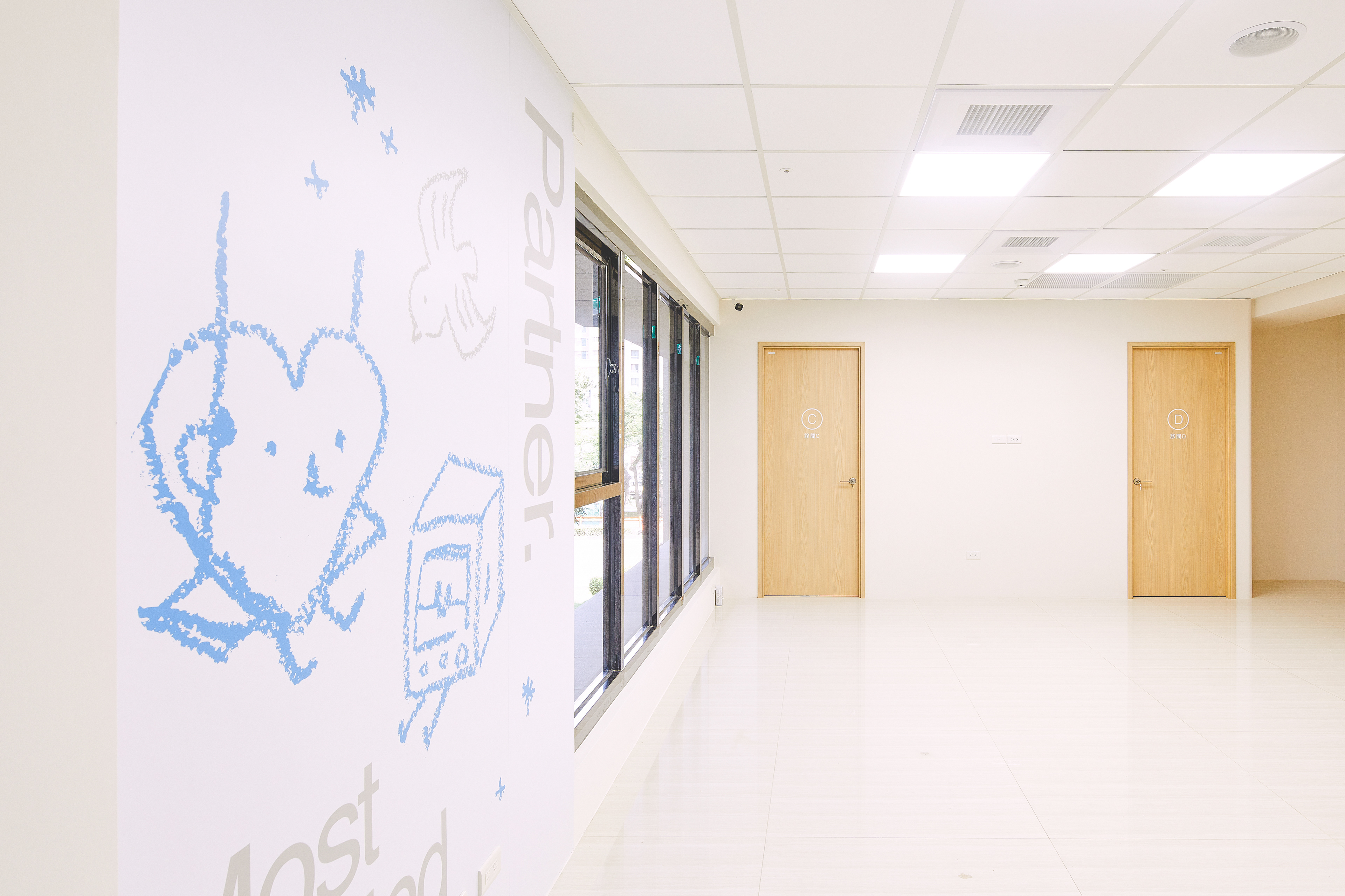
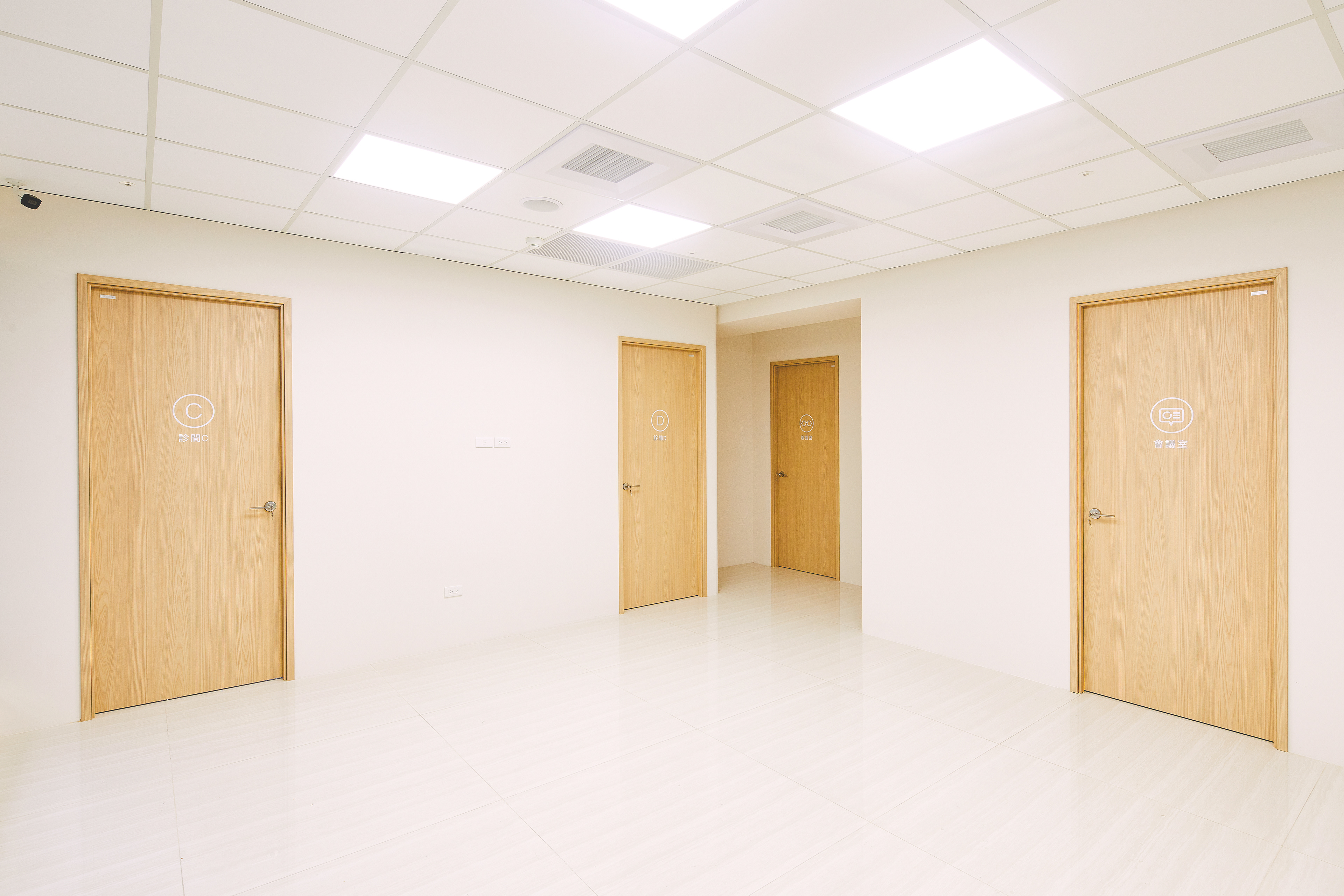
空間與指標系統被視為品牌體驗的重要一環,規劃上以女性與兒童為主要使用者,重新檢視視線高度、閱讀距離與資訊密度,使動線與指引在潛意識層面即能被理解。同時,兒童導向的識別元素被有意識地融入空間設計之中,避免過度卡通化,轉而以節制、溫潤的方式,與侘寂所強調的自然、不張揚與時間感形成呼應。
整體而言,恆芯診所的品牌規劃並非以「醫療機構」為出發點,而是以「長期被信任的社區醫療夥伴」作為品牌角色定位。透過一致且內斂的識別與指標系統,恆芯將專業、透明與溫度轉化為可被感知的品牌經驗,陪伴孩子與家庭在成長過程中,建立穩定而安心的醫療關係。

Identity system
Signage system
Evercore Clinic’s brand strategy is rooted in a conscious return to the essence of medical care. Positioned as a pediatric cardiology clinic serving local community families, the brand emphasizes professional, insurance-based treatment and prioritizes parents’ need for clear explanations and understanding throughout the medical journey.
The brand core, defined as “listening and understanding,” guides all touchpoints—from clinical communication to visual identity and wayfinding design—aiming to reduce anxiety and build trust through clarity and consistency rather than commercialized medical messaging.
The visual identity centers on the heart, translated into a smooth, pebble-like form that represents protection, care, and long-term companionship. Dotted patterns abstract cardiology waveforms, suggesting continuous observation and precision. Blue is used as the primary color to convey calmness, rationality, and medical reliability.
Spatial and wayfinding design are treated as essential components of the brand experience. Designed with women and children in mind, adjustments to visual height, information density, and circulation enable intuitive navigation. Child-oriented elements are subtly integrated into the space, aligning with wabi-sabi principles of restraint, naturalness, and quiet warmth.
Together, the identity and spatial system position Evercore Clinic as a trusted, long-term community healthcare partner, translating professionalism, transparency, and care into a cohesive and reassuring brand experience.

專案類型 Type | Branding 品牌規劃
專案年份 Year | 2025
客戶 Client|恆芯診所
製作單位 Production | AAOO Stduio
設計總監 Art Director | Ping Sung Chiu
專案規劃 Project Planning|Ping Sung Chiu
平面設計 Designer|Yu Jie Li
室內設計 Interior design|研品川文化
室內設計 Interior design|研品川文化