
人們常說,英國人沒有什麼事是一杯茶無法解決的。
-
因為喝茶不僅是一種生活哲學,也是一種文化的節奏——關於自律、秩序與日常的儀式感。
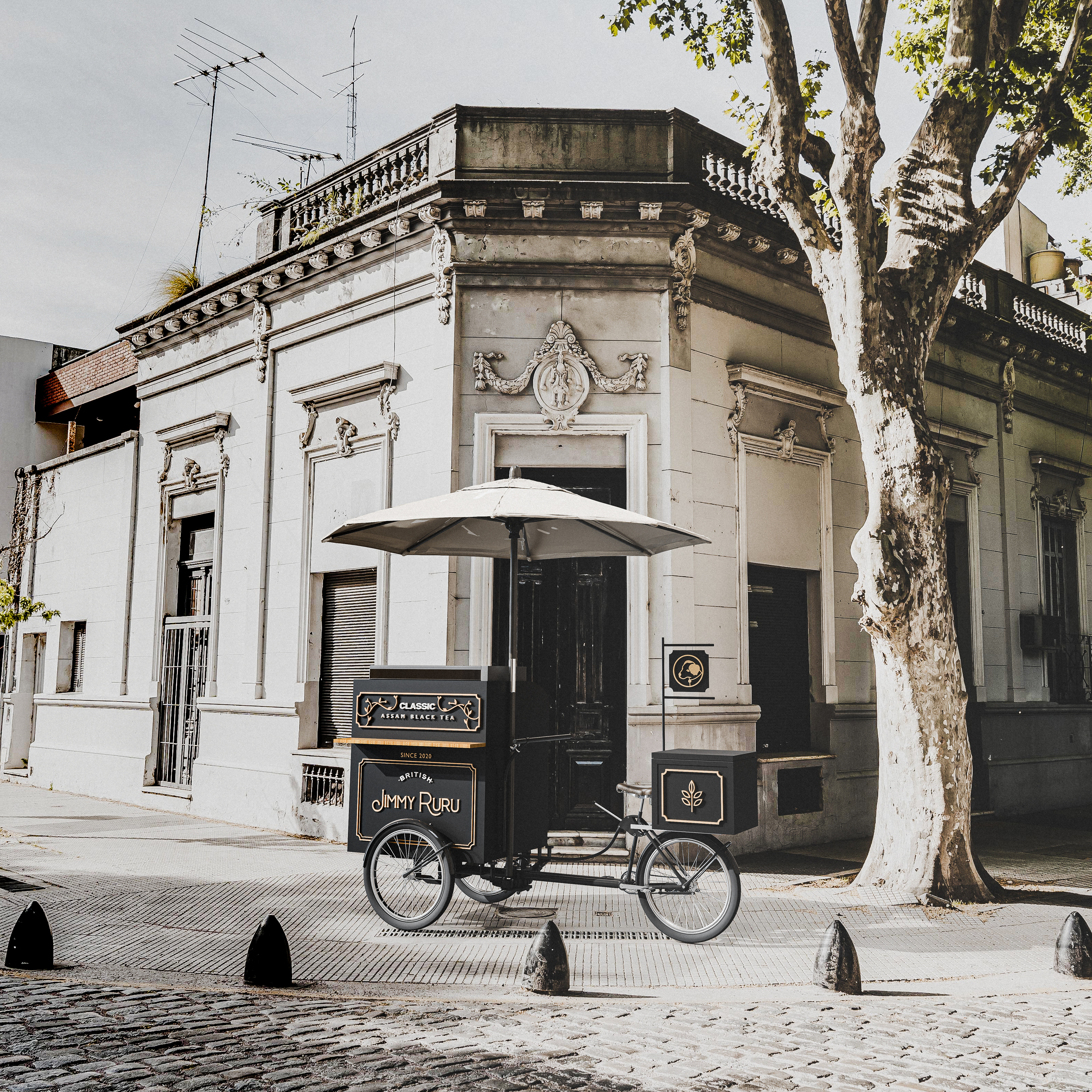
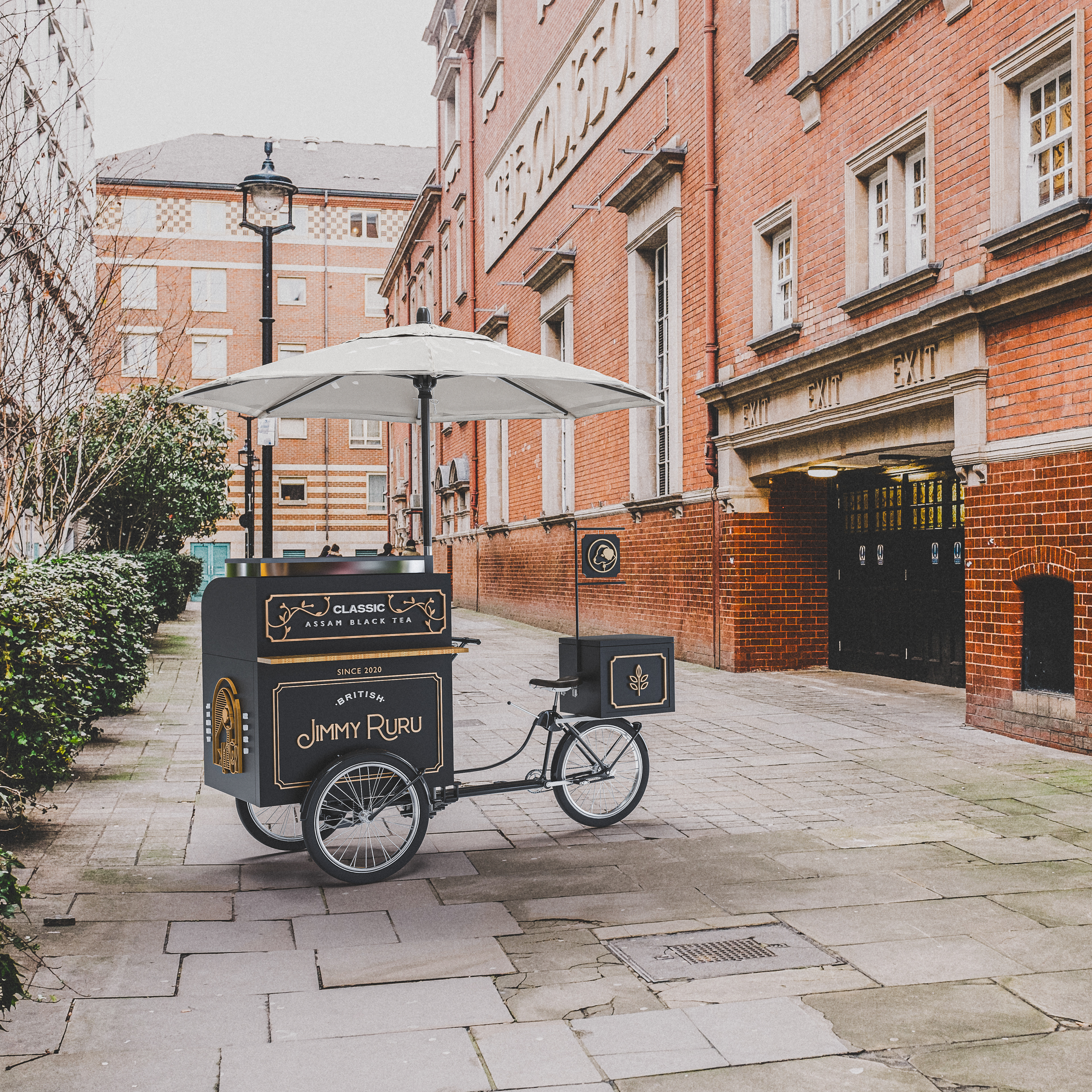
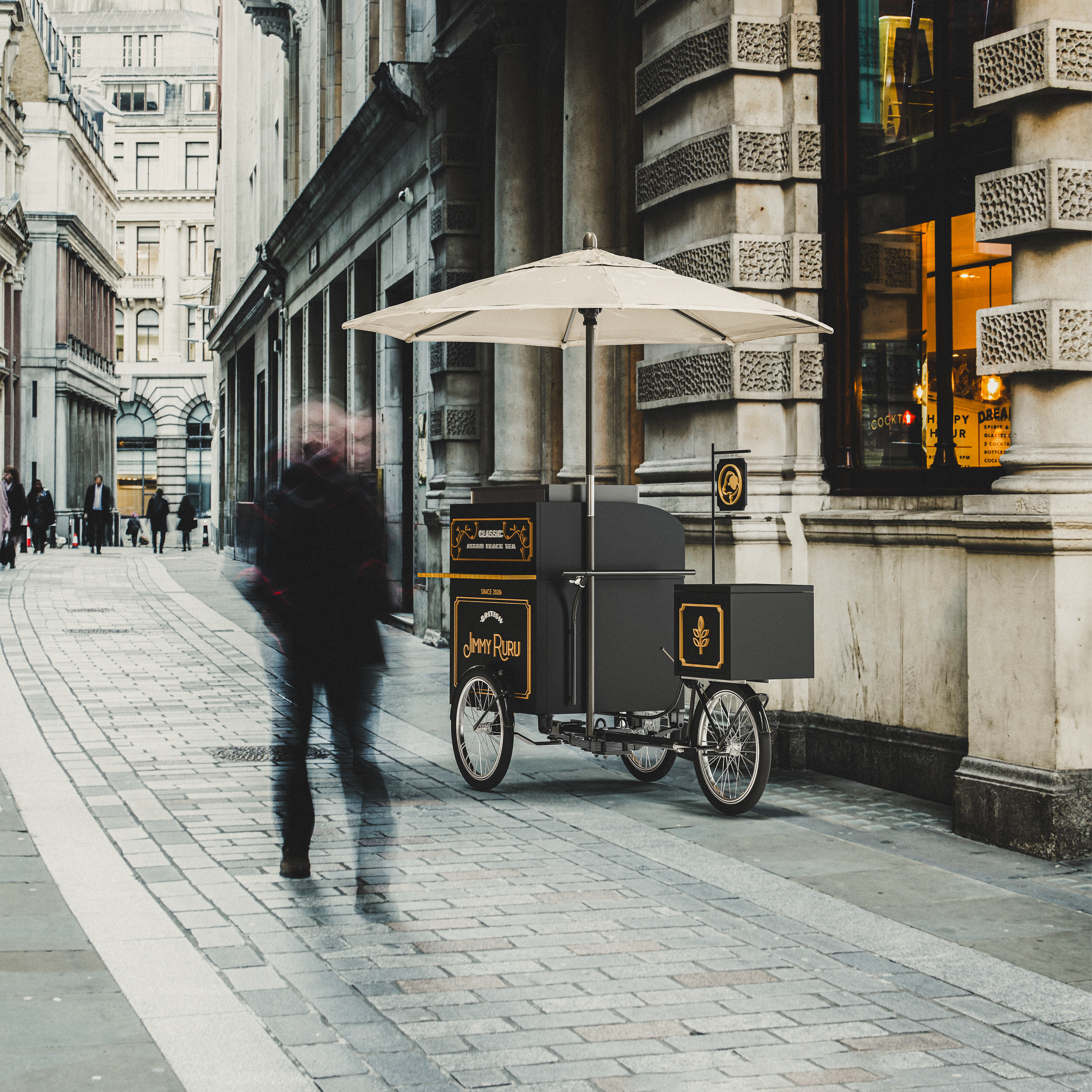
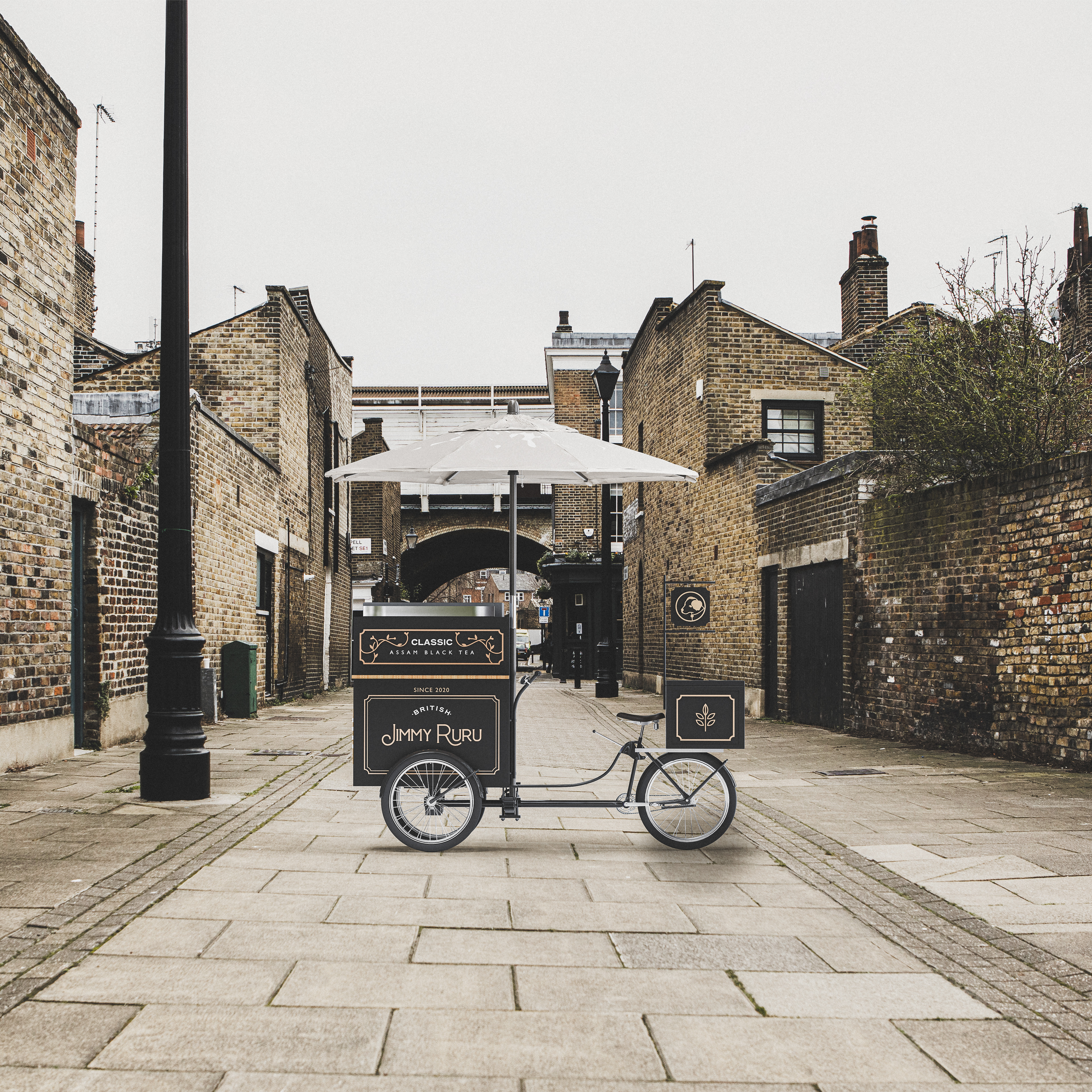
在這次的設計專案中我們將品牌核心以英式茶飲文化為起點,客群定位落腳於市集,面對的是觀光與在地雙重客群。
品牌主希望即使在快速移動的人流中,也能讓人願意停下腳步、感受到片刻的寧靜與優雅。
因為喝茶不僅是一種生活哲學,也是一種文化的節奏——關於自律、秩序與日常的儀式感。
在這次的設計專案中我們將品牌核心以英式茶飲文化為起點,客群定位落腳於市集,面對的是觀光與在地雙重客群。
品牌主希望即使在快速移動的人流中,也能讓人願意停下腳步、感受到片刻的寧靜與優雅。
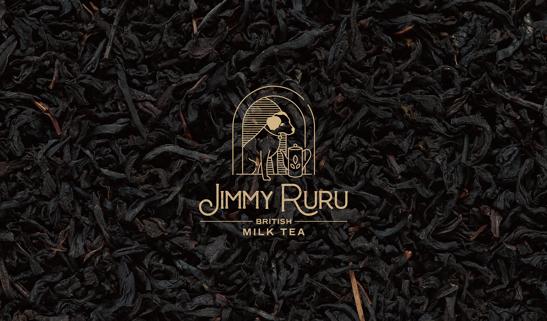
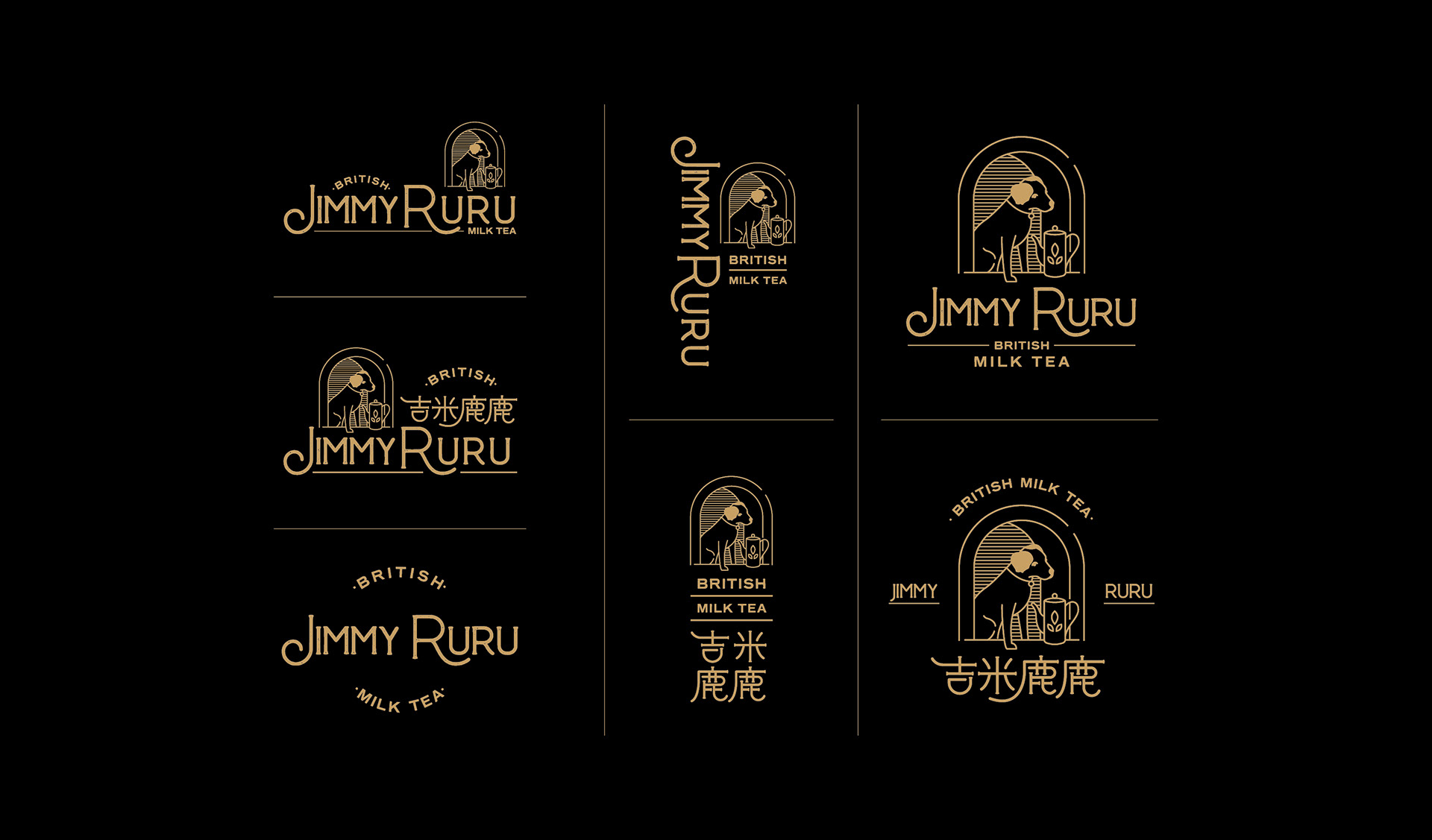
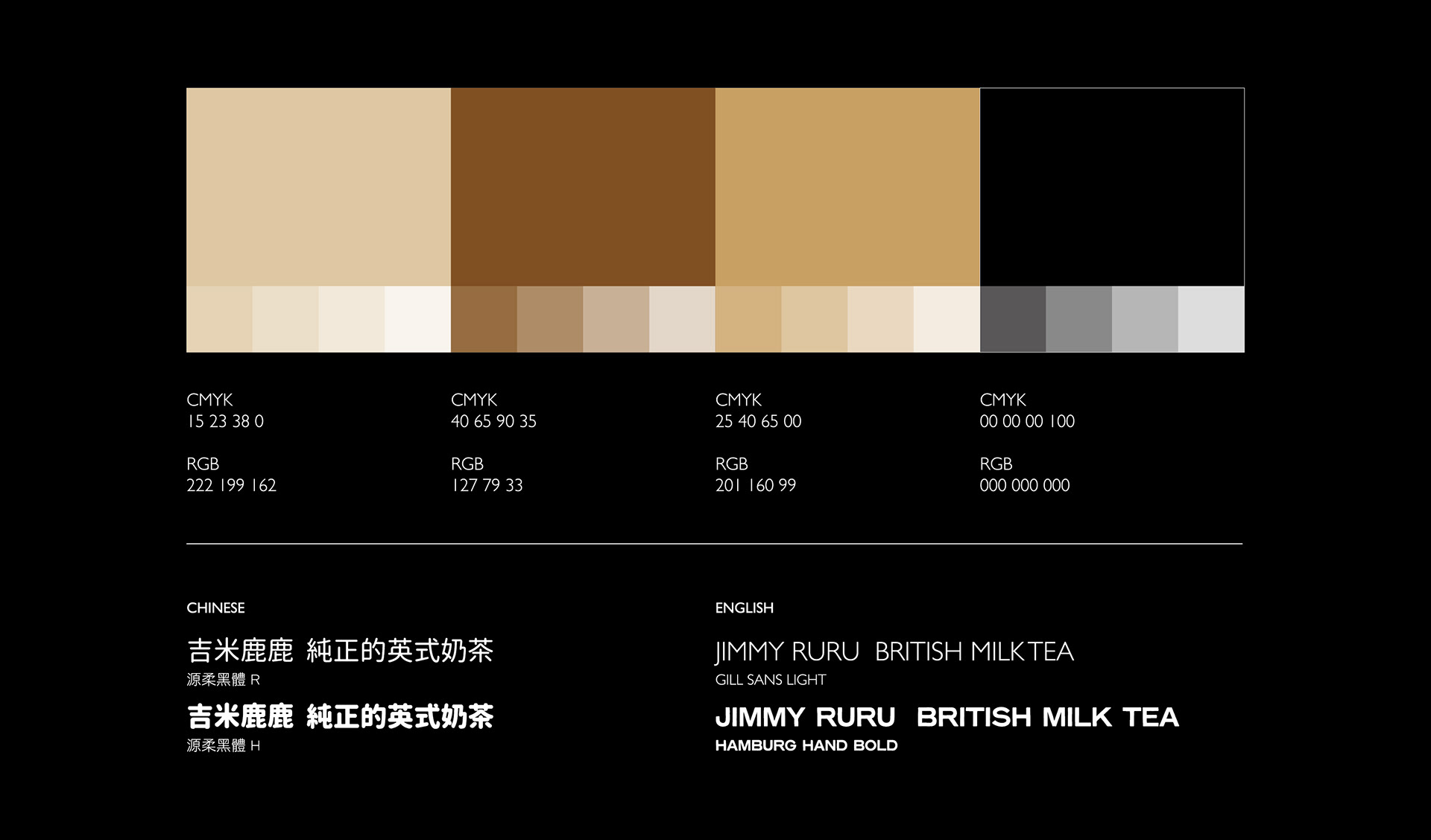
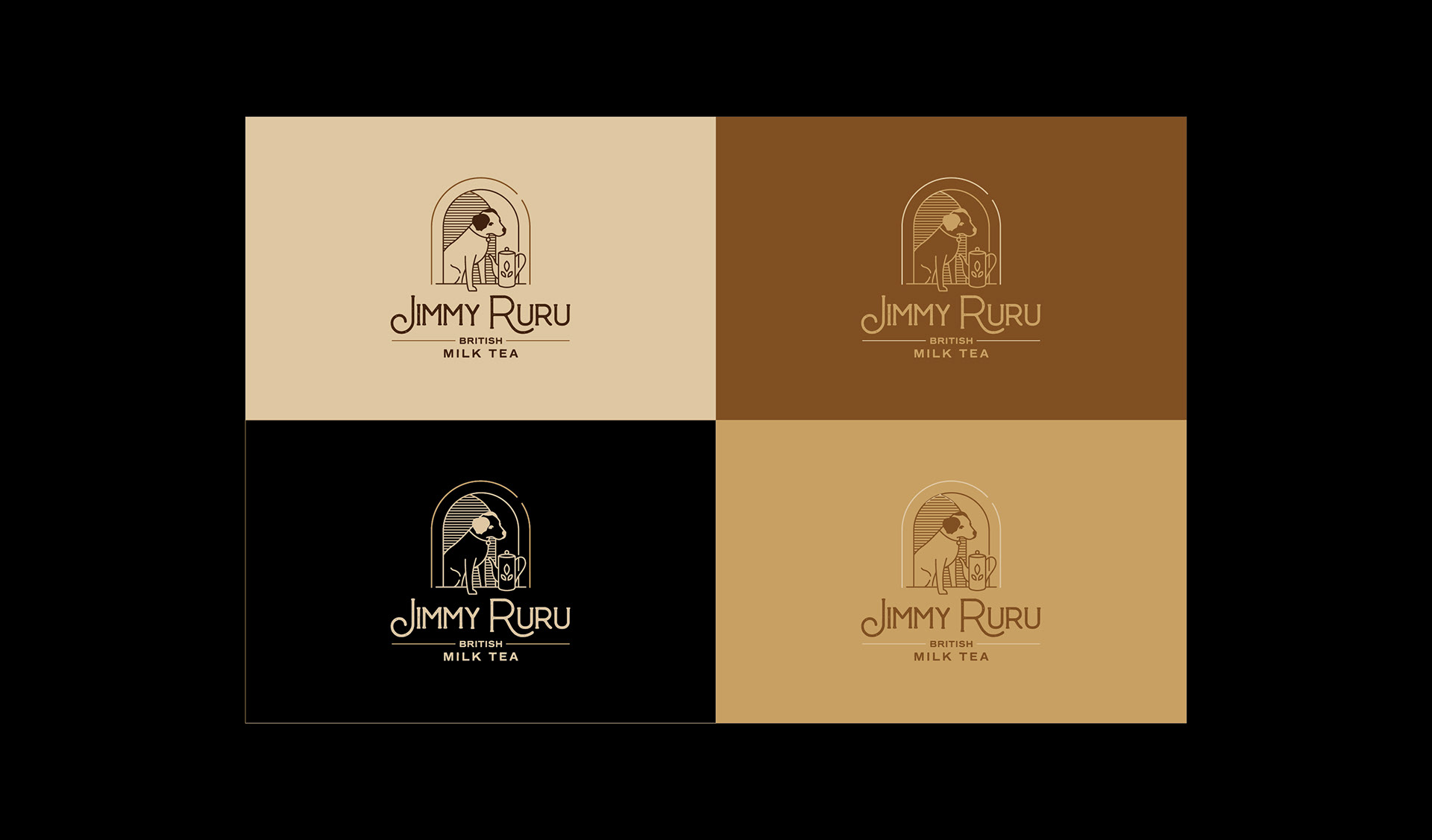
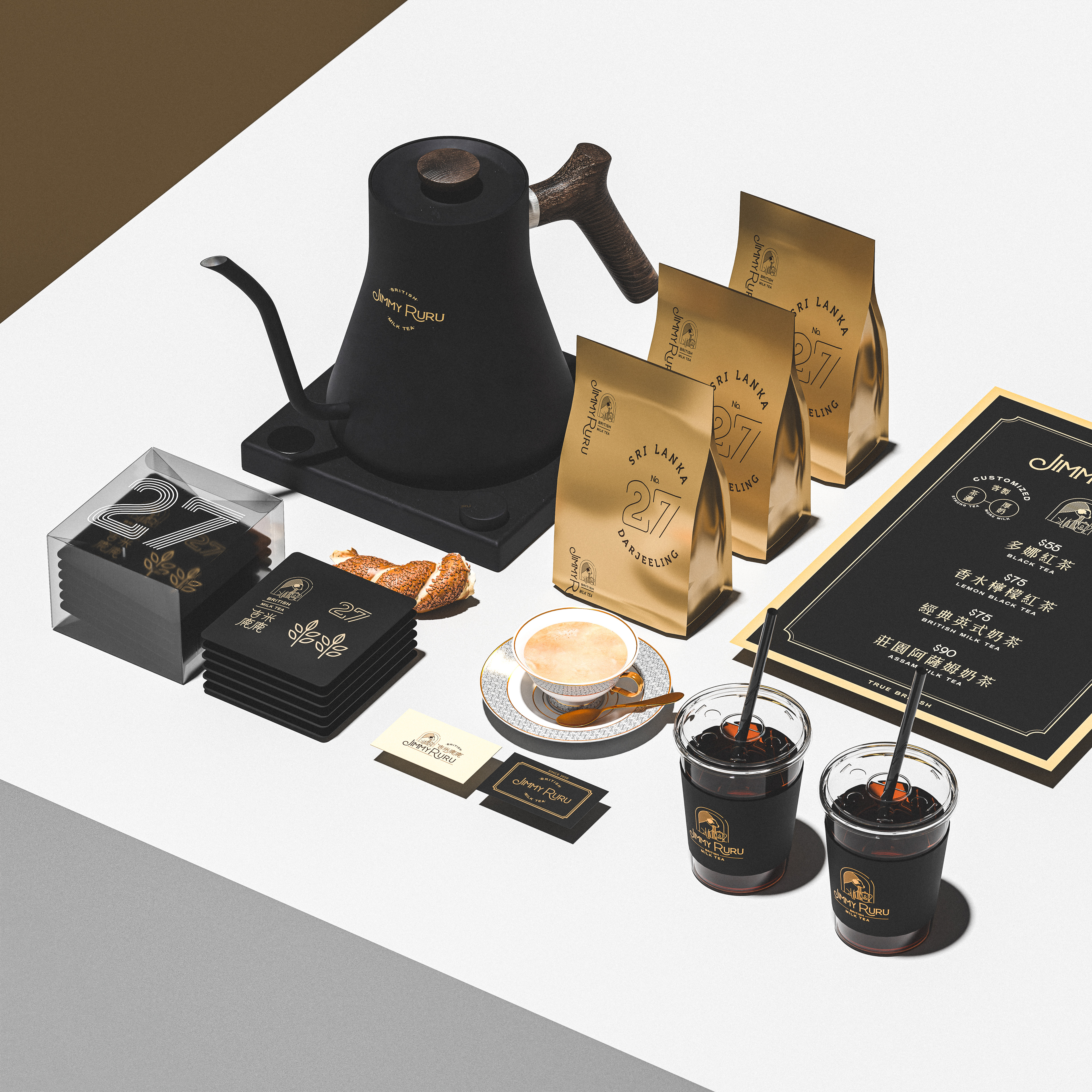
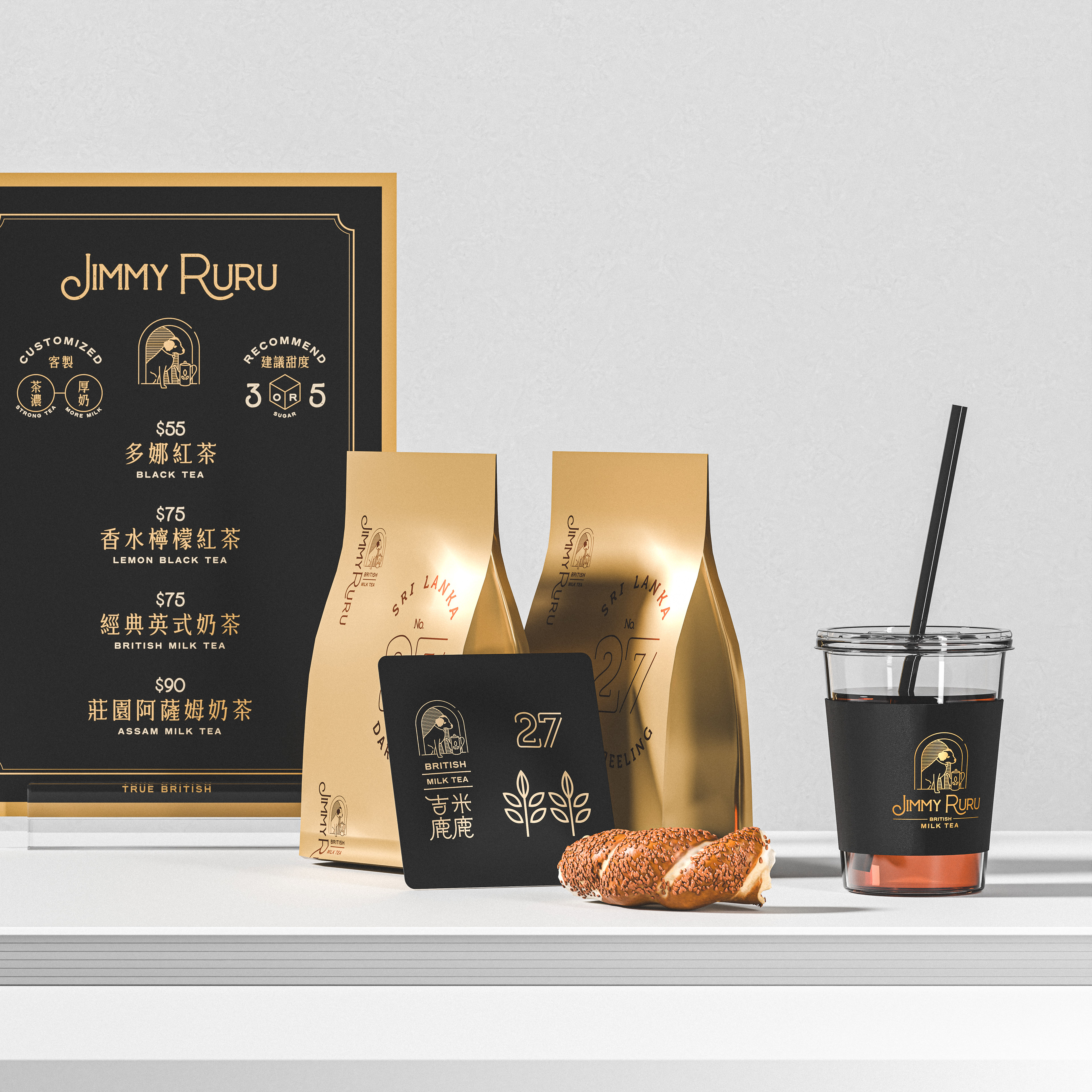
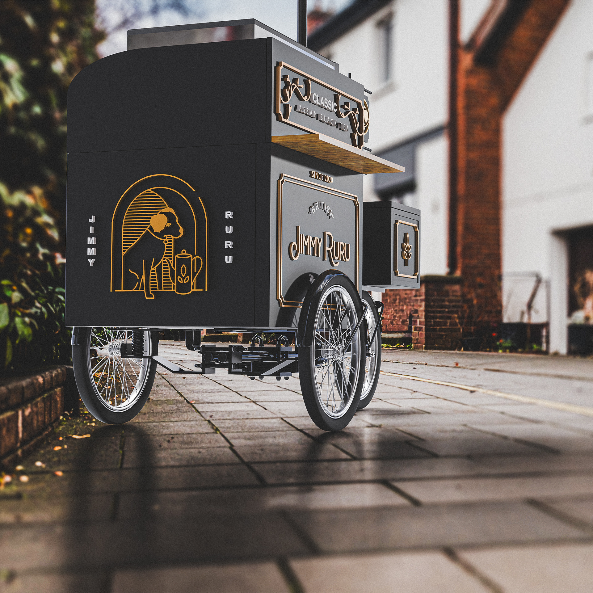
視覺策略上,我們以黑與金作為主色建立經典且具有深度的品牌基調,並選擇英殖民風格元素作為視覺語言的參照。
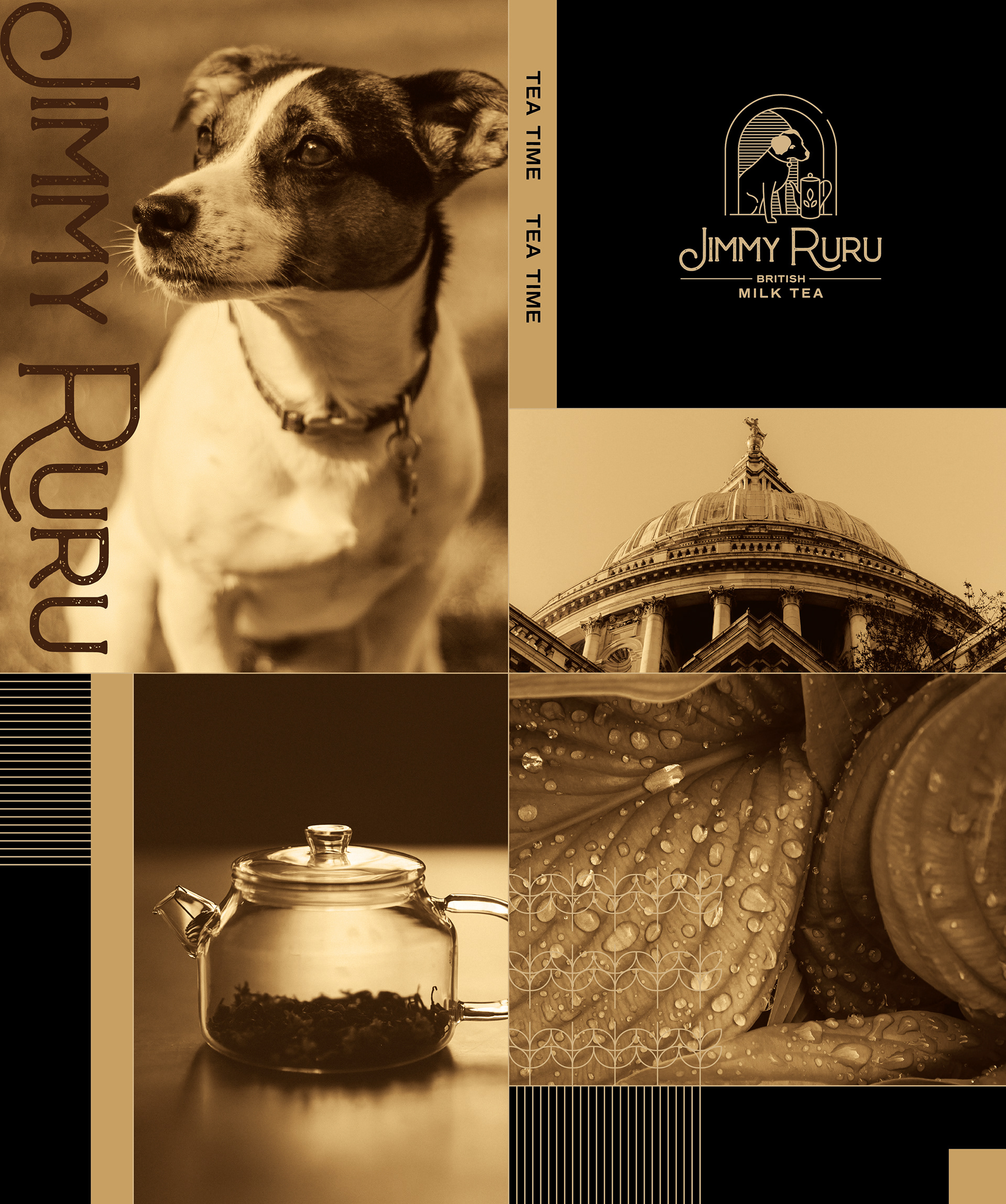
輔色部分,我特別選用了卡其色 —— 一種原本源自印度語「泥土」之意的色調 ; 卡其色在19世紀末由英國軍隊正式引入軍服設計,作為應對氣候與地形的實用選擇,也逐漸成為英國海外擴張歷史中最具象徵性的顏色之一。
輔色部分,我特別選用了卡其色 —— 一種原本源自印度語「泥土」之意的色調 ; 卡其色在19世紀末由英國軍隊正式引入軍服設計,作為應對氣候與地形的實用選擇,也逐漸成為英國海外擴張歷史中最具象徵性的顏色之一。
這樣的色彩,不僅帶有土地與旅途的記憶,也蘊含了某種屬於「秩序與適應」的文化脈絡。
對我而言它既是設計語彙的一環,也是對那段歷史的有意回應。
對我而言它既是設計語彙的一環,也是對那段歷史的有意回應。
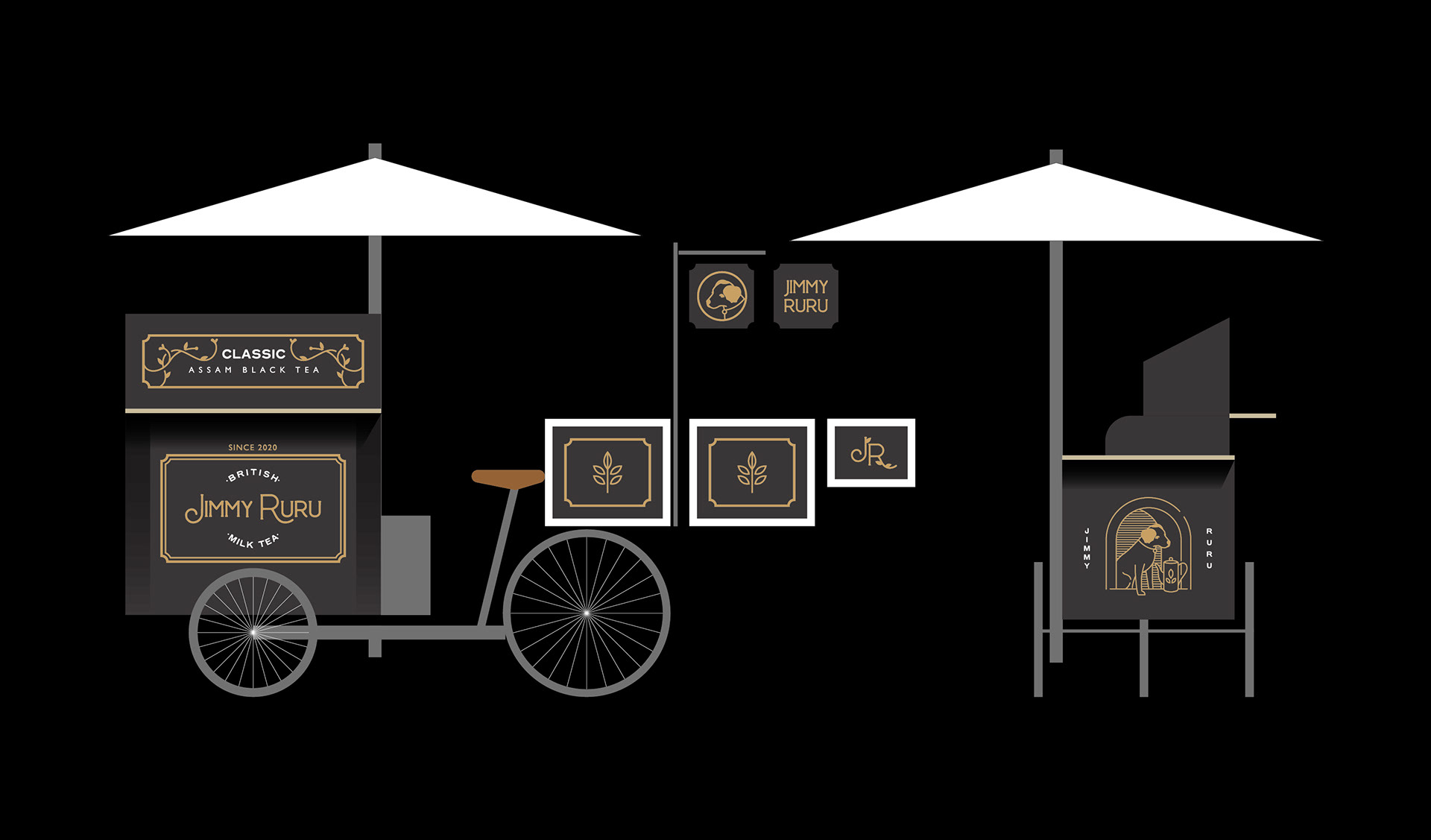
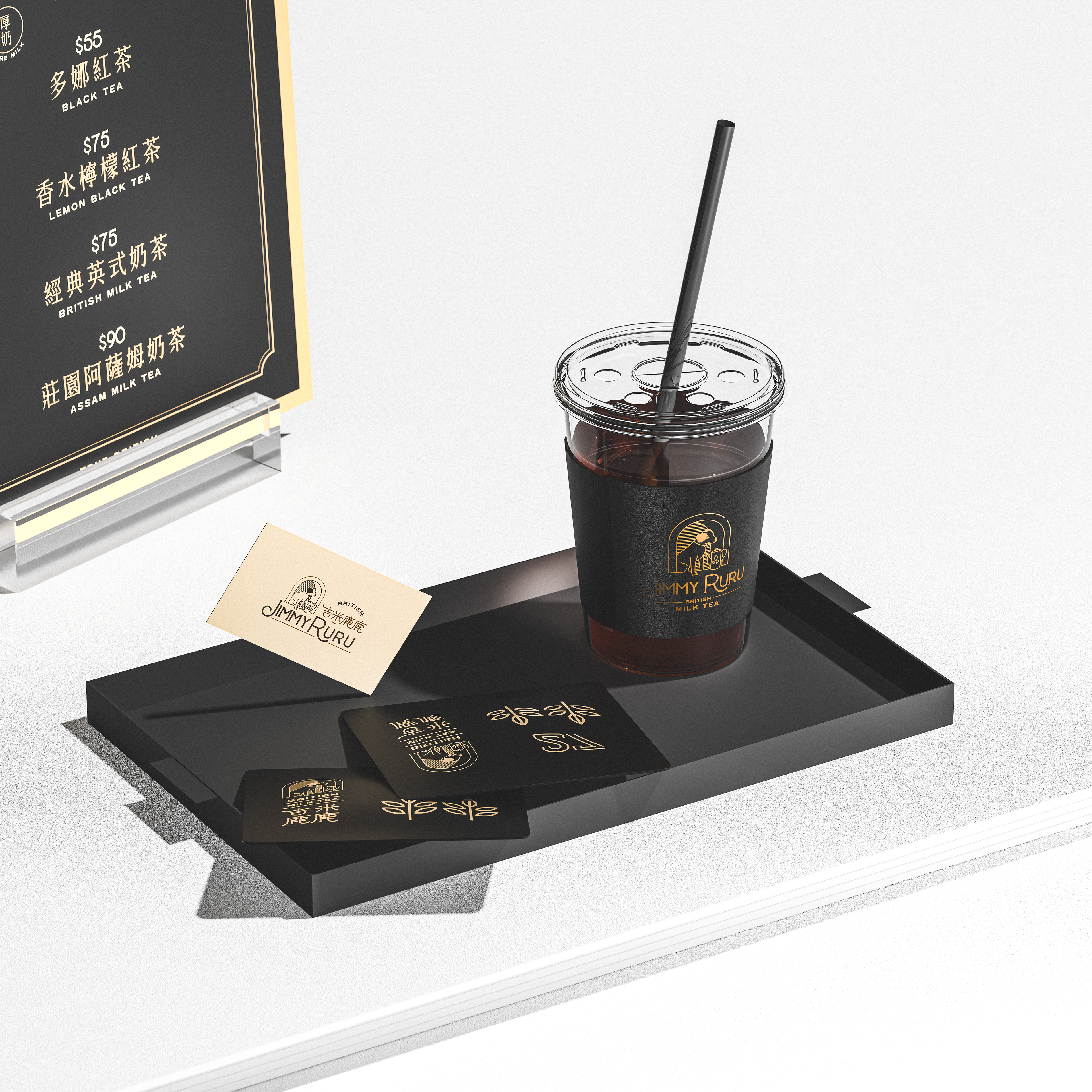
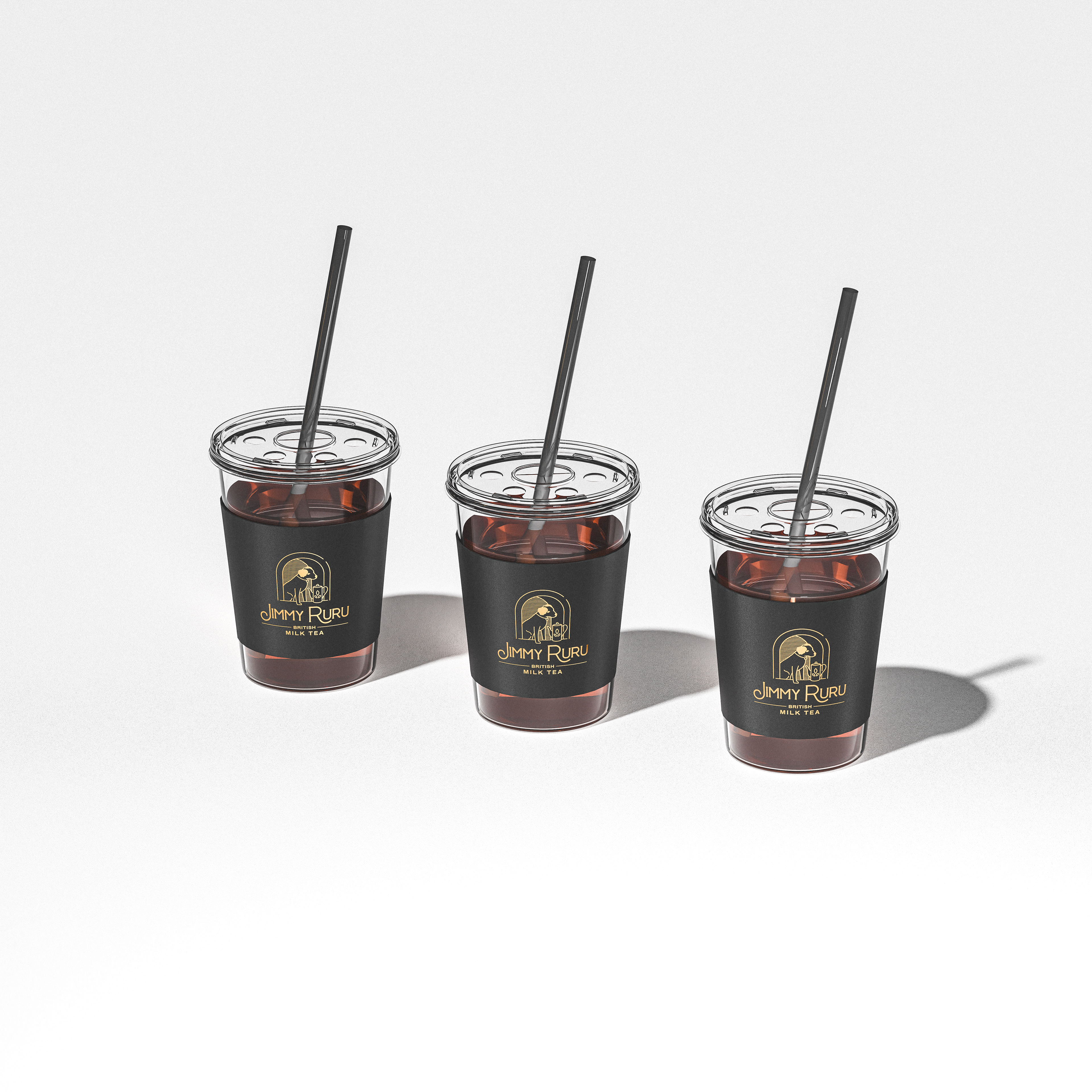
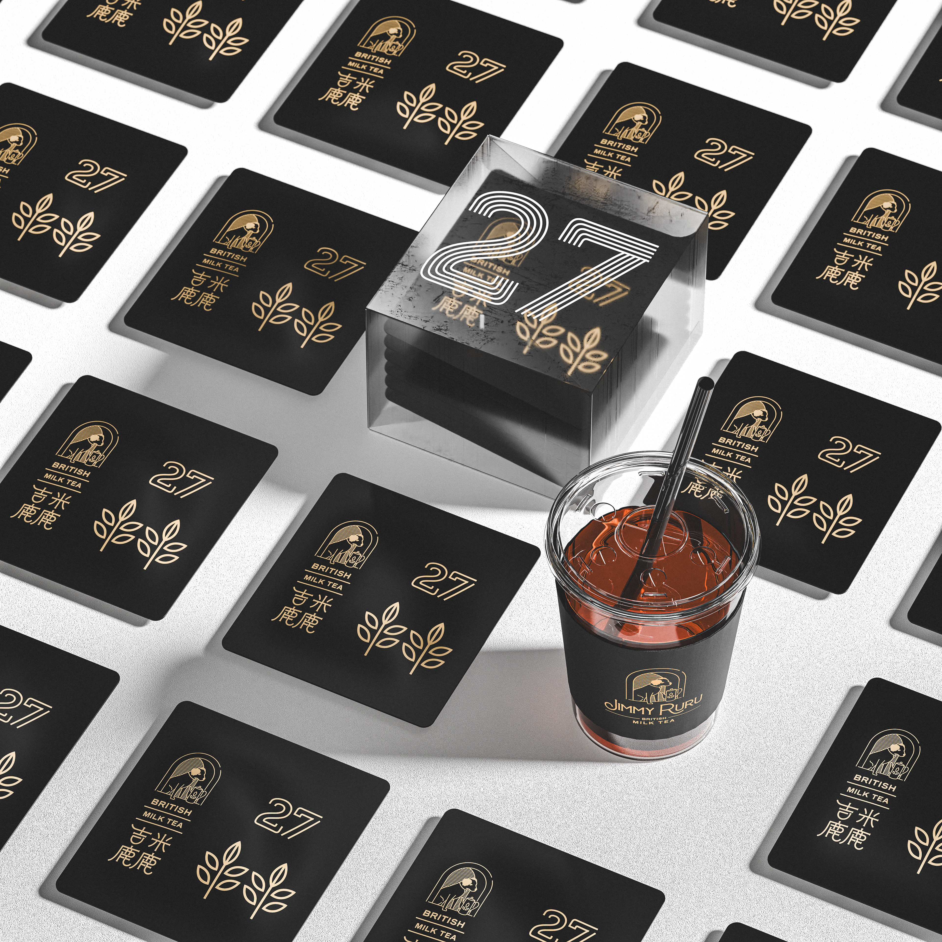
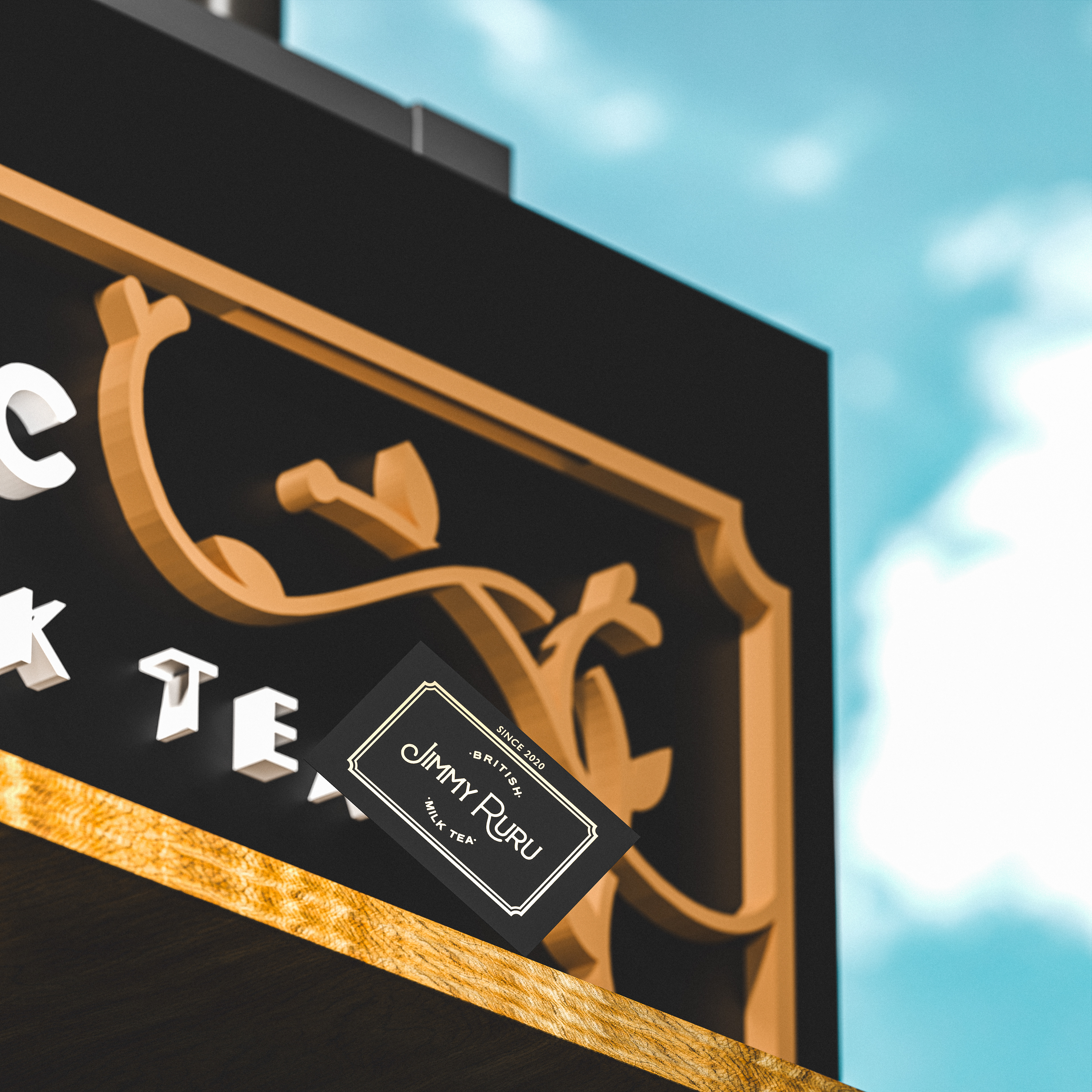
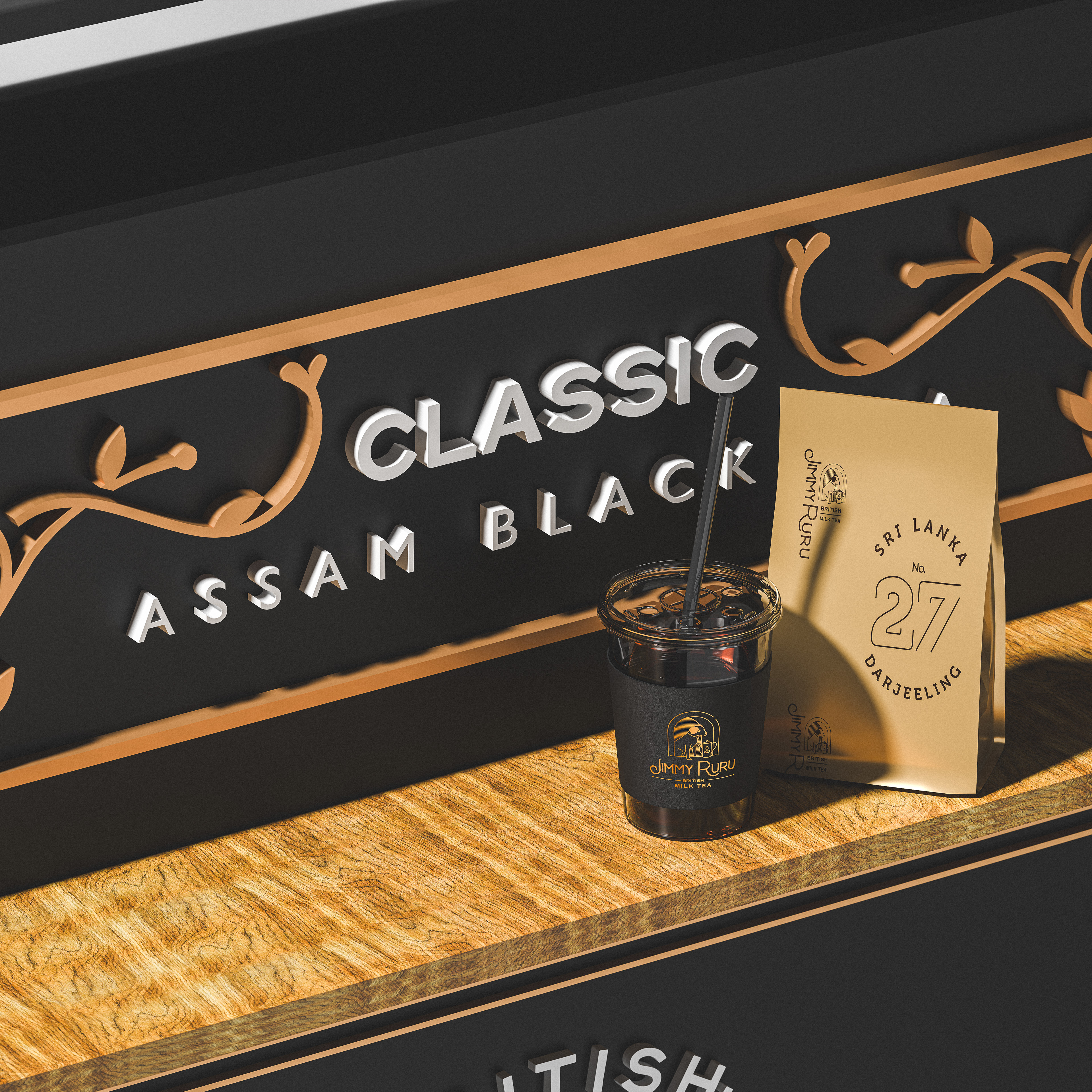
從包裝、名片、茶具到攤車設計每個細節都在維持視覺一致性的同時,承載品牌想要傳遞的節奏與層次。
就像一杯剛好的茶,溫熱、且恰到好處。
就像一杯剛好的茶,溫熱、且恰到好處。
People often say that there’s nothing a cup of tea can’t fix in England.
Because tea is not just a way of life — it’s a cultural rhythm, shaped by discipline, order, and the quiet rituals of the everyday.
In this design project, we anchored the brand’s core in traditional English tea culture, positioning it within local markets, aimed at both tourists and the local public.
The founder’s vision was clear: even in a fast-paced, bustling environment, they wanted to create a moment of calm and elegance — something that would make people pause.
Our visual strategy centered around black and gold as the primary palette, establishing a tone of classic depth and refinement.
To express the brand’s identity, we referenced elements of British colonial aesthetics as the visual language.
As a supporting color, I deliberately introduced khaki — a tone whose name originates from the Hindi word for “soil.”
Adopted by the British army in the late 19th century, khaki was originally chosen for its practicality in responding to climate and terrain, and over time, it became one of the most symbolic colors of Britain’s imperial history.
This color carries with it not only memories of land and travel, but also a deeper cultural narrative of order and adaptation.
To me, it is not merely part of the color system — it is a conscious response to that layered past.
From packaging and business cards to tea ware and market stall design, every detail was created to maintain visual coherence while embodying the brand’s intended pace and atmosphere.
Like a perfectly steeped cup of tea — warm, composed, and just right.
Like a perfectly steeped cup of tea — warm, composed, and just right.
”It’s always tea time somewhere“
專案類型 Type | Branding 品牌
專案年份 Year | 2025
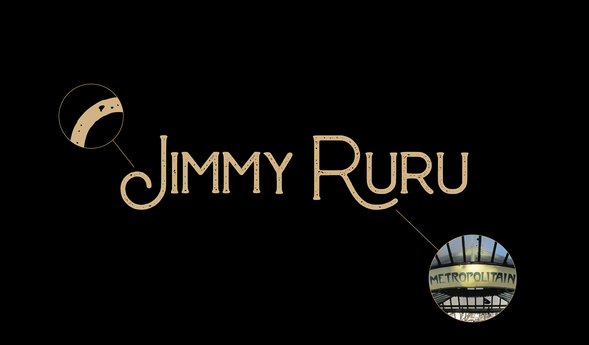
客戶 Client|吉米鹿鹿 Jimmy Ruru
製作單位 Production | AAOO Studio