
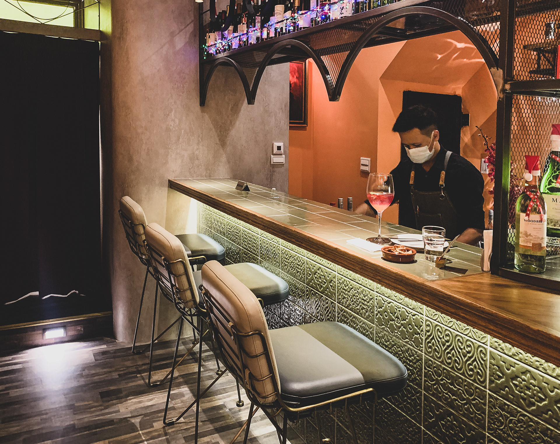
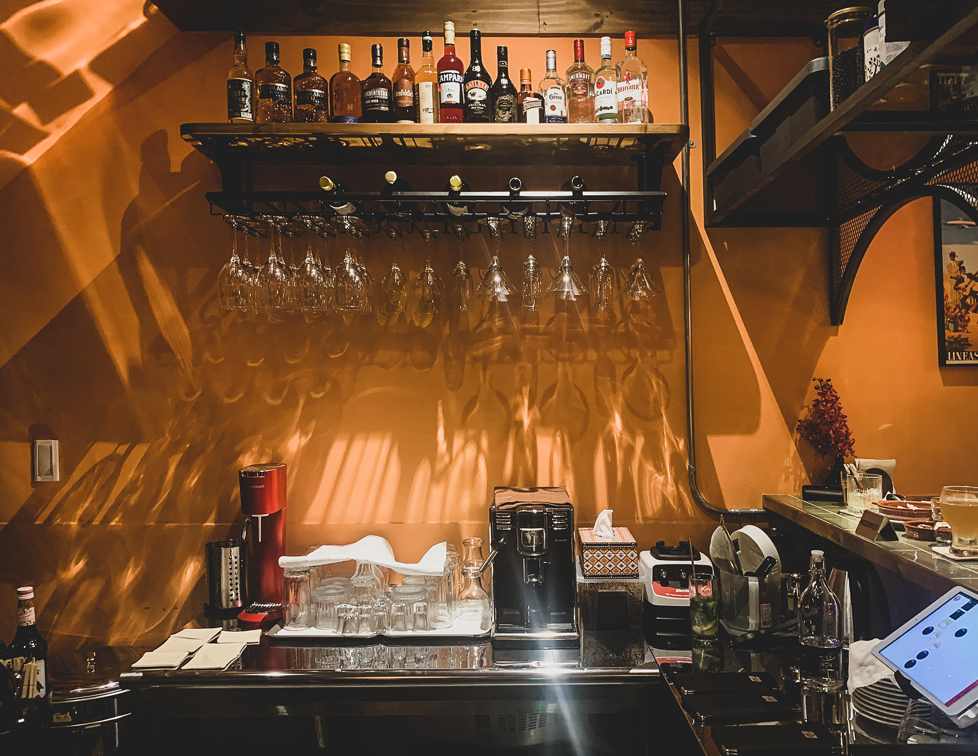
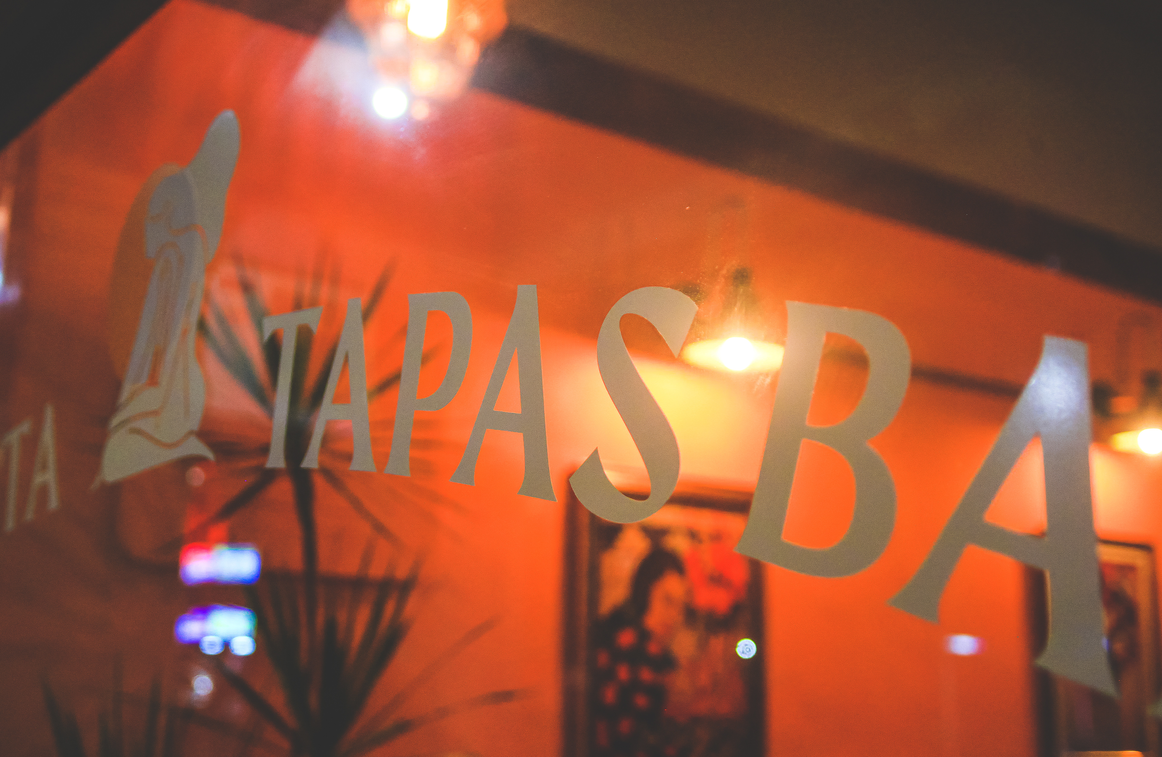
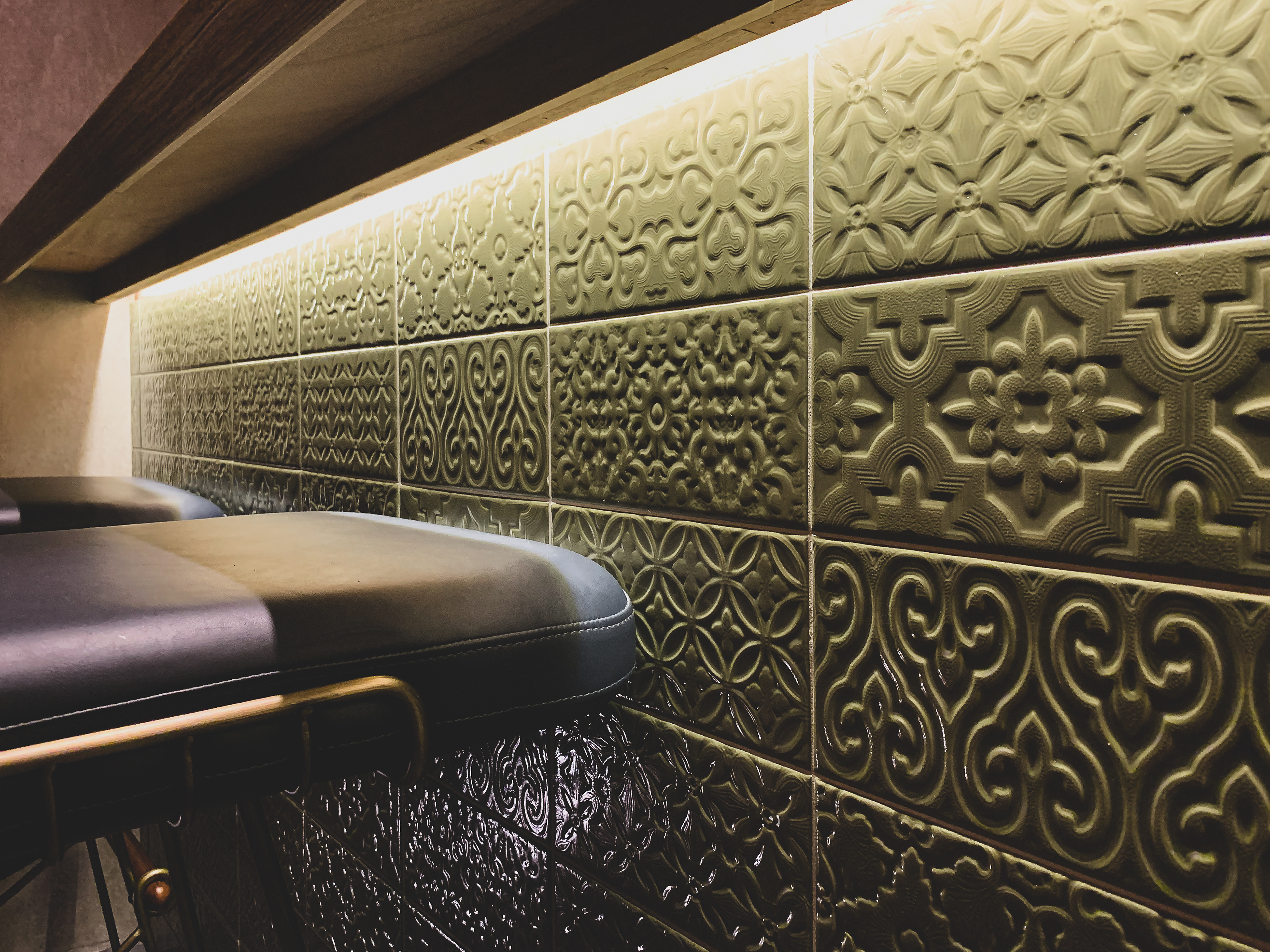
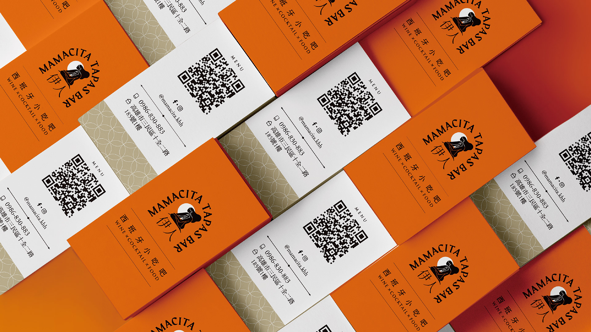
Branding|Mamacita Tapas Bar
伊人·西班牙小吃吧
Tapas不只是一道菜,而是生活文化美學。
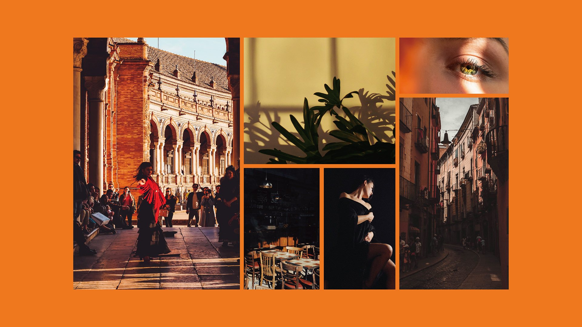
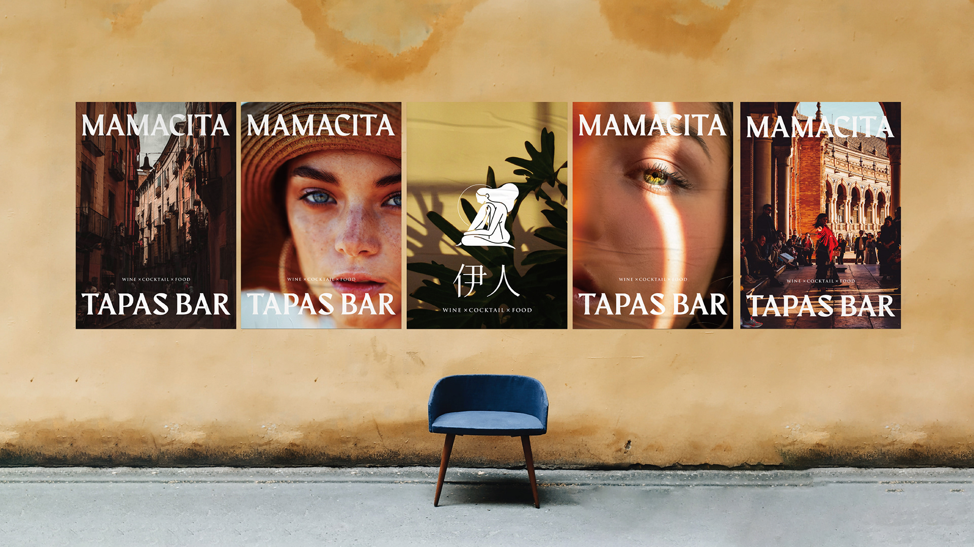
當你漫步在西班牙的城市街道上,琳瑯滿目的酒吧映入眼簾,那裡總會販賣著小份量且多樣化的Tapas餐點。你可以在酒吧裡與身旁的人相談甚歡,一起分享餐點並享受舒適的環境,就像去到好友家聚會一樣。對於西班牙人來說,Tapas文化不僅只是食物與美酒,更是一種人與人之間的交流。
Mamacita的創辦者認為,Tapas之所以流傳世界,正在於其多變的特性。為了創造出屬於自己的Tapas文化,於是將東西方各種食材進行融合創造,並且以合理的價格提供給消費者,使這一新飲食文化更能夠被在地的消費者接受。
-
當你漫步在西班牙的城市街道上,琳瑯滿目的酒吧映入眼簾,那裡總會販賣著小份量且多樣化的Tapas餐點。你可以在酒吧裡與身旁的人相談甚歡,一起分享餐點並享受舒適的環境,就像去到好友家聚會一樣。對於西班牙人來說,Tapas文化不僅只是食物與美酒,更是一種人與人之間的交流。
Mamacita的創辦者認為,Tapas之所以流傳世界,正在於其多變的特性。為了創造出屬於自己的Tapas文化,於是將東西方各種食材進行融合創造,並且以合理的價格提供給消費者,使這一新飲食文化更能夠被在地的消費者接受。
-
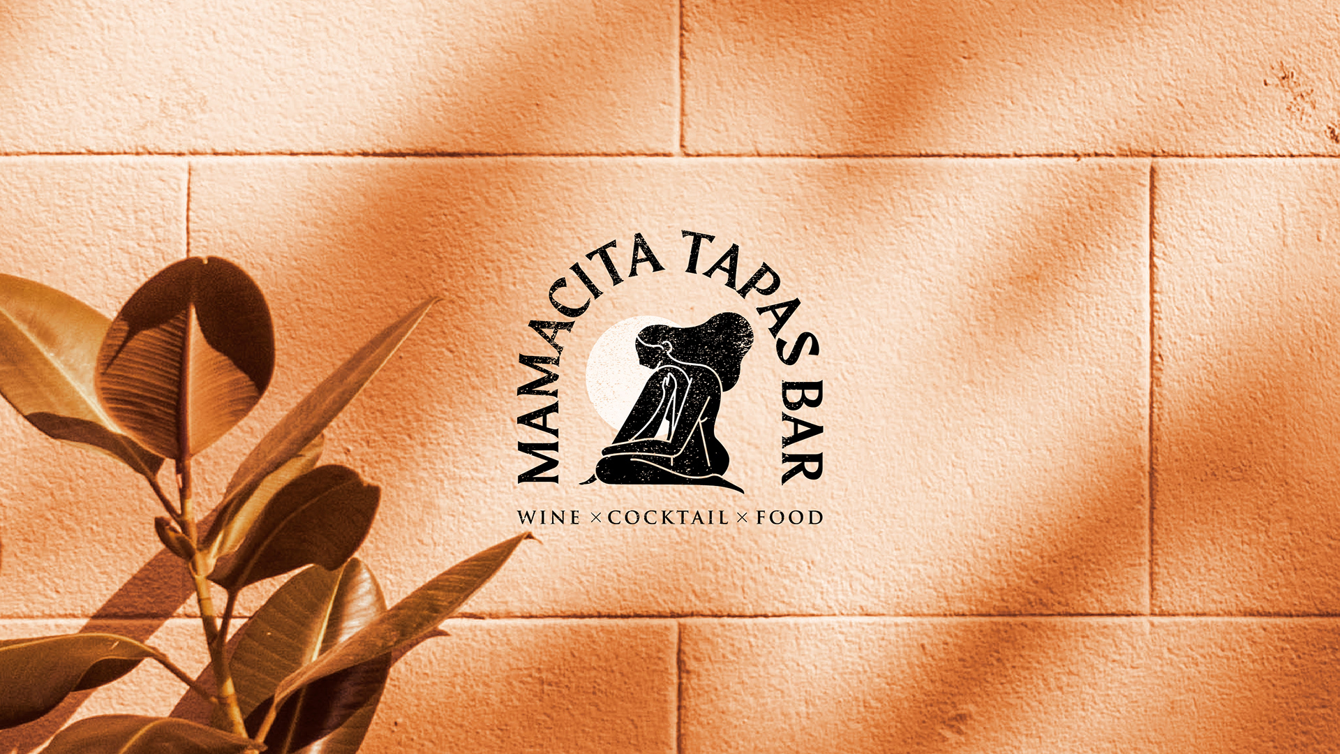
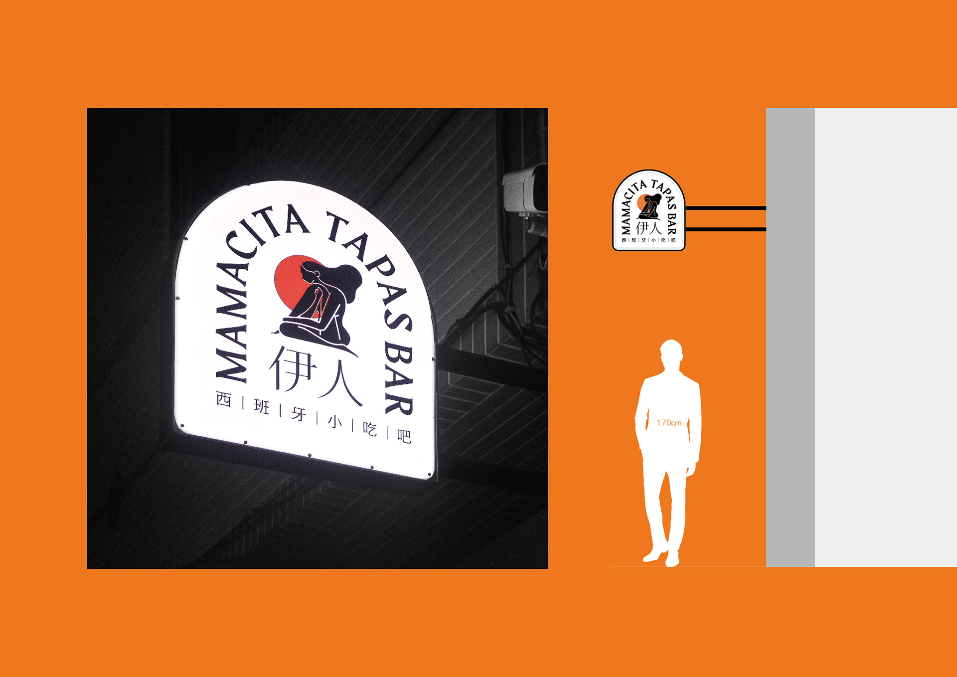
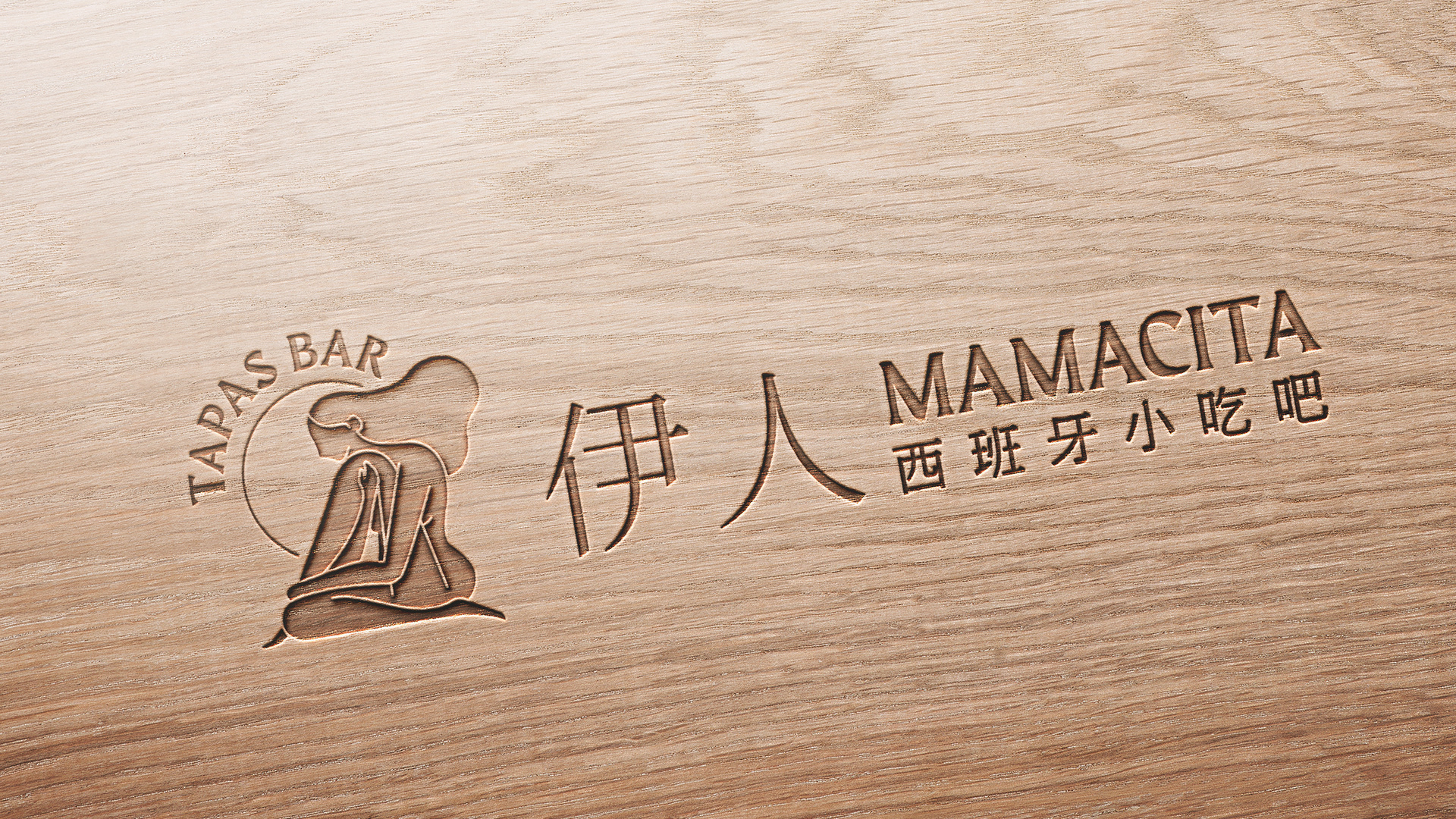
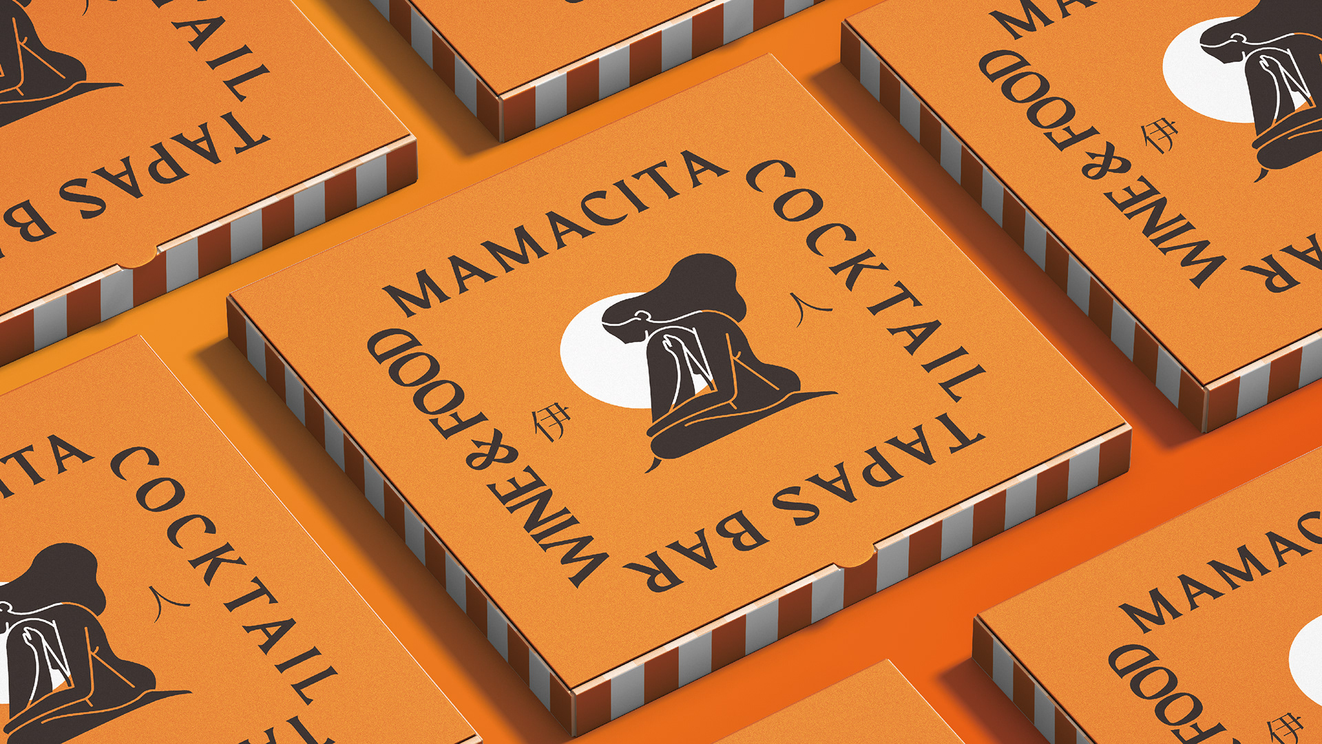
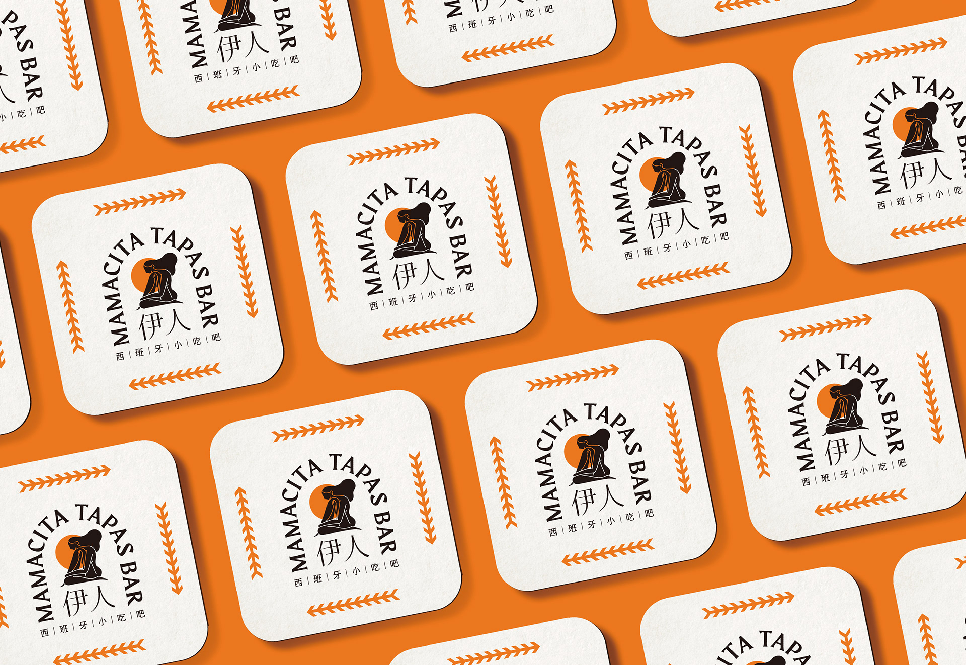
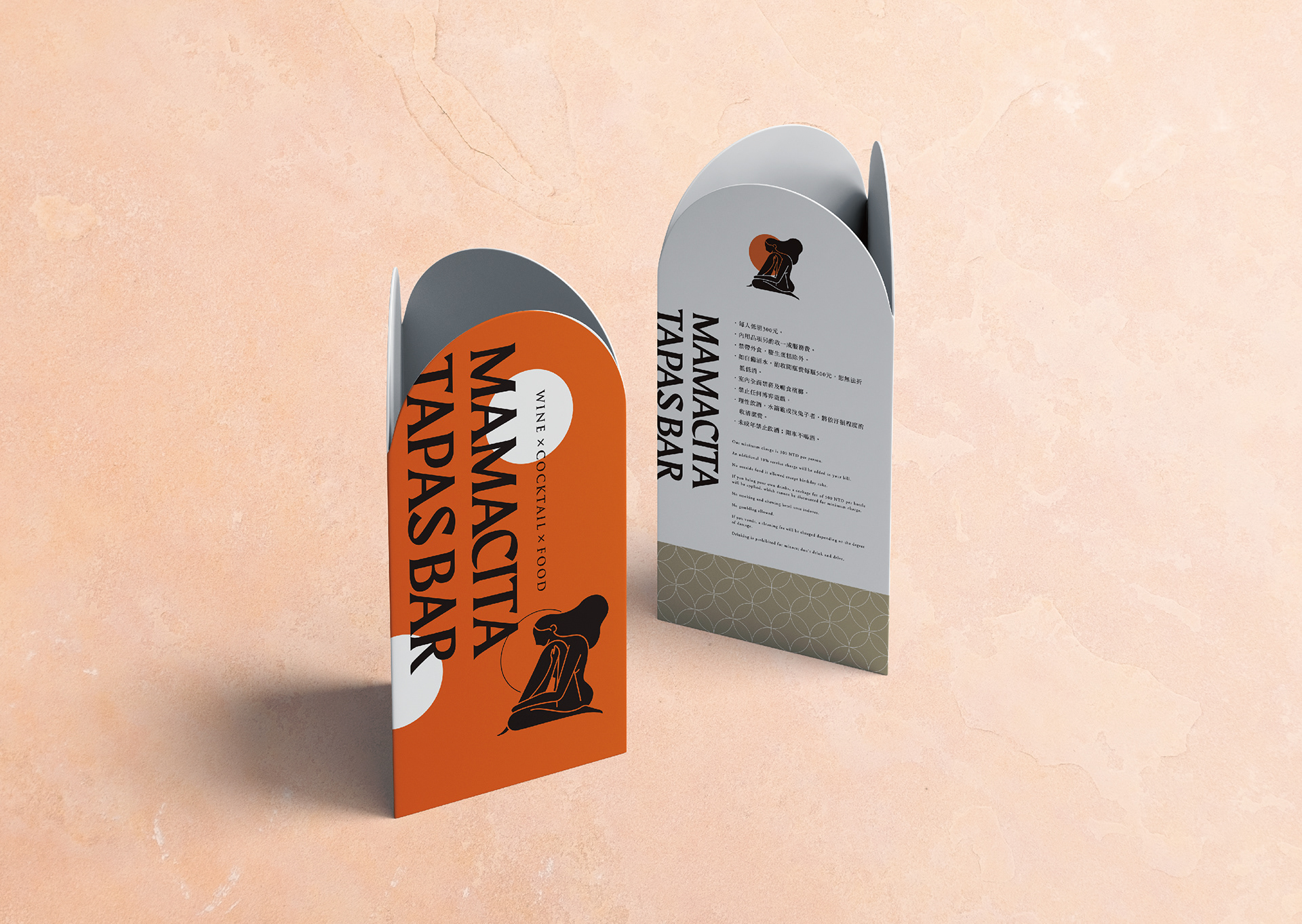
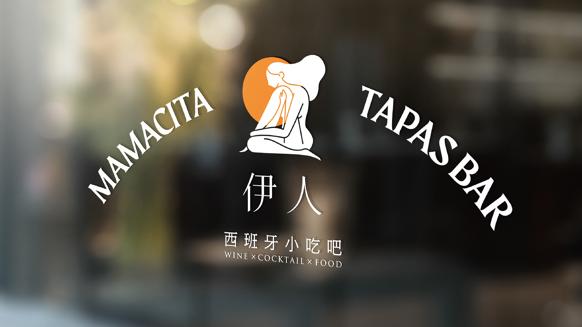
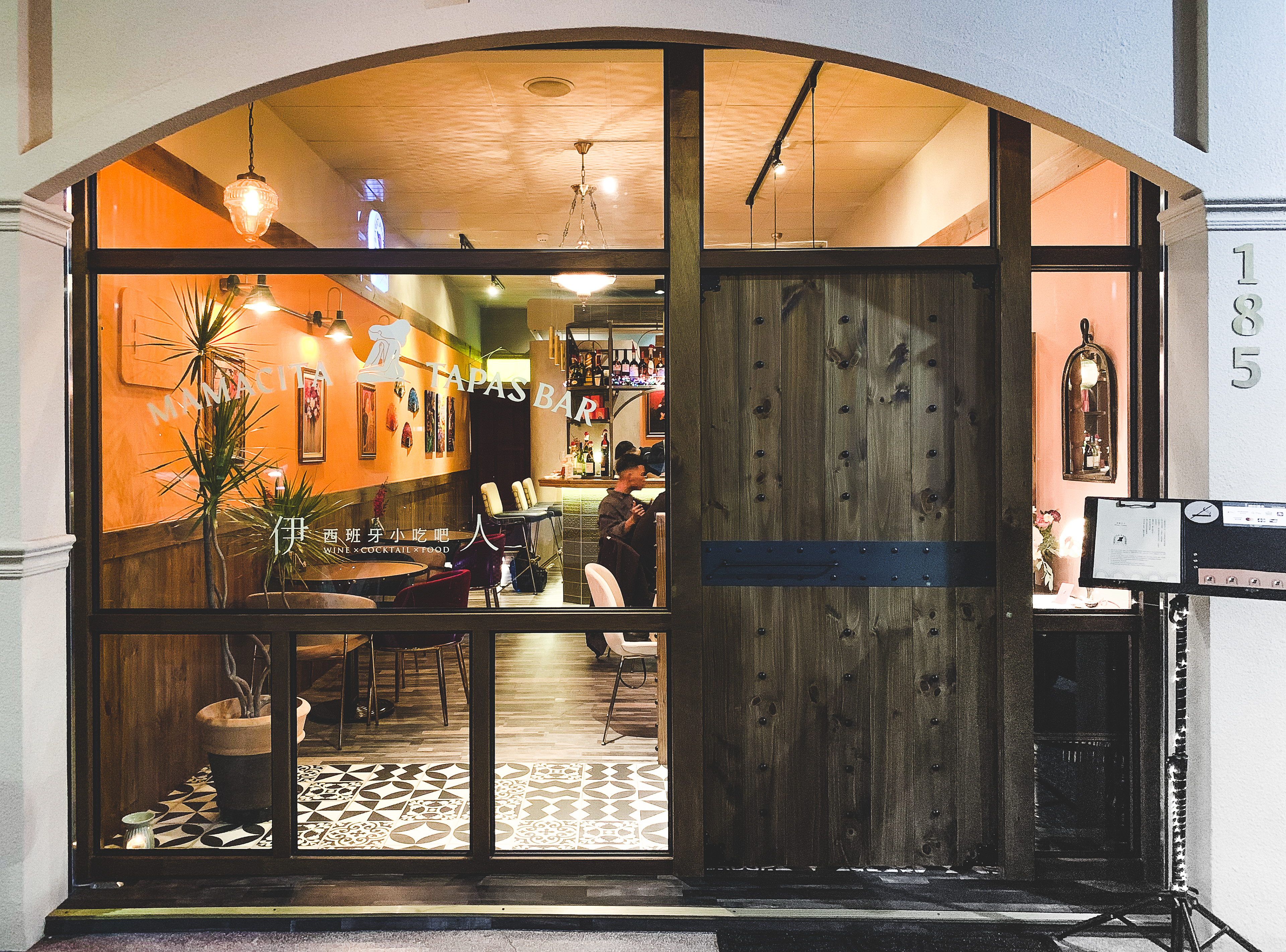
在本次的品牌識別中,創辦者以mamacita作為品牌名稱,在西班牙語中代表著風塵女子之意。在標誌設計上,我們以女性舞者所代表的視覺特質-如律動、自我展現、身體線條等元素作為切入點,並以較為簡約的表現手法進行繪製人像,猶如地中海遺跡中常見的黑彩陶器彩繪。
Tapas is not just a dish, but an aesthetic of life culture.
As you stroll the streets of Spanish cities, you'll see bars selling Tapas in small and varied sizes. You can have fun at the bar with the people around you, share your meals and enjoy the comfort of your surroundings, just like going to a friend's house for a party. For Spaniards, Tapas is more than just food and wine. It's a way of connecting with people.
Tapas, according to Mamacita's founders, has spread around the world because of its varied nature. In order to create our own Tapas culture, we fused eastern and Western ingredients together and provided them to consumers at a reasonable price, so that this new food culture could be more acceptable to local consumers.
-
In this brand recognition, the founder takes Mamacita as the brand name, which stands for woman of prostitution in Spanish. In the logo design, we use the visual characteristics represented by female dancers, such as rhythm, self-presentation, body lines and other elements as the entry point, and draw portraits with relatively simple expression techniques, just like the black pottery painting commonly seen in Mediterranean ruins.
Type|Branding
Client|Mamacita Tapas Bar 伊人西班牙小吃吧
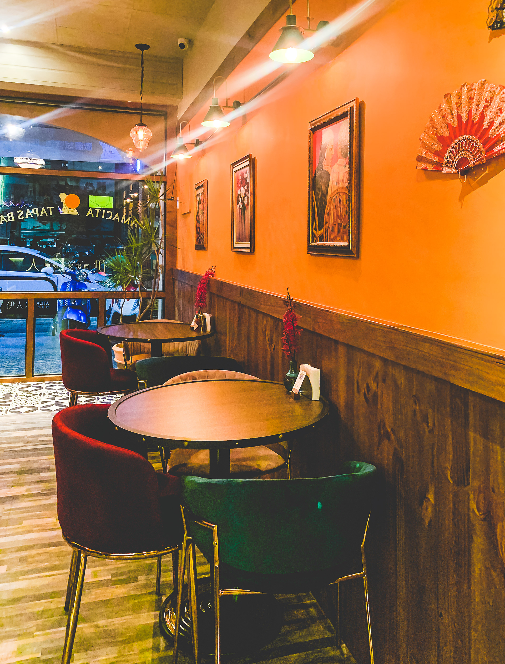
Interior Design|維度空間設計
Identification Design|Louis Chiu , AAOO Studio