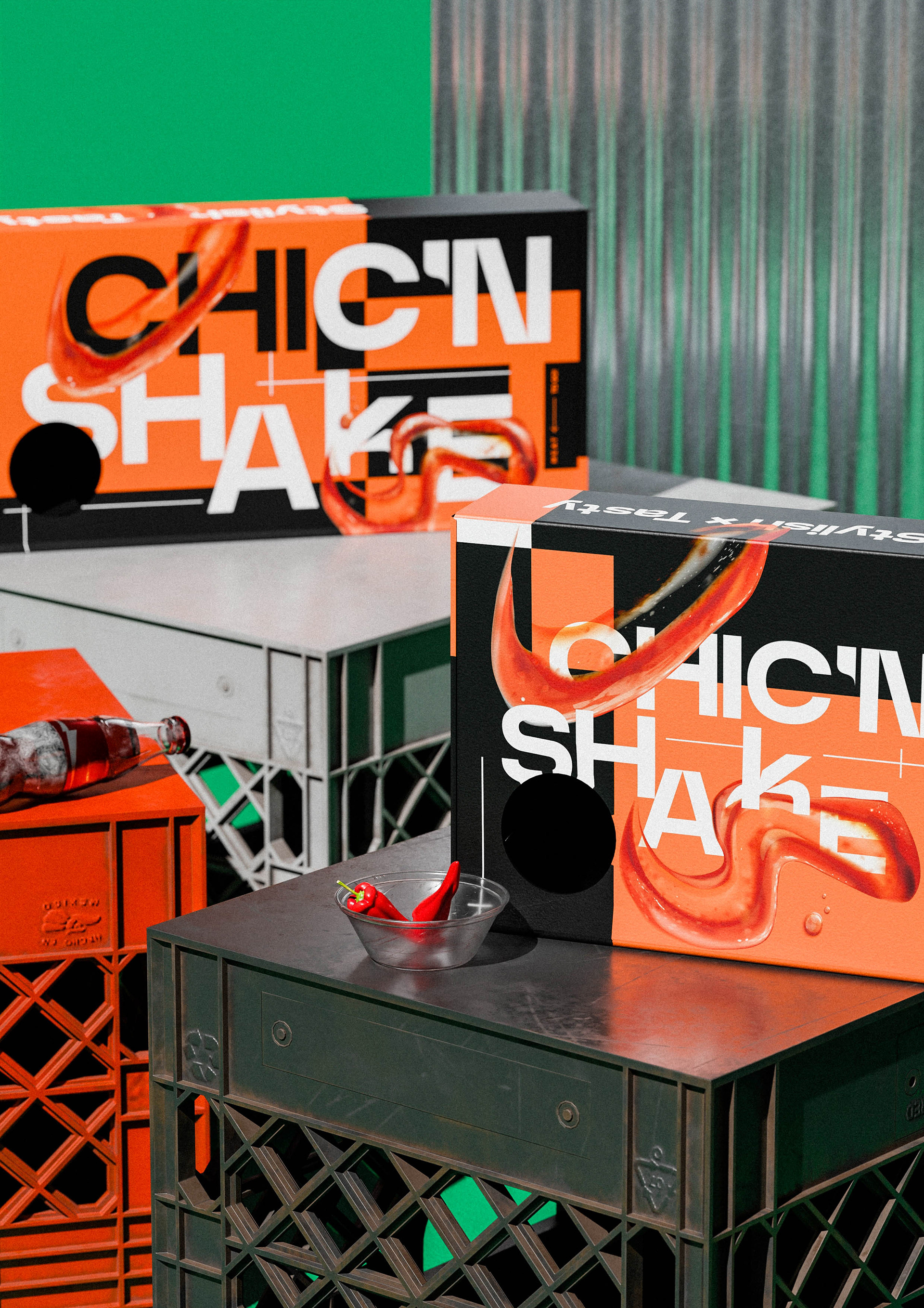
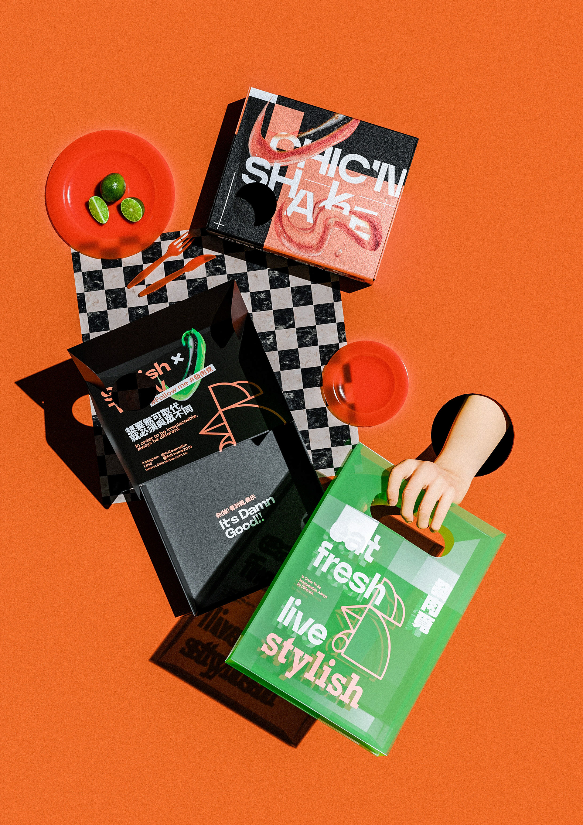
Chic'n Shake Packaging design
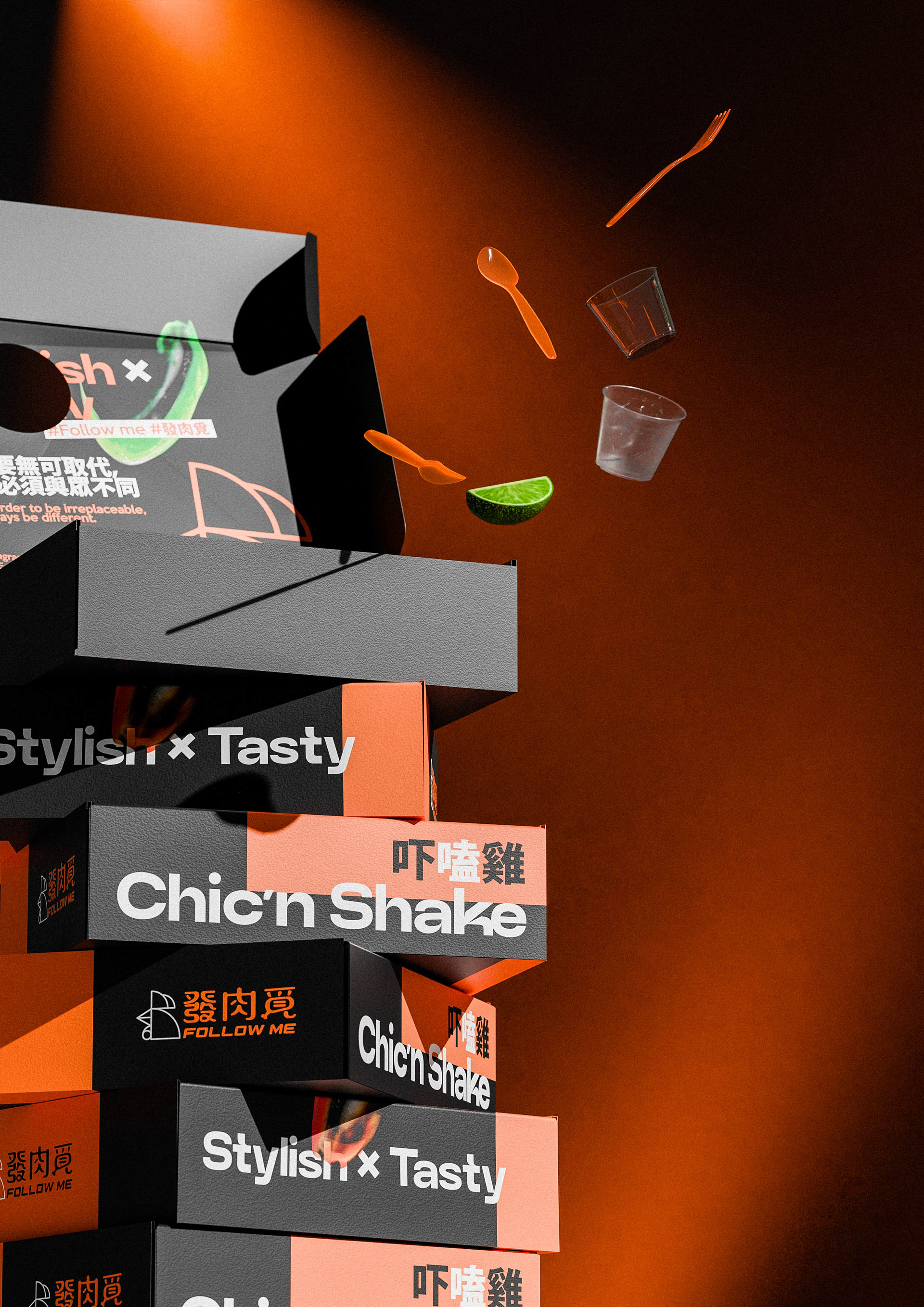
發肉覓包裝設計
發肉覓包裝設計

你咬下去的,是一種態度
烤雞不是路人,是主角。
我們選擇以橘色與黑色作為主色,橘色點燃食慾,黑色保持俐落。包裝採用標語式編排,以大面積文字呼喚行動,打造具有號召力的視覺語言——每一餐不只是填飽肚子,更是對「健康、時尚、純粹」生活風格的選擇宣言,俐落、不做作;彷彿要掀起一場味覺的革命。
「吃什麼,決定你想成為誰。」
我們選擇以橘色與黑色作為主色,橘色點燃食慾,黑色保持俐落。包裝採用標語式編排,以大面積文字呼喚行動,打造具有號召力的視覺語言——每一餐不只是填飽肚子,更是對「健康、時尚、純粹」生活風格的選擇宣言,俐落、不做作;彷彿要掀起一場味覺的革命。
「吃什麼,決定你想成為誰。」
Chic’n Shake,用最簡單的形式,說最有力的話。
準備好,就來咬;不夠帥,就別拆包裝。

What you bite into is an attitude.
Chicken isn’t a side character — it’s the star.
We chose orange and black as the primary colors: orange ignites the appetite, black keeps it sharp. The packaging uses bold, slogan-style layouts, calling for action with large-scale typography. Each meal isn’t just about filling you up — it’s a declaration of a lifestyle: healthy, stylish, and pure. Clean-cut, no frills; like a flavor revolution waiting to happen.
We chose orange and black as the primary colors: orange ignites the appetite, black keeps it sharp. The packaging uses bold, slogan-style layouts, calling for action with large-scale typography. Each meal isn’t just about filling you up — it’s a declaration of a lifestyle: healthy, stylish, and pure. Clean-cut, no frills; like a flavor revolution waiting to happen.
“What you eat defines who you want to be.”
Chic’n Shake speaks loud with the simplest form.
Ready? Then bite. If you can’t pull it off, don’t open it.

專案類型 Type | 識別 Identity
專案年份 Year | 2025
客戶 Client|發肉覓
製作單位 Production | AAOO Studio