
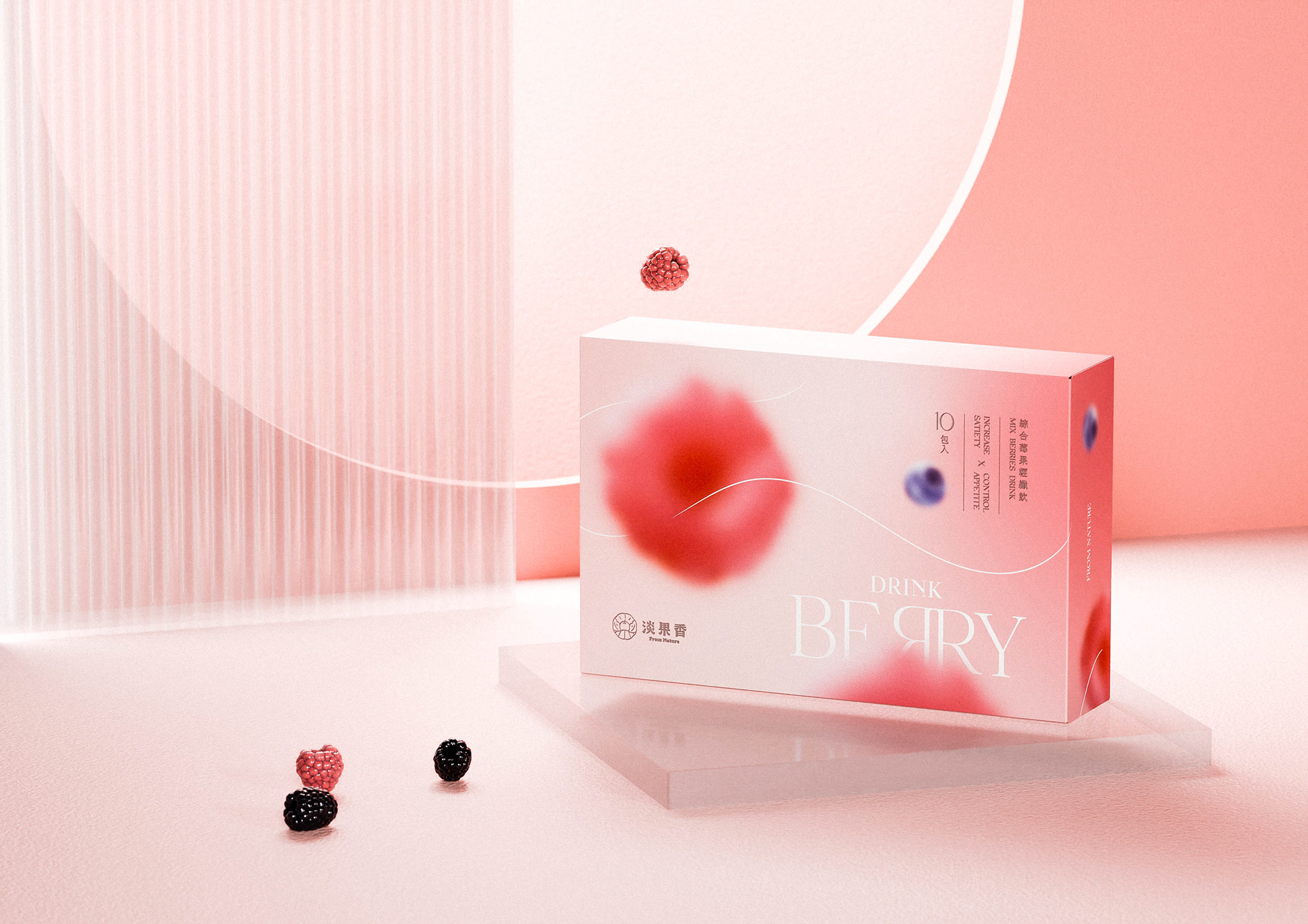
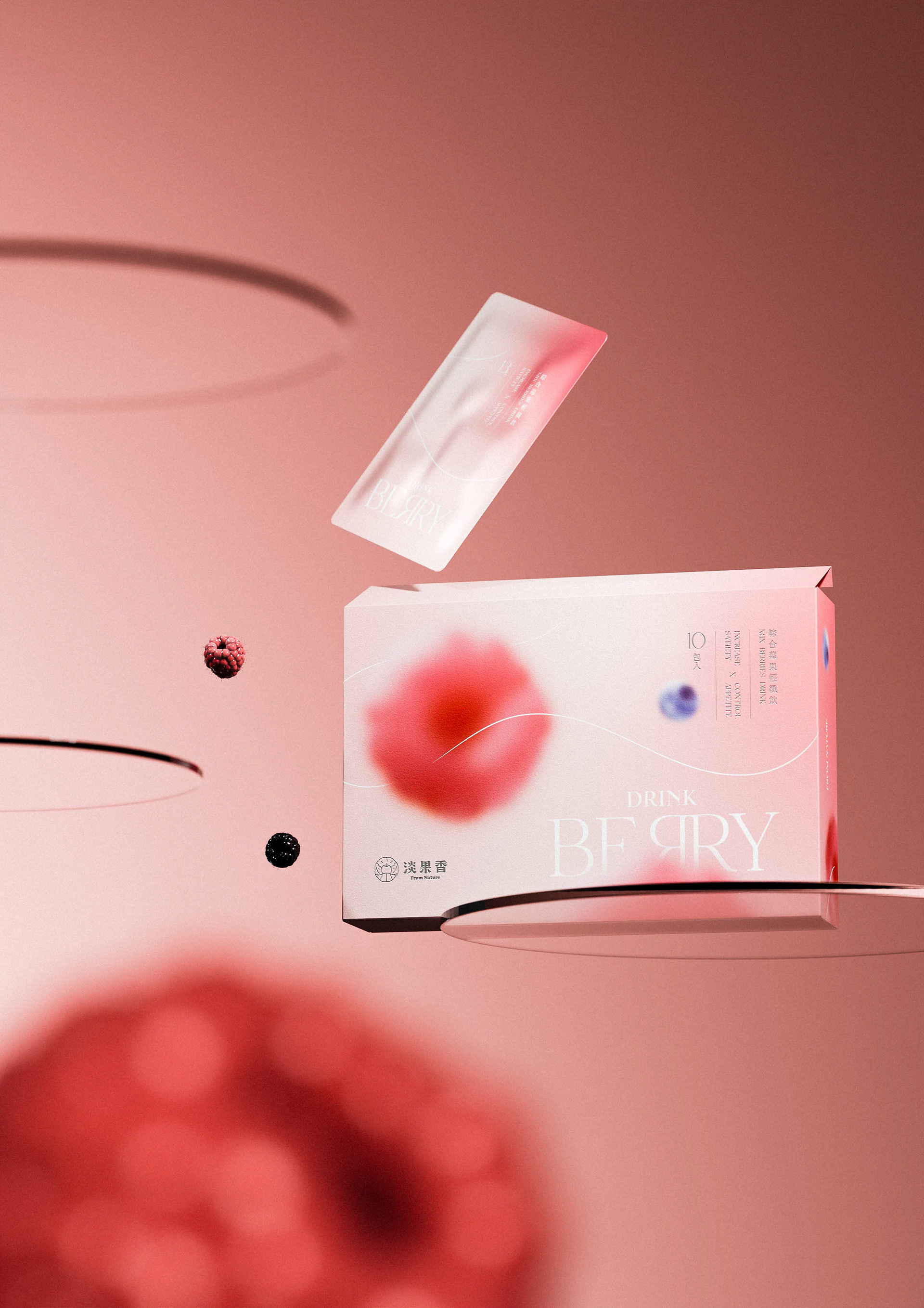
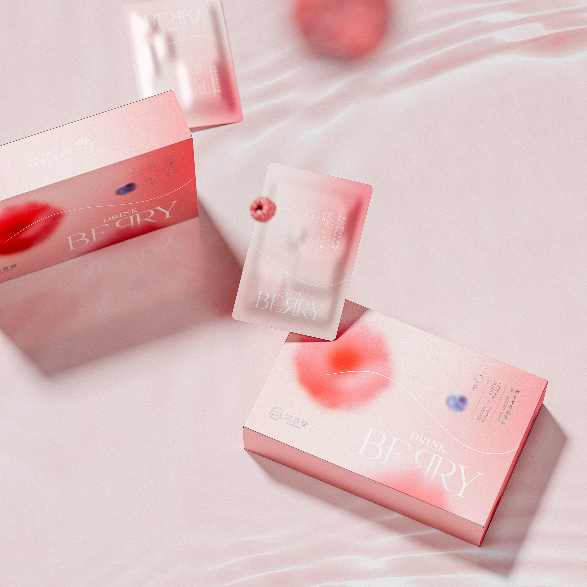
綜合莓果輕纖飲包裝設計
Drink berry packaging design
Drink berry packaging design
一口讓日常慢下來的飲品設計
我們想像這個飲品,不是一種功能性的補給,
而是生活裡一個微小但確實存在的儀式。
我們想像這個飲品,不是一種功能性的補給,
而是生活裡一個微小但確實存在的儀式。
將莓果的色彩簡化為柔霧漸層,讓包裝更貼近日常而非過度包裝。
不使用誇張的圖像,不強調機能語言,而是透過材質與顏色的處理,呈現產品本身的節奏與節制。
排版上我們選擇讓訊息有呼吸空間,讓使用者在看到時感受到清晰、有條理,而非干擾。
這不只是設計一個包裝,而是回應一種當代消費者的生活狀態——
簡單、有感,但不喧嘩。

A sip that slows down the everyday.
We imagine this drink not as a functional supplement,
but as a small, intentional ritual embedded in daily life.
but as a small, intentional ritual embedded in daily life.
The berry-inspired color palette is reduced to soft, misty gradients,
bringing the packaging closer to the rhythms of everyday living—without excess.
bringing the packaging closer to the rhythms of everyday living—without excess.
No exaggerated imagery, no emphasis on functionality.
Instead, the material and color choices convey a sense of pace and restraint.
Instead, the material and color choices convey a sense of pace and restraint.
In typography, we created space for the message to breathe,
so that what’s seen feels clear, structured, and never intrusive.
so that what’s seen feels clear, structured, and never intrusive.
This isn’t just a packaging design.
It’s a response to how modern consumers live—
simple, thoughtful, and quietly present.
It’s a response to how modern consumers live—
simple, thoughtful, and quietly present.

專案類型 Type | Packaging 包裝
專案年份 Year | 2025
客戶 Client|淡果香
製作單位 Production | AAOO Studio , Yu Jie Li