
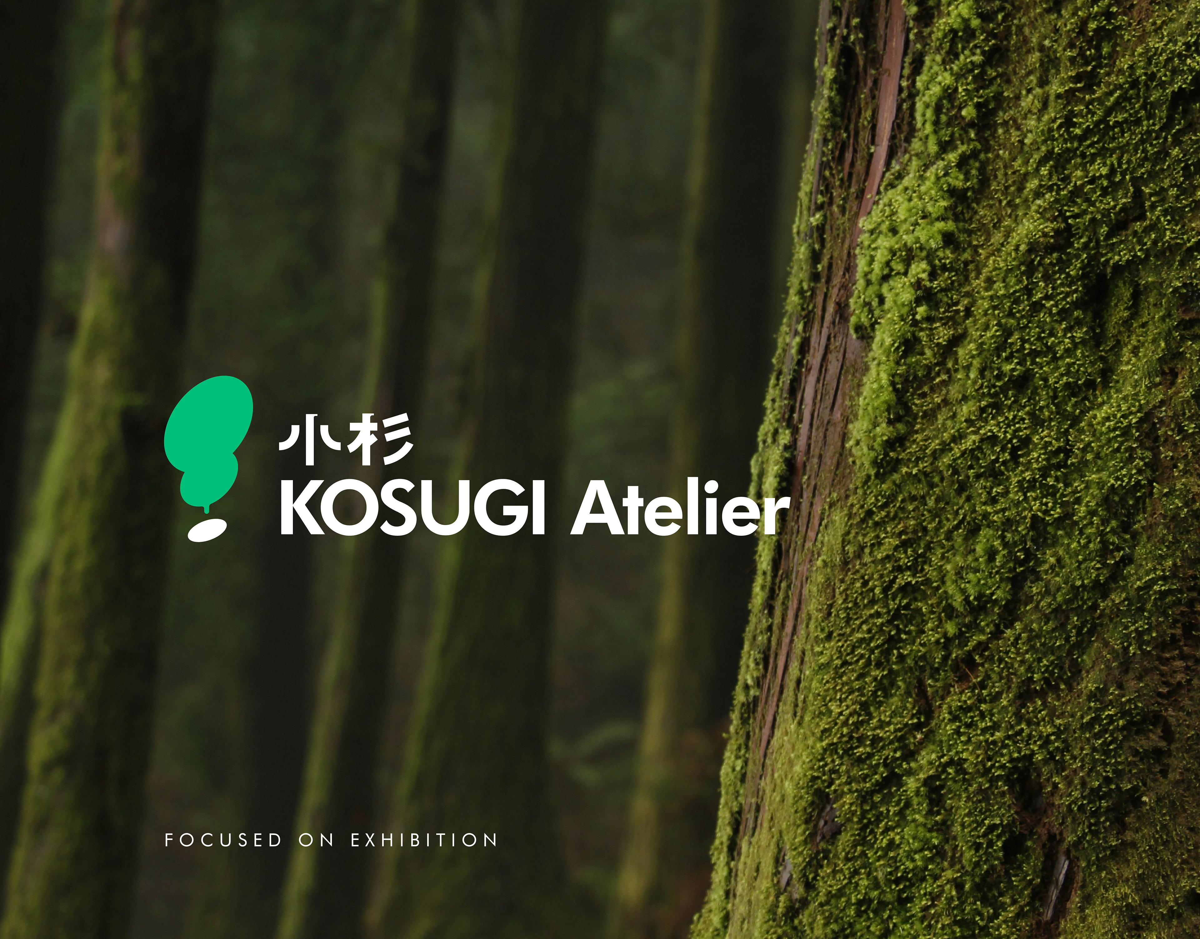
創意往往始於瞬間的靈光一現,而策展則是落地生根的過程。
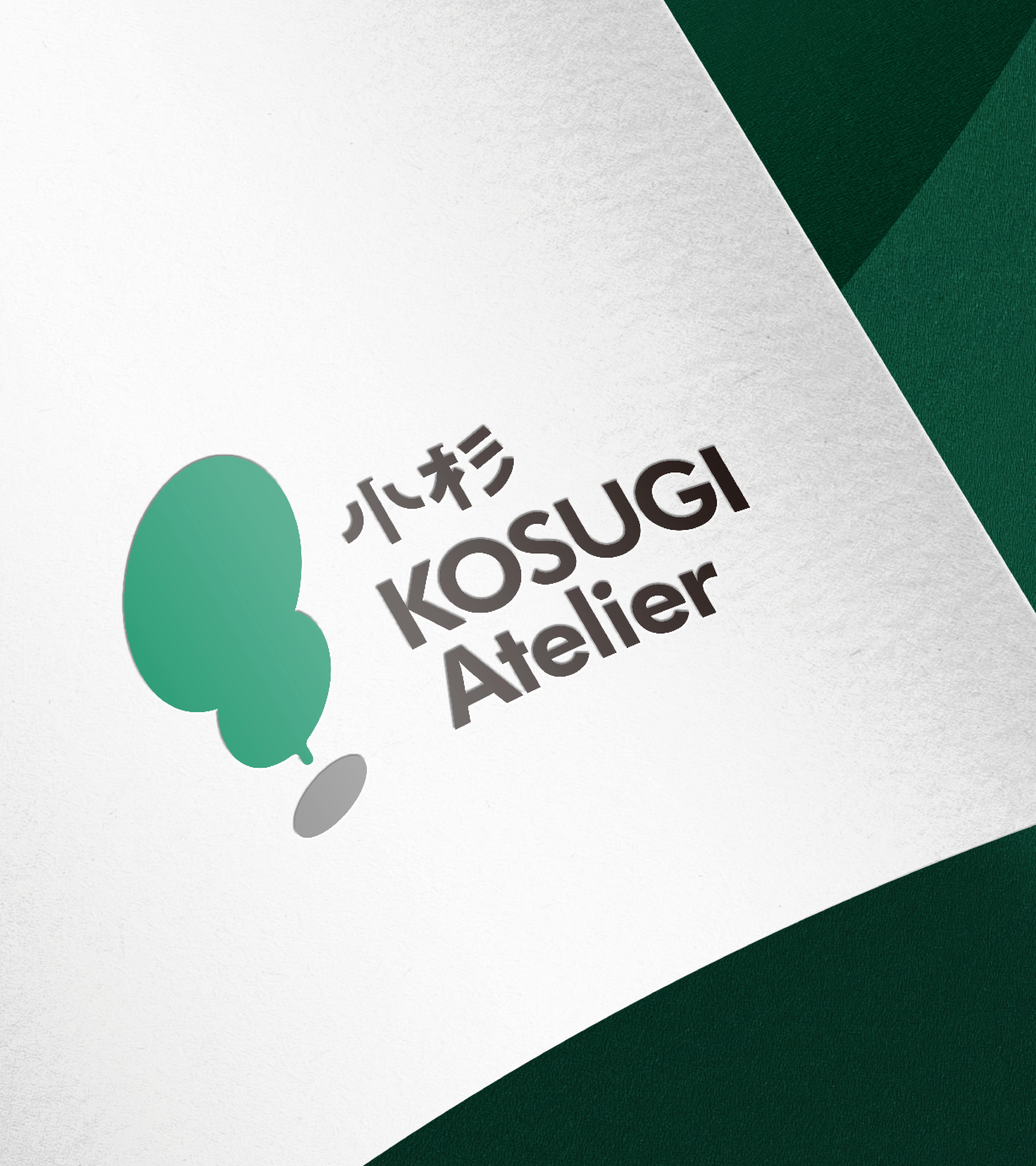
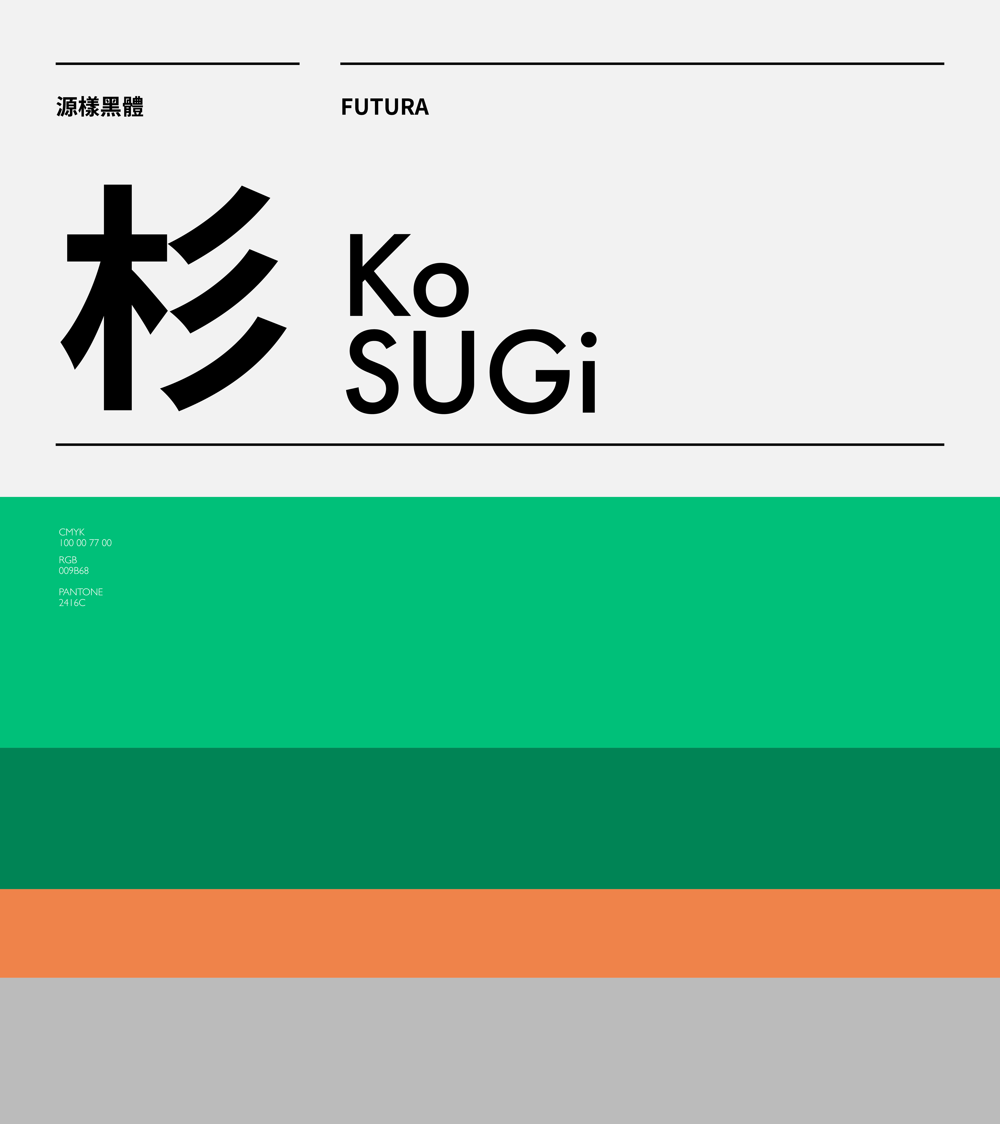
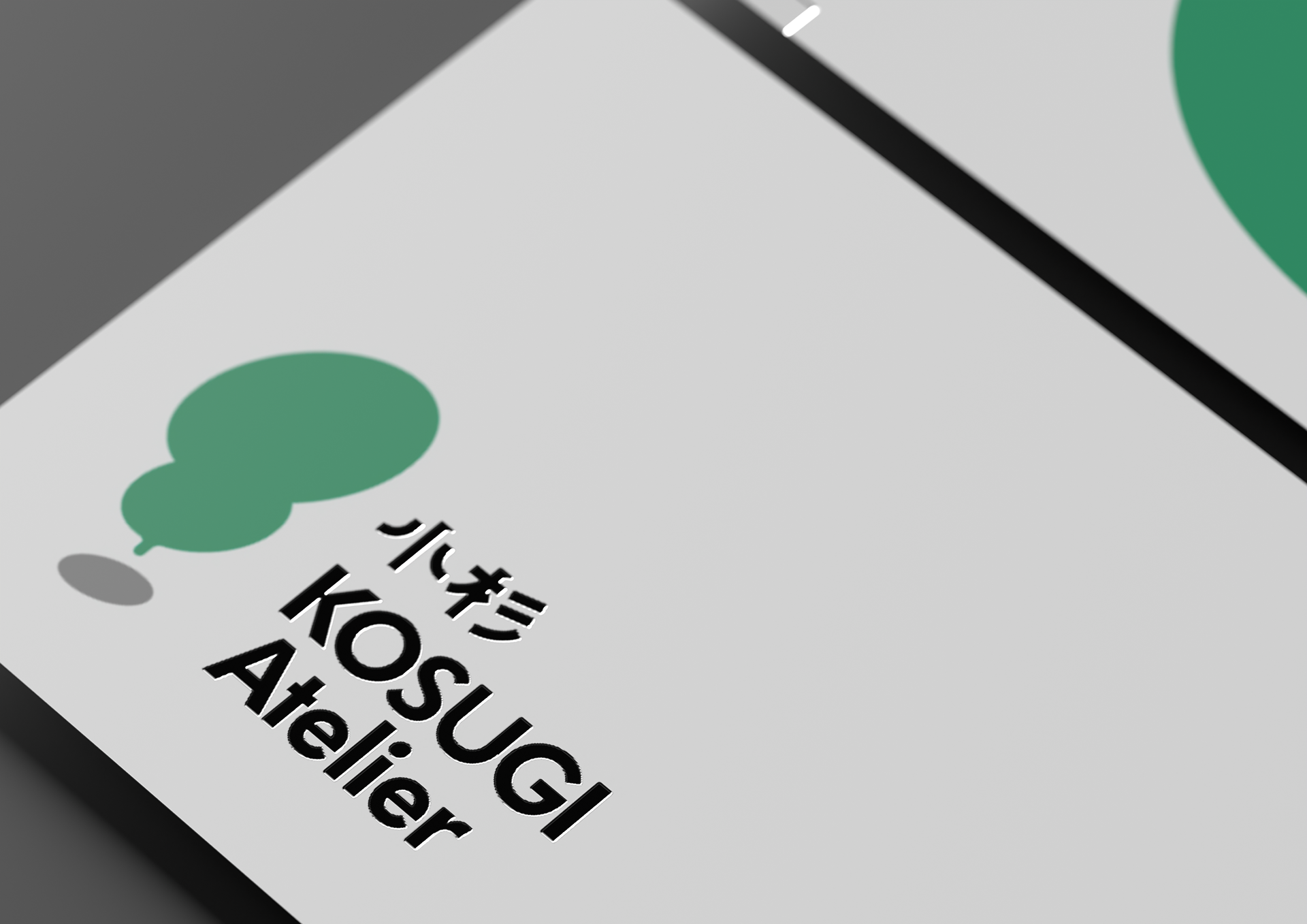
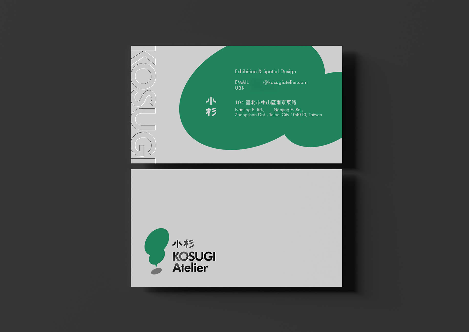
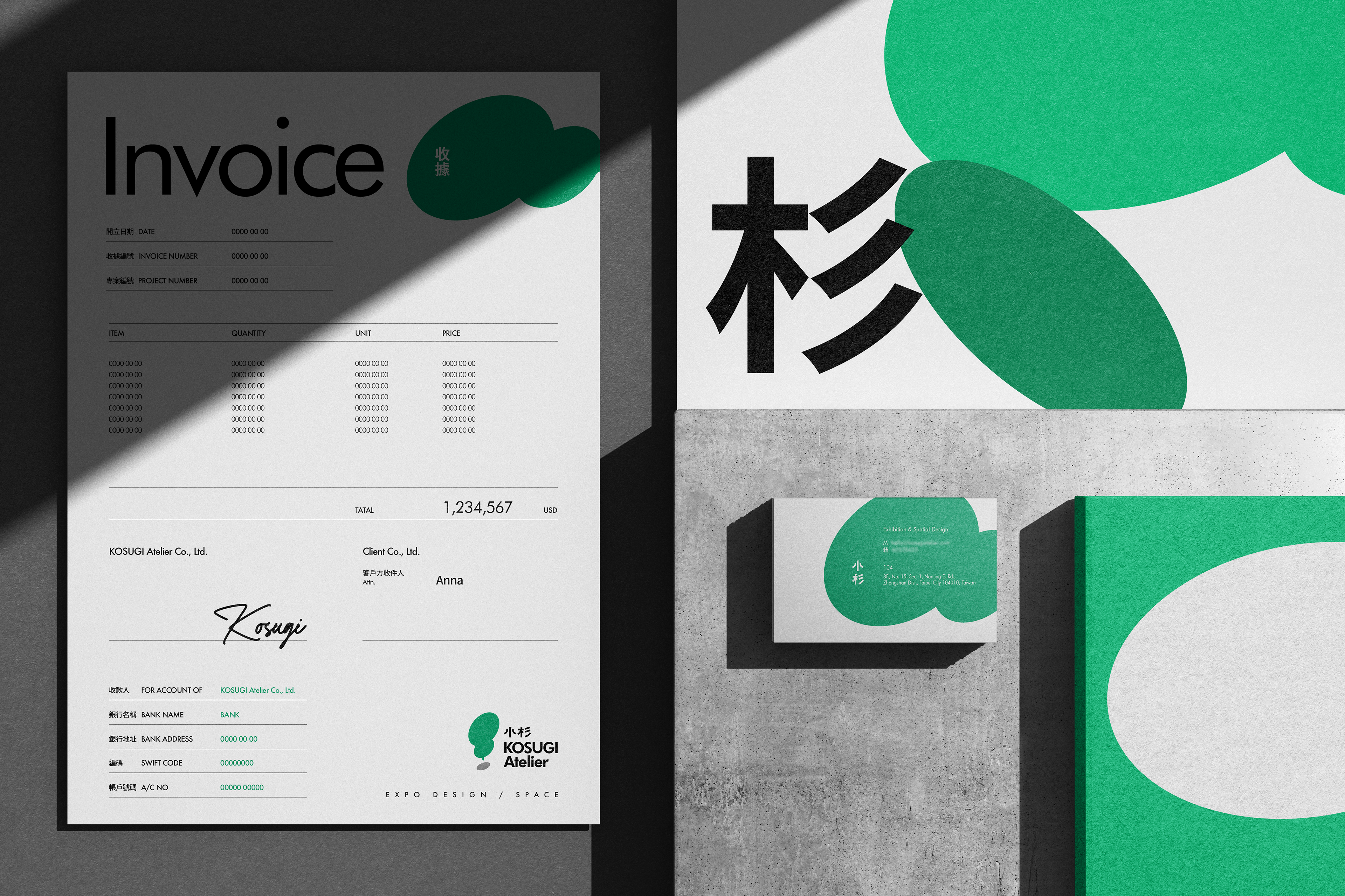
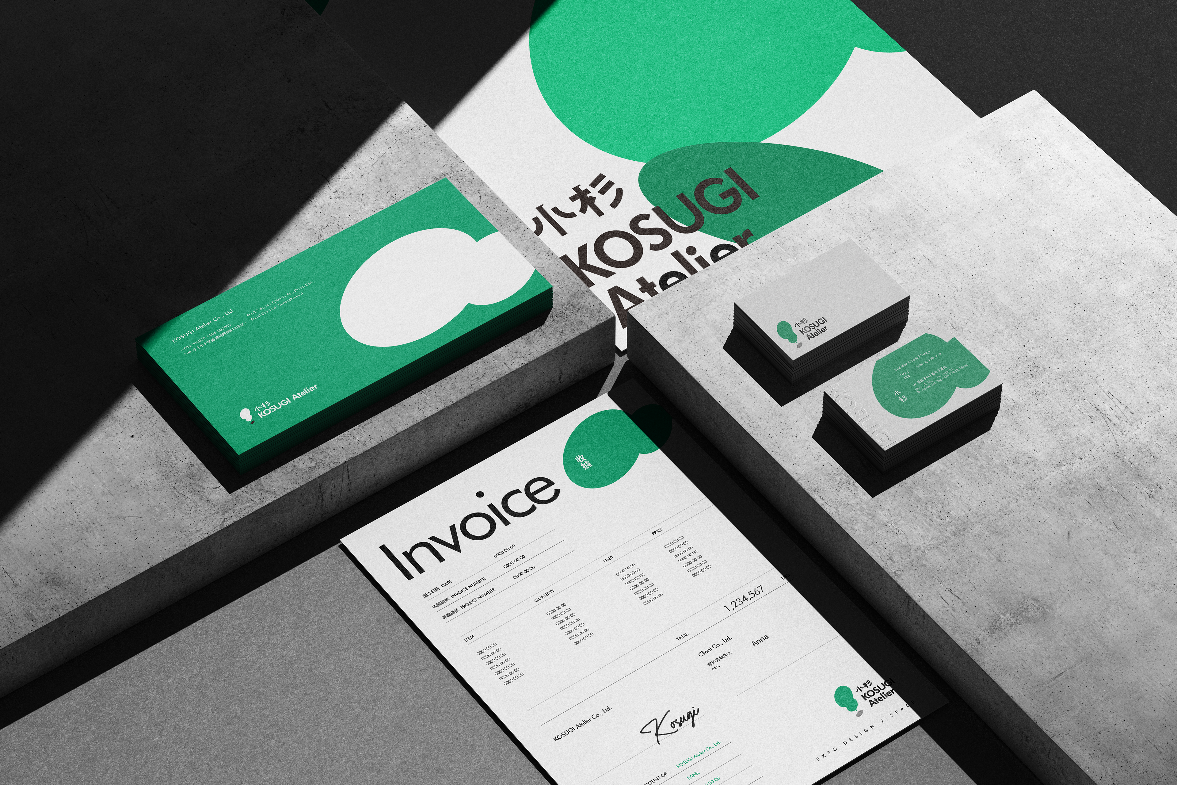
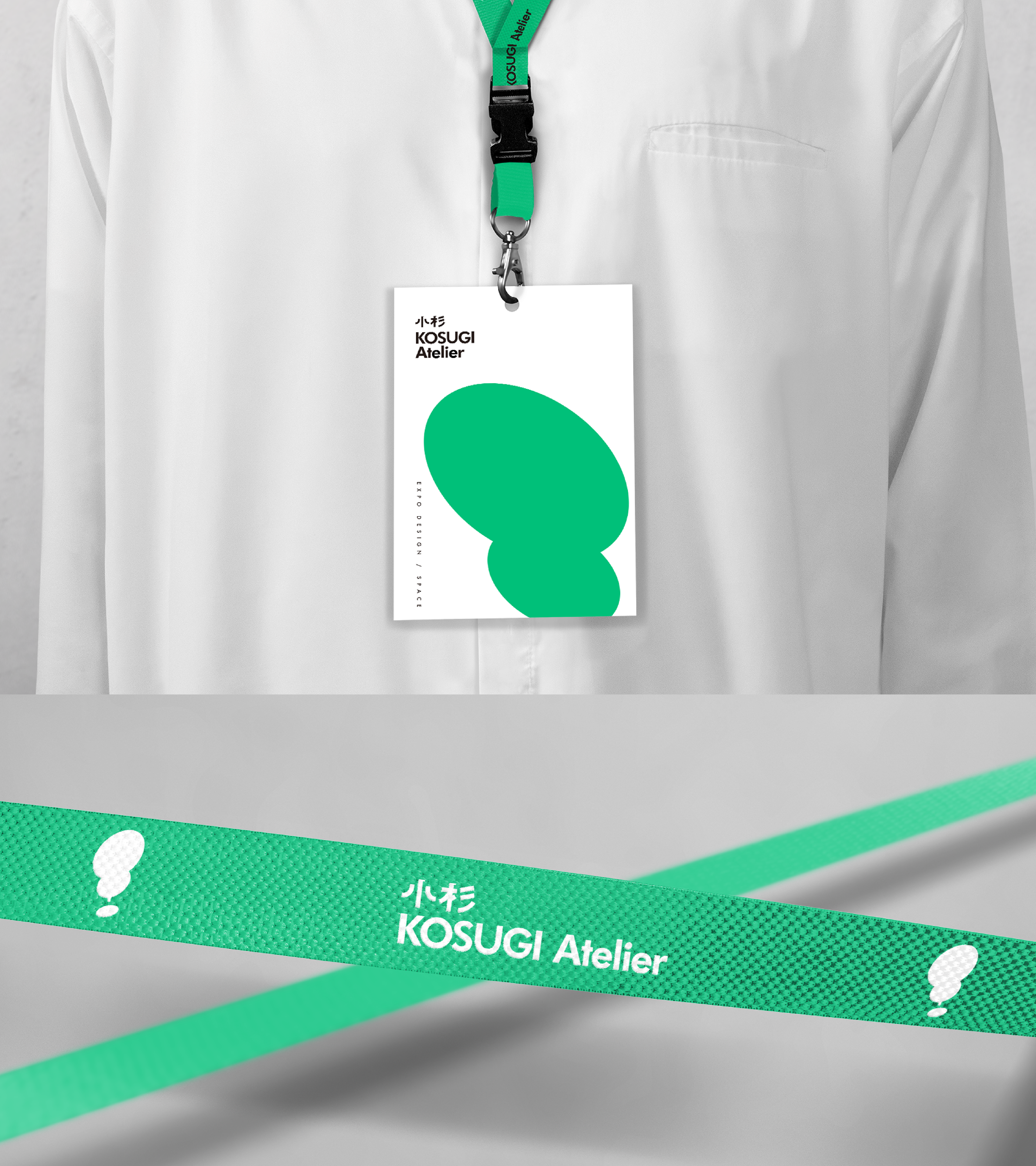
我們將"小杉"名稱的樹木意象與"驚嘆號"互相結合構成標誌的核心,
主體綠色塊面可視做初見萌發的樹苗;亦可轉化為提案與對話時的對話框,
代表團隊在策展過程中不斷回應需求、提出解決方案的溝通本質。下方的圓點則如沉穩基石,
支撐著上方持續發芽的創意形態。
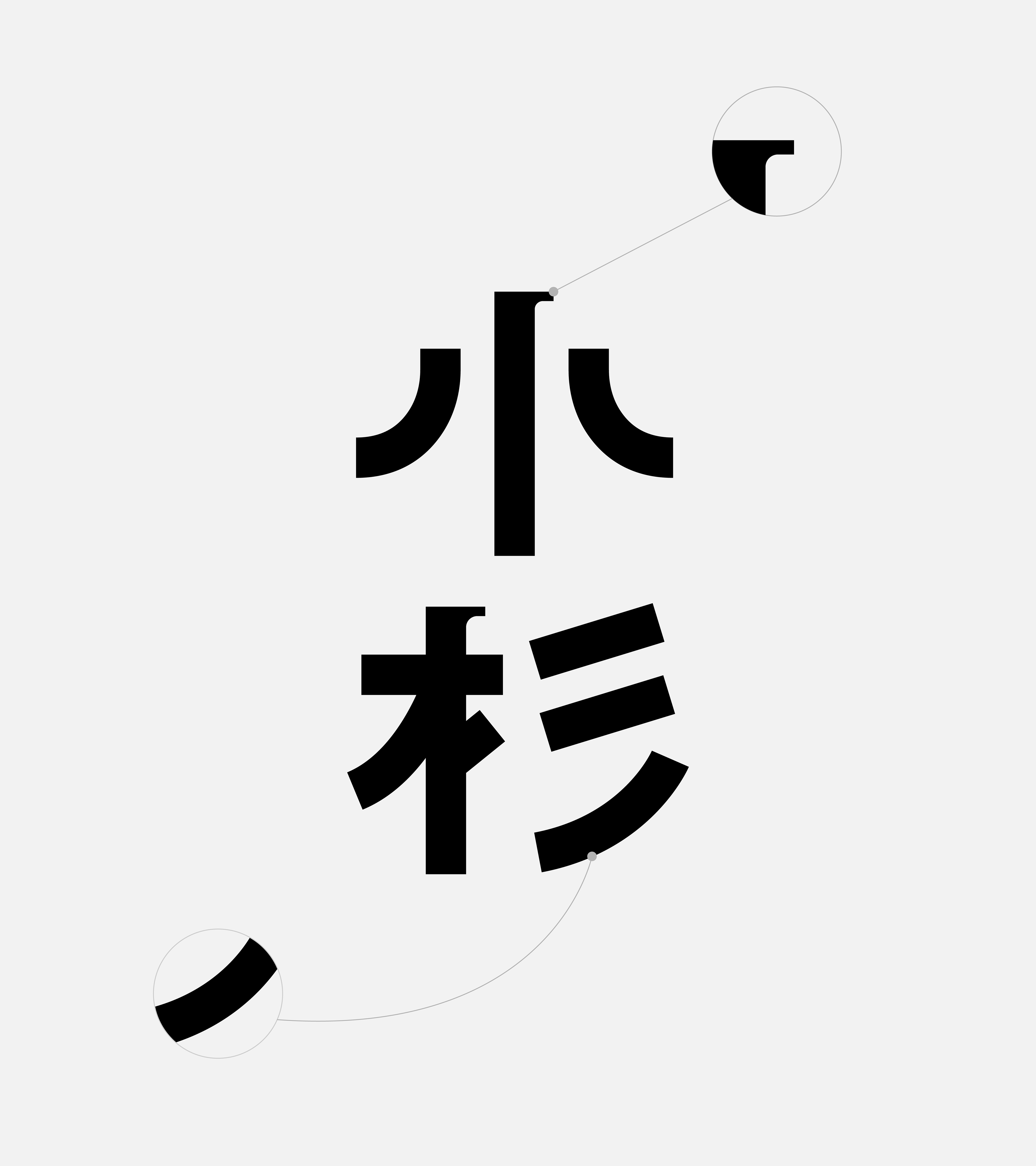
整體設計以簡約幾何結構連結品牌名稱與創意專業,
傳達小杉策展每次都能為客戶帶來驚喜與深刻感動的品牌承諾。


Creativity often begins with a sudden spark of inspiration, while curation is the process of bringing that spark to life and allowing it to take root.
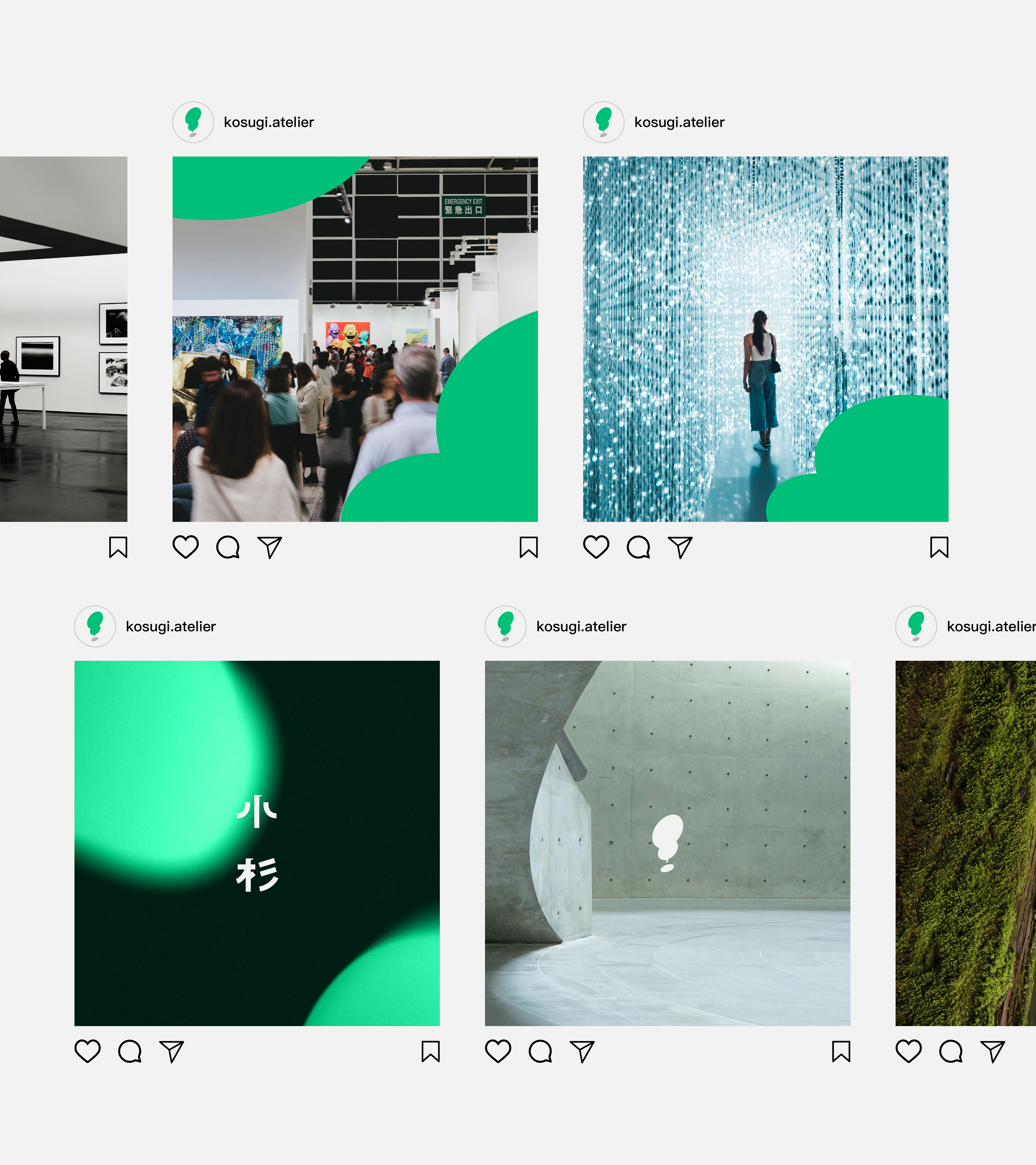
At the core of the logo, we combine the tree imagery embedded in the name “Xiaoshan” with the form of an exclamation mark. The main green shape can be seen as a young sapling just beginning to sprout; it can also be interpreted as a dialogue box representing proposals and conversations. This reflects the team’s communicative nature throughout the curation process—continuously responding to needs and developing solutions. The dot beneath it serves as a steady foundation, supporting the creative form as it continues to grow.
The overall design uses a simple geometric structure to connect the brand name with its creative expertise, expressing Xiaoshan Curation’s brand promise: to bring clients a sense of surprise and create moments that leave a lasting impression with every project.

專案類型 Type | 識別 identity
專案年份 Year | 2026
客戶 Client|Kosugi Atelier
製作單位 Production | AAOO Studio