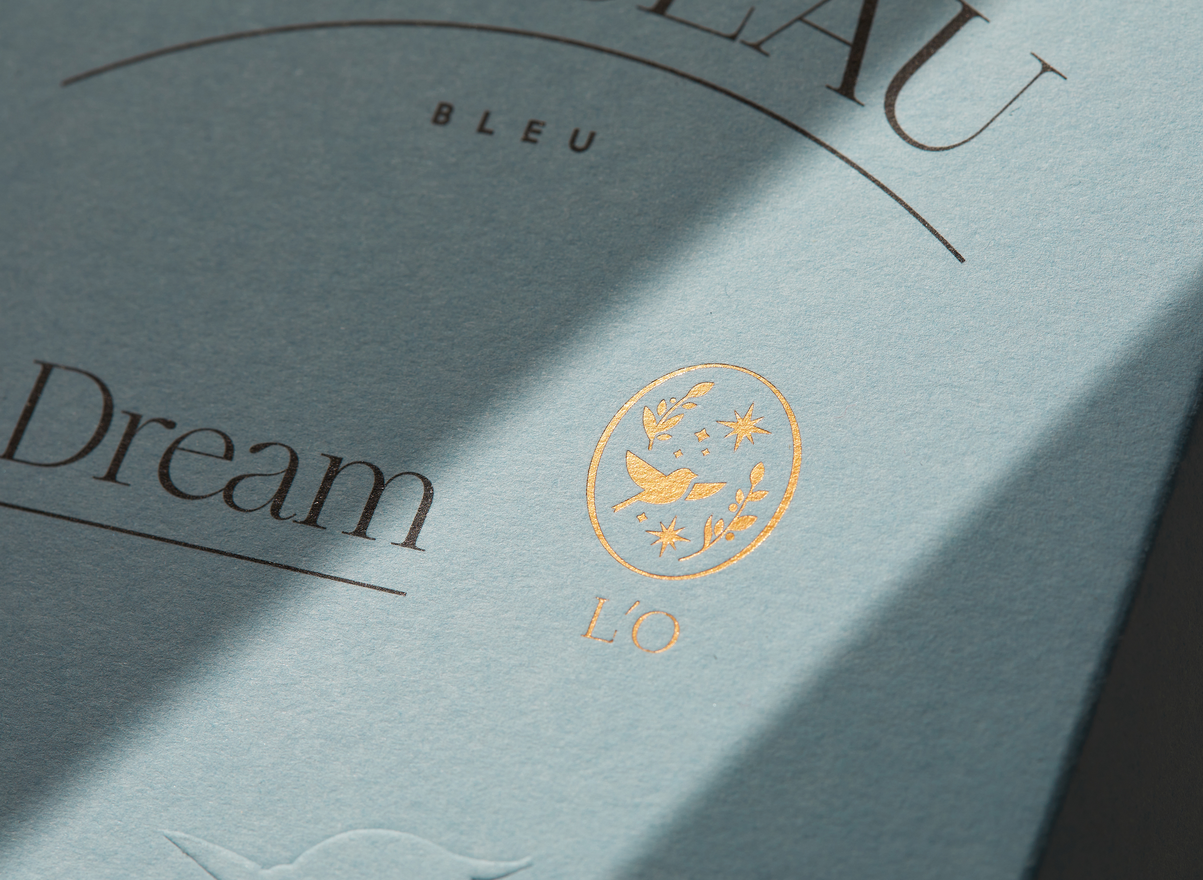
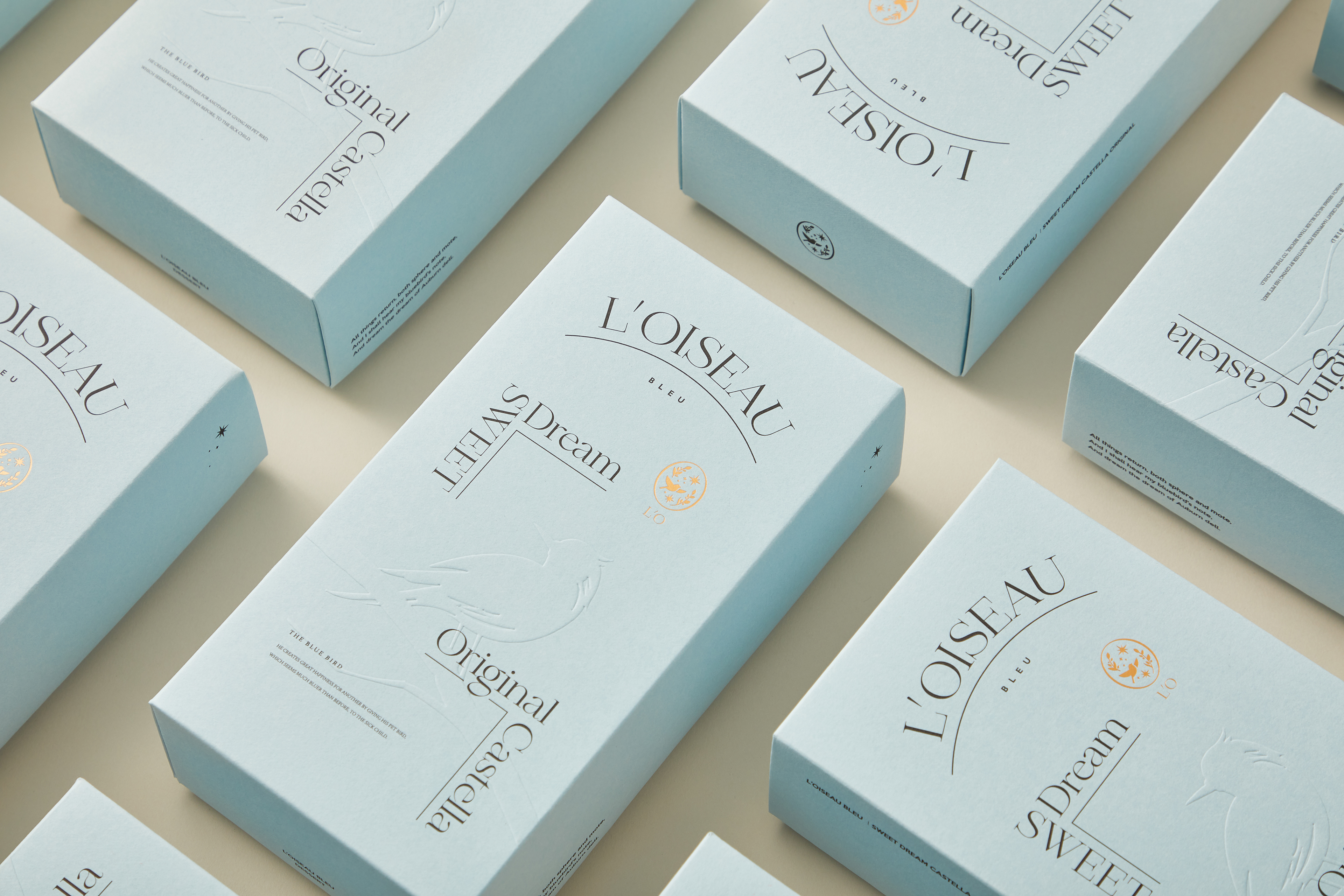
來自日本的L'O Bleu以童話青鳥中的故事理念作為引導,希望將"知足與真誠"的生活理念傳達給人們;同時也將其理念貫徹在產品之中,以最原始的配方搭配天然原料來製作糕點,使人們在品嚐到他們的產品之後,都能夠感受到純粹真切的幸福感。
"人們為自己所定義的幸福踏上追求之旅,而事實上他們早在路途上得到幸福了,只是他們並不知道。"
在本次的標誌與包裝設計中,我們將故事"青鳥"以劇場表演的概念展現整體的視覺元素,從故事的序幕開始,乃至中途劇情的發展,直至故事結尾分段呈現。在包裝材質部分,我們選用特殊的染色紙材表現青鳥的色彩特徵,並將其外型以打凸加工與印刷交疊的方式呈現,展現故事本身的樸實特質。


"People embark on a journey in pursuit of their definition of happiness, when in fact they have already achieved it, they just don't know it."
In this logo and packaging design, we show the overall visual elements of the story "Bluebird" with the concept of theater performance, from the beginning of the story, to the development of the midstory, until the end of the story. In the part of packaging material, we chose special dyeing paper to show the color characteristics of blue birds, and presented its appearance by convex processing and overlapping printing, to show the simple characteristics of the story itself.
Designer|Louis Chiu , AAOO Studio
Print|金彩曰包裝
Photograph|Whitehand Studio
