

客戶作為生產古早味餅乾的老店品牌,在這次的中秋禮盒設計中,以「悠久、廣闊與創新」作為視覺核心,將經典台味餅乾的酥脆質感與古樸造型,轉化為極簡而具未來感的現代語言。
在整體視覺色彩中我們採用深空藏藍與金黃搭配,降低多餘細節,將脆餅與酥餅的幾何線條重構為星域軌道與異星天體,讓傳統點心與遙遠宇宙在盒面上展開一場時空對話;主視覺中的金色圓盤既代表中秋明月,亦描繪品牌的經典產品,強化產品在開盒、陳列與餽贈時的高級識別度。
禮盒不只是一個僅有實用性質的裝載容器,也是一套具有宣示性的品牌形象展示,透過一致的比例、色調與圖騰,展現品牌歷史與不斷創新的品牌理念。
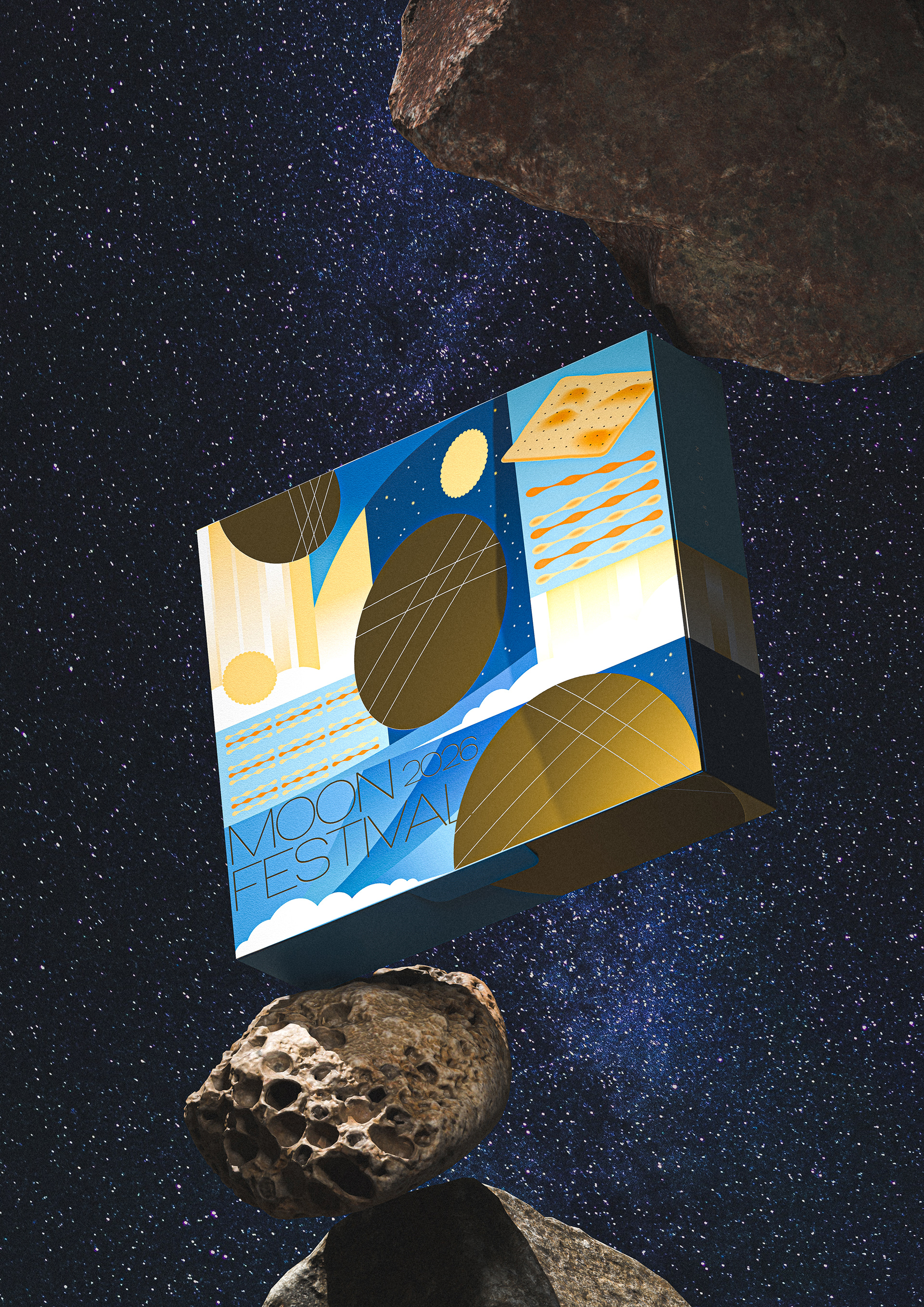
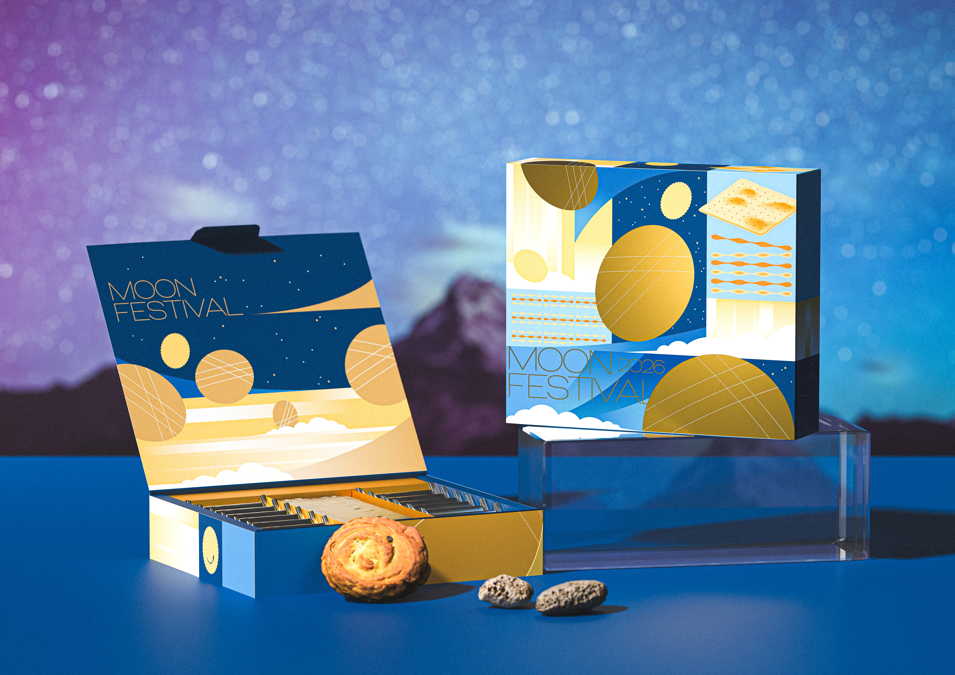
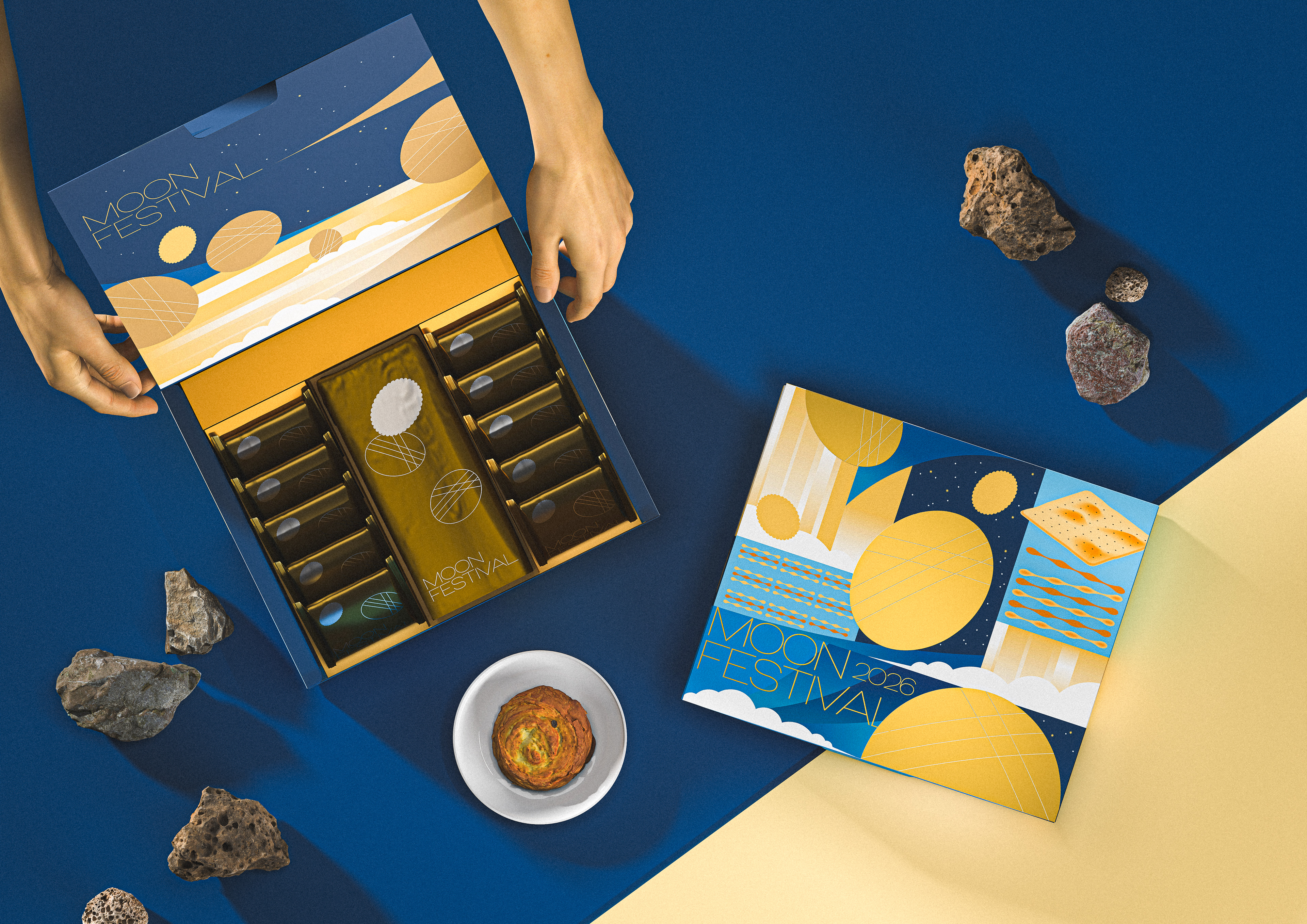
As an established heritage brand specializing in traditional Taiwanese biscuits, our Mid-Autumn Festival gift box design centers on "Heritage, Immensity, and Innovation," transforming the crispy textures and classic shapes of traditional treats into a minimalist yet futuristic visual language. The color palette relies on deep cosmic navy and radiant gold, stripping away unnecessary detail to reconstruct the geometric lines of classic crackers and pastries into celestial orbits and alien planetary bodies—creating a spatiotemporal dialogue between traditional confectionery and the distant cosmos on the box surface.
The golden spheres in the main visual represent both the full moon of the festival and the brand's iconic products, enhancing sophisticated brand recognition upon opening, display, and gifting. This gift box goes beyond a functional container; it serves as a bold statement of brand identity, embodying our rich history and ongoing spirit of innovation through consistent proportions, tones, and patterns.


專案類型 Type | Packaging 包裝
專案年份 Year | 2025
客戶 Client|提案
製作單位 Production | AAOO Studio