Nudae私密調理粉包裝設計
Packaging Design for Nudae Intimate Care Powder
"Nudae"
Nudae is a brand that values self-care—not through loud declarations, but by gently reminding us to be more at ease with our bodies. It’s an attitude that balances softness and rationality, a way of carving out small moments of breathing space in the rhythm of everyday life.
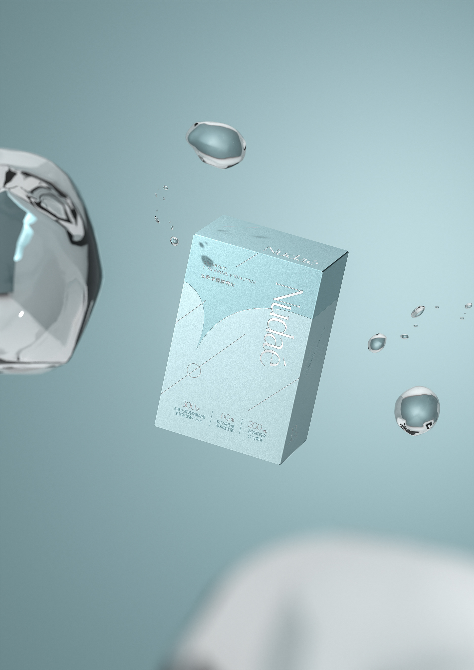
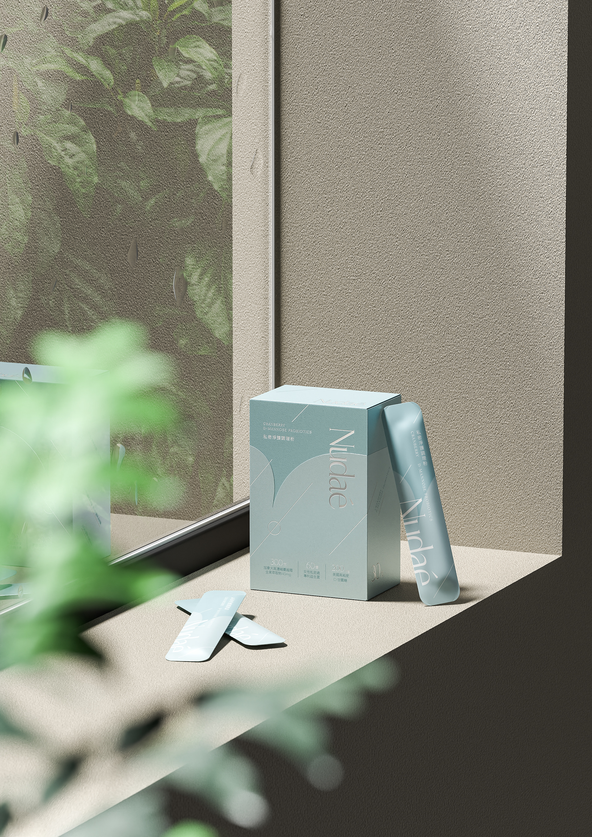
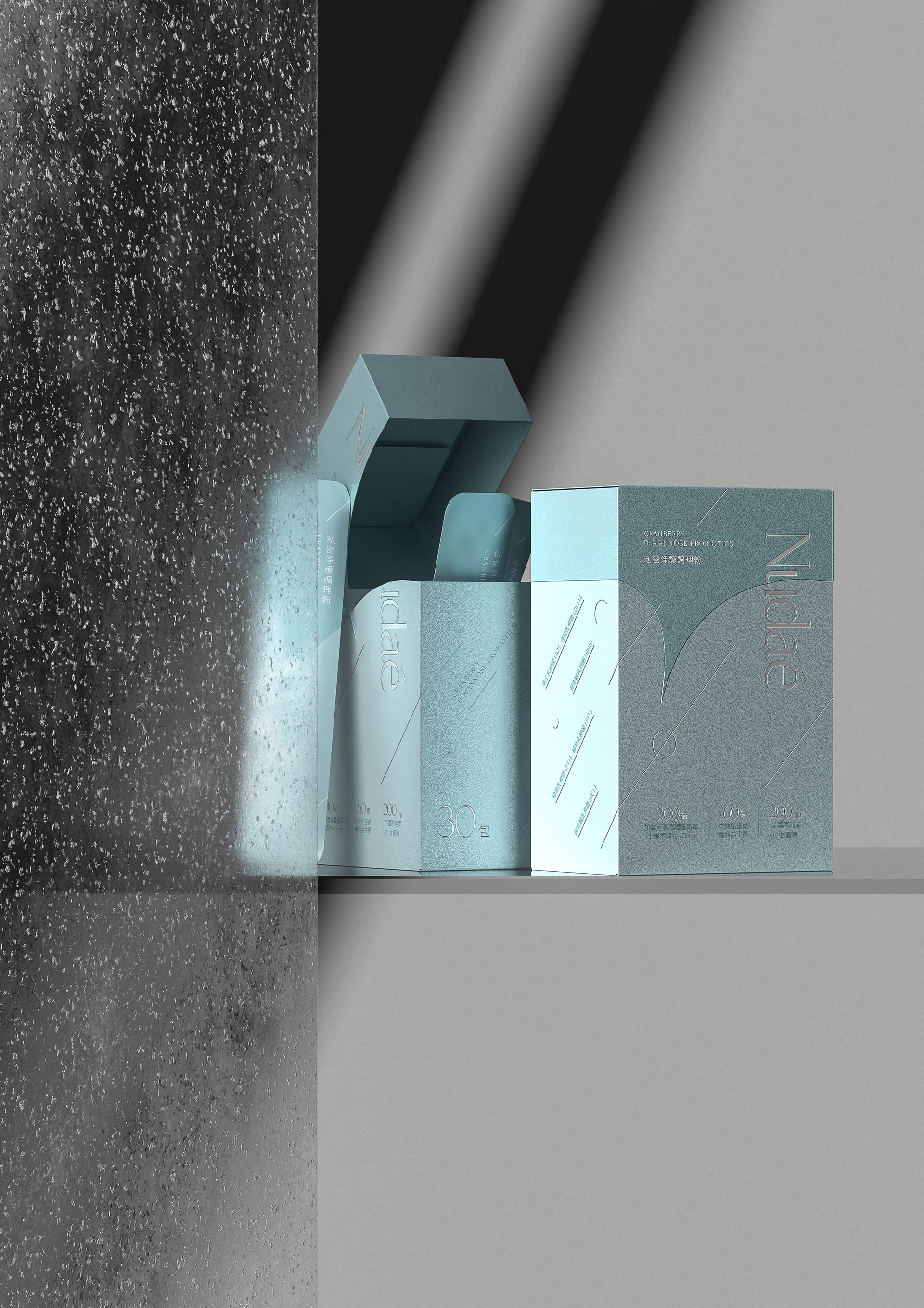
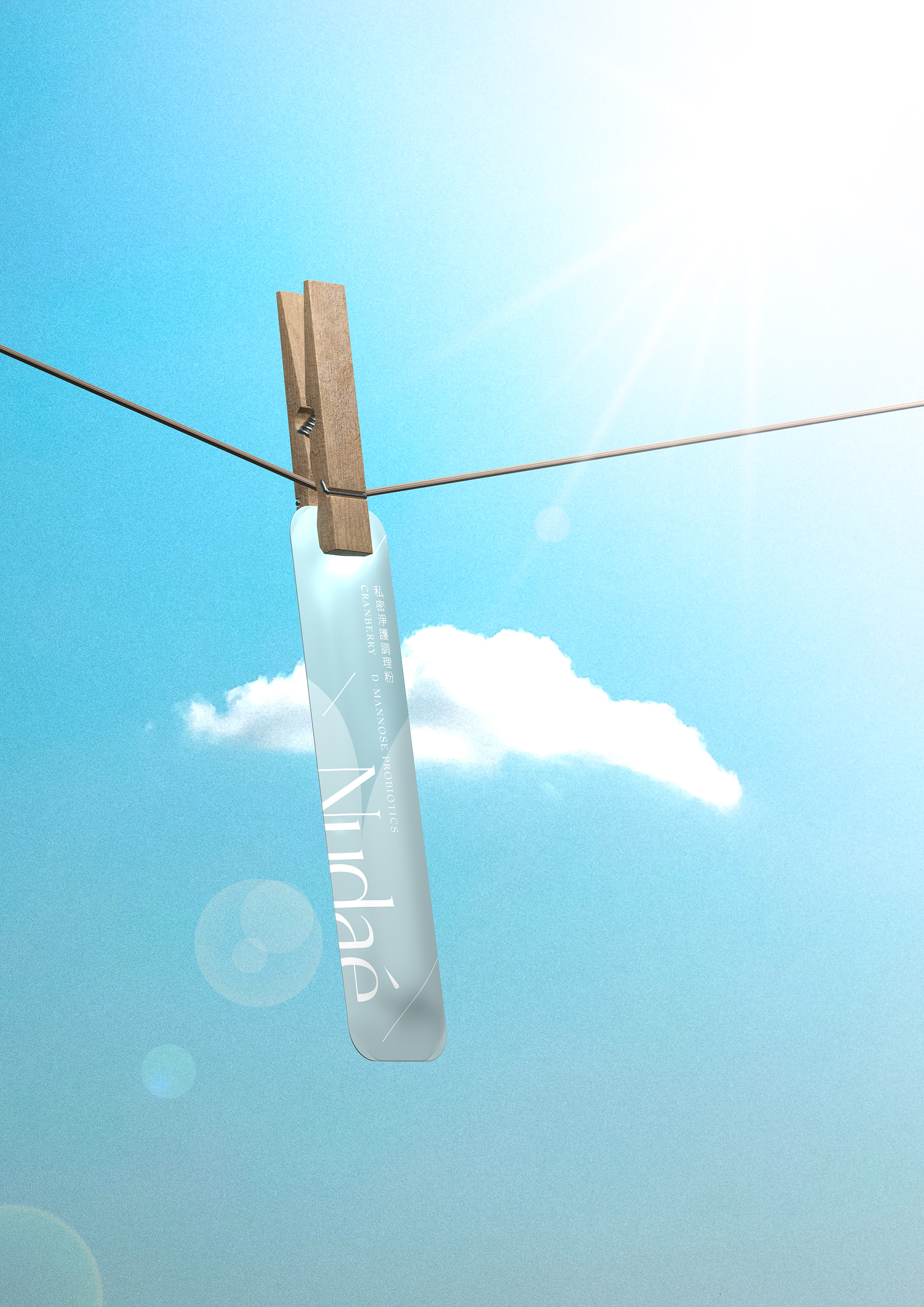
For this packaging design, we started with the image of “clear skies after rain”—that subtle sense of relief and release when discomfort quietly fades away, something only you can truly feel. The desaturated celadon blue evokes a freshly washed sky, a color that mirrors inner calm.
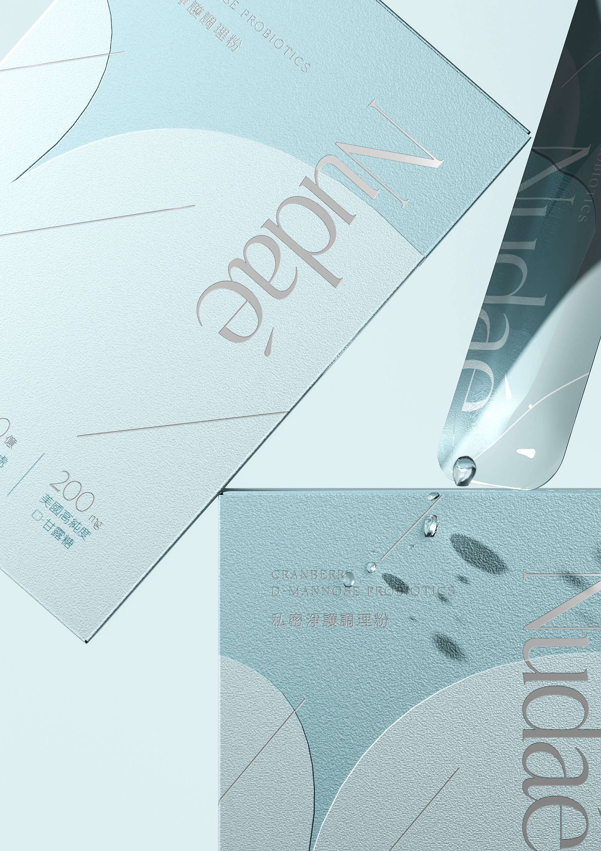
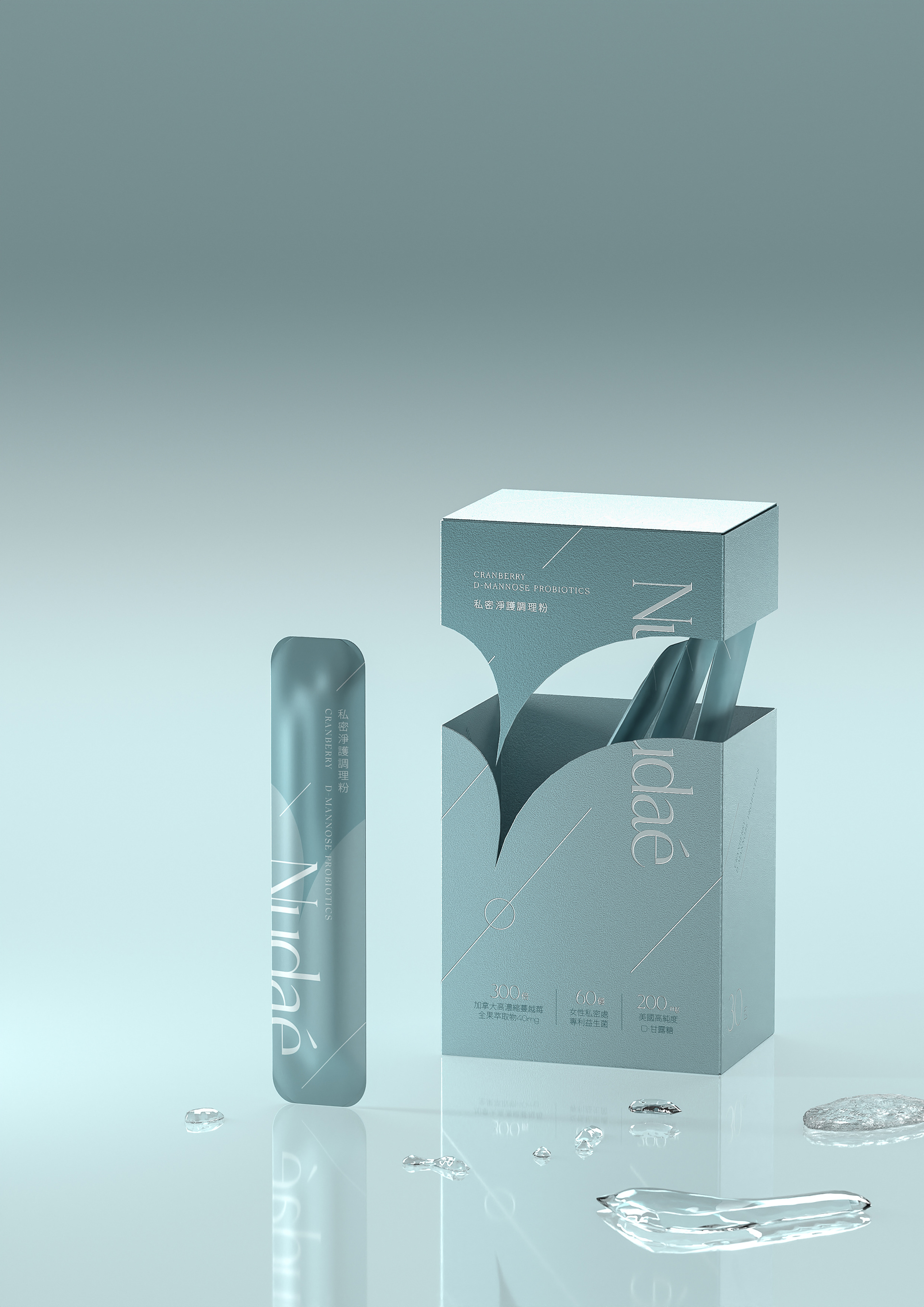
In terms of layout, we used generous whitespace to create a slower visual rhythm, reflecting the brand’s sense of elegance and restraint. The silver foil detailing represents delicate raindrops, like an afternoon moment gently tucked away.
The name Nudae suggests a sense of honesty—bare, but not fragile. I wanted the packaging to carry that same feeling: unadorned, naturally present, and quietly becoming part of your everyday life.
Nudae - 一個重視"照顧自己"的品牌,不是張揚地宣示,而是提醒我們可以更自在地與身體相處。這是一種介於溫柔與理性之間的態度,一種選擇在生活節奏裡為自己留出一點餘裕的方式。
這次的包裝設計我們從「雨後天青」這個畫面出發——不舒服的感覺被悄悄解決後的那種清鬆與釋放,只有自己知道。低飽和的天青藍像剛洗過的天空,也是內心平靜的顏色。
整體編排上我們用大量的留白讓視覺節奏更舒緩,帶出品牌想傳達的優雅與克制。燙銀工藝呈現細緻雨滴,就像午後的小時光被溫柔收納。
Nudae 的語意接近「坦然」、「裸露但不脆弱」,我希望包裝本身也有這樣的感受——沒有過度裝飾,而是自然地存在,像一種日常裡的安靜。
專案類型 Type | Packaging 包裝
專案年份 Year | 2025
客戶 Client|Nudae
製作單位 Production | AAOO Studio , Yu Jie Li